Fox Paws - Cover Critique Corner - Free - OPEN 2024

Updated: March 27, 2024

This is where you come for feedback on your cover.

I have a lot to say about covers and design. It’s been almost a decade in the making. I won’t say I’m free from being critiqued though. I’m still learning, too.

While I don’t make covers for people much these days, I still can critique.

Orders

Premades

Own Covers

If you think a thought or two from me might help, drop your cover. Covers can be ones you made for yourself, for someone, or just for fun. It can be a mock-up too if you just want some thoughts on how the design looks.

My suggestions will respect your style. If you do simple, great! Faceclaims? great! Horror? great! Dark colors? great! Bold colors? great! Anything is fine, I’ll help you in any way I can while keeping to your style.

Also note that I’m not a professional designer. I’m self taught. If something I said sounds weird, find a professional on here and ask them. They’re everywhere :stuck_out_tongue:

Why do I offer this for free? Well, I like to help budding covermakers, and I like seeing people grow in their covermaking journey :grinning_face_with_smiling_eyes: If something I said sparks some idea or inspiration in you, then, well, that’s a job well done for me :blush:

You can come back as many times as you like. Do fill out the form if you want an in-depth critique.

Form:
Cover (current and previous versions if you have):
Mood / Vibe of the Cover:
Genre:
Specific Questions if any:


As a bonus, if you tell me to, I can analyze your font choice.

Font psychology is fascinating. When I apply it to my own covers, people seem to understand the genre more and can more accurately guess the story :exploding_head:

Here’s some reading you can do if you’re interested:
Font psychology article one, article two

12 Likes

Cover:

Mood: Dark, but like a fantasy allure that draws you in. (as the requester specified)

Specific questions:
This was one of the inspiration pictures provided and this was the request: My object Base would be (my preference) a bloody Violet (the flower, not the color lol). I think A bloody violet would be more dramatic. The details would include the front of the cover would be a silver gate covered in blood. In between parts of the gate (refer to links for better use) there will be bloody violets. The background beyond the gate is a light, peachy color to draw the eye to the blood and violets (opposite color). If possible, I would prefer the gate to look gritty and kind of old but with an overall dark tone.

Obviously, I did that only on one cover. For the other one, I just followed a bout of inspiration. I want to know how close you think it matches the request. And any suggestions?

6 Likes

First off, both are beautiful covers :grinning_face_with_smiling_eyes: I do think the one on the right, closer to the requester’s inspiration picture, would be better. (Although, as the covermaker, you can say, here’s another version, and see if they like it. Sometimes people can surprise you XD )

One suggestion I do have is for the one on the right. The middle violet and the ones on the top right and bottom left, are kind of bright and my eyes immediately went to that instead of the title. It might give better attention on the title if you darkened those violets a little more (shadowing or adding more blood, or tinting the violets a darker purple). Otherwise, I think it looks pretty close to what they seem to want :slight_smile:

Hope this helps :grinning_face_with_smiling_eyes:

2 Likes

Thank you! I am planning on offering both and letting them choose whichever cover they want to use!

Oop- They were actually much darker, I added in overlays to brighten on purpose lol. Guess I overdid it! I’ll reduce the brightness, thanks!

3 Likes

No problem :grinning_face_with_smiling_eyes: Fingers crossed they’ll like what you did!

3 Likes

It’s open if anyone would like help or some thoughts on a cover :slight_smile:

3 Likes

So, I’ve been ghosting around your thread for a while . . . but it took me a couple of days to gather up enough courage to post something here . . . :sweat:

So, while I was in the wattpad forums, I designed some covers for several authors. I was a complete noob in cover making then. I’m still kind of a noob, but I think, I kinda gathered some knowledge. So, I decided to do redos . . . just to check my improvement and I would love to hear your opinions!

Cover (current and previous versions if you have):

Mood / Vibe of the Cover: This is one of my problems. I sometimes completely suck at reading moods. I think, in this case, it’s fantasy. :sweat_smile:

Specific Questions if any: As you can already guess, the book is about werewolves and stuffs . . . also, there’s a crow and a dagger - they play some sort of roles in the story. Now, I tried to show these elements on the cover. My problem is, did I overdo it? Cuz I think, in the first verson, I kinda overdid it and it looks jumbled. :sweat_smile: And how can I overcome this problem?

Okay, I think I’ve said everything I wanted to for now.
Thank you for this opportunity! :heart:

6 Likes

First off,

Yes, very jumbled, but can I just say, I like how the text is partially behind the wolf on the left and I do like that red text. Also, great font choice :grinning_face_with_smiling_eyes: I like to call that, royalty people font :stuck_out_tongue: 
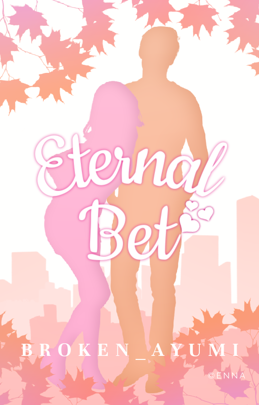
It just looks like it belongs with words like princess or prince or duchess or something along those lines.

One thing I must point out: author name says MIDNIGHTCUPOFNODLES instead of NOODLES XD

Okay, back to my thoughts :stuck_out_tongue:

The improvement :open_mouth: Omg, it’s so much simpler and my eyes are attracted to the picture and then the title. That’s exactly what I want to look at when deciding whether to pick up a book or not. I don’t find it to be jumbled in terms of the elements you put on it.

The daggers as part of the title design works really well. In fact, I didn’t realize they were there until I read your explanation (or it could have just been because I’m tired XD). But it looks good to me :grinning_face_with_smiling_eyes:

Although, I do feel like there’s all kinds of colors going on because of the title. Still a bit clunky there. Maybe the title should be all in one color? All red or all purple? There’s a bit of purple on the crow silhouette so maybe try that one? Or, what if you tried the same pinkish red you used for the first version?

Also, small thing, something about the shadowing on the lower bit of the girl’s right arm makes it look like she’s missing an arm. Idk how you would fix this, if you do decide to. Anyway, just thought I’d point that out because it was one of the first things I noticed :stuck_out_tongue:

Btw,

Moods is usually like maybe you want to show that the story is foreboding, calm, happy, romantic, epic adventure, whimsical… From what I’ve gathered over the years the cover should reflect the mood of the story within. So, you would use your design skills to get people to feel the story.

For example, if two people were hugging on the cover romantically, there, the mood is romantic so the story must be, too. Or, if some princess is looking all regal on the cover, and maybe she’s looking somber or determined, that would tell the reader this might be a serious royalty fantasy story.

Despite there might be some moods that can be universally understood across many people, I think mood can be quite subjective sometimes. So, you do your best :slight_smile:

I hope some of this helps! If you have any questions about what I said, feel free to ask :grinning_face_with_smiling_eyes:

3 Likes

Both of these are not my best work–by far! And I think I could use a lot of improvement on these, but I just don’t know where to start.

MOOD: the first one is some… darkish fantasy that has some magic, but not much. The second is… I was trying to go for a windy feel. Of course I didn’t succeed. And WHY oh WHY did I think that making that title being so busy was good?

Specific questions: PLEASE TEAR THESE APART.

I do like how I did the author name on the second one, and I think the first is… somewhat okay? It looks professional-ish, but something’s off with it…

6 Likes

Beneath the Surface

First Impressions

I like the silvery text and how it looks embossed. I don’t have any issues with that. The girl doing the stretch is throwing me off. Not really getting dark fantasy vibes :sweat_smile: Maybe it needs a tad more magic? Placement of text, no issue. Person front and center, no issue. The color scheme, no issue. There’s unity. I like unity.

But I’m a little confused. Is she…sta…standing? :stuck_out_tongue: Her legs have vanished and I can’t tell what she’s on or in, and where she’s doing what. Is that a cape behind her? The edges on the bottom part are faded in a way that has merged them with the background so at first glance, a girl is doing a stretch exercise and there’s some shadowy abstract background behind her.

The Title and a bit more magic

It is a lot of that swirly font. Is that Cinzel? What about if you made “Beneath” like how you have “the” and leave the swirliness to “Surface” for the title? Not a big issue, really. Just wondered if that would make any difference in how the cover looks.

To add a bit of magic, what do you think about adding a glow to the title and the same color glow behind the girl? Just a little of it? Right now, the image and the title look a little separated from each other. That might bring it together more :slight_smile:

The Splash Force

It took me a while to realize that on the bottom was a splash. You might try, if you can, making the splash taller because I thought the splash was a reflection of the forest in the water. Maybe the splash needs more depth? layers? colors? as well. Also, if she’s jumping in from the top, her dress at the bottom will probably pull a Marilyn Monroe, not fall straight down. Her hair, too. If she’s jumping in, her hair would go upwards a little.

Unless, that is, if she’s actually coming out of the water, (like, “I have emerged!”) her body should look wet and the cape? would be flat against her and dripping.

Also, for some reason, maybe it’s the lighting on the water…it doesn’t look so deep that it would make that volume of splash.

And, the surrounding parts of the splash look a little unnatural because there are no ripples around the splash. Or maybe that’s the point? Some unnatural splash force? Instead there’s some interesting haziness. I think you can take off some of the haziness down there.


Whisper of the Wind

First Impressions

The font, beautiful (what is that font? I feel like I know it!). The colors, I love it :grinning_face_with_smiling_eyes: The dark background really makes it pop! Awesome! And yes, I think the author name looks professional with a nice gradient. I also like how the title looks glassy and like ice almost. There’s something between “of” and “the” and at first I thought it was supposed to be a little spider web. On closer inspection, it’s a diamond. You said you were thinking about wind, but what I got was water or ice.

The Diamond

It looks quite out of place because at the moment. Is it important? Can you delete it? If you need to keep it, I have three ideas:

  • One idea is to have it behind the title and make it BIG and blend it with the background. Could you carve the big diamond into the background? I’ve seen covers that do that.
  • The other idea is to put it between the first and last name of the author. The downside of this is that it might mess up the author name. You might have to make the author name smaller.
  • The third idea is if there’s no difference putting one or many on the cover, to have one above and below the title, and make it the same color and style as the title.
More wind up in here

About the wind feel you were going for, honestly got water or ice without looking at your explanation. I’m not sure…how…how you would pull off wind :sweat_smile: Maybe you need a different font. Something more wispy. Like, Jellyka Delicious Cake font. Or, if you keep that font (I want to know what font that is, tell me! XD) add something in the back. Maybe wispy swirls in the same color as the title.

image
This kind of thing. I just pulled this from a google image search.

Or this.
image

Alright, that’s all I’ve got :grinning_face_with_smiling_eyes: I hope this sparks something in you or helps you improve on the covers. These are just one person’s suggestions, so of course, go with your best judgement in the end. If you have any questions, feel free to ask away.

1 Like

OOH yup! Thanks for all of that helpful stuff! I’m going in for a remake of Whisper of the Wind tomorrow, because idek what I’m trying to do with Beneath the Surface. Might revisit it when I have some ideas.
PS: That font is Star Black Inline

2 Likes

Another PS: that diamond… is my… watermark

1 Like

:open_mouth: ohhh

Right now it kind of makes it look like it’s supposed to be part of the cover. Do you need the watermark if you already have “Cover by” on the top? I thought that was your watermark.

2 Likes

Yup! I just place it anywhere on the cover where it’s convenient…
And I just prefer using both for some reason… I usually do turn down the opaqeucity of both so they’re faded

1 Like

Please pardon my laziness :sweat_smile: I noticed the typo but I was too lazy to correct it! :laughing:

Now back to business . . .

Thanks a lot for this! Especially for explaining moods XD! It’s gonna be a B-I-G help! :heart:
I’ll try to improve the colours of the title and keep it in mind for future attempts!

And this! OMG! I didn’t notice it before. I was so absorbed in changing the dress colour that I didn’t notice it! Thanks for pointing it out! I’ll probably need to borrow an arm from a model! :joy:

This was really helpful! Thanks a lot for this opportunity! :heart:

2 Likes

This is what became of Whisper of the Wind. I quite like the simplistic design, tbh

@TheTigerWriter What do you think?

6 Likes

THAT IS GORGEOUS

2 Likes

Thank you!

1 Like

Omg, that is SO BEAUTIFUL! :smiling_face_with_three_hearts: 
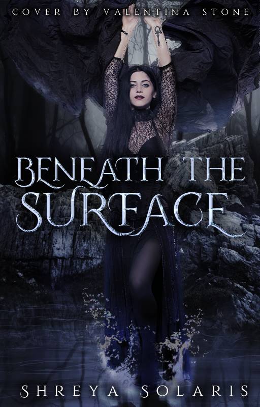
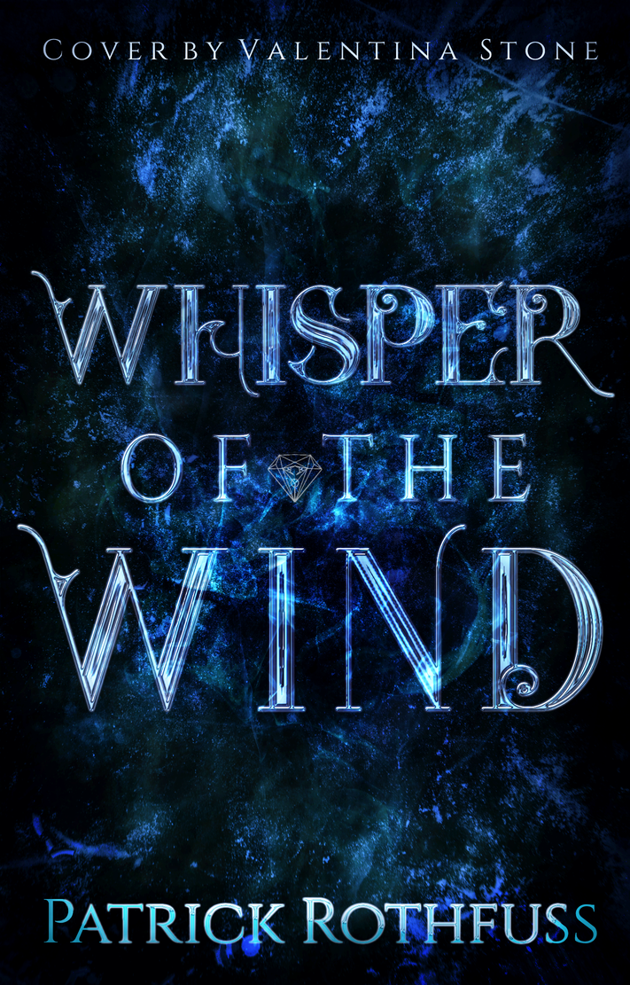
Pat yourself on the back, I can feel the wind. I can hear it whispering!
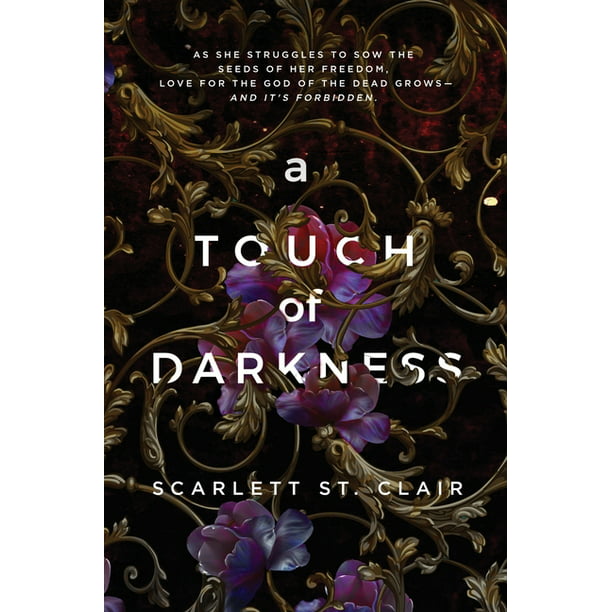
The only thing that caught my eye was the “Elemental Chronicles Book One” is touching the swirl on the right side :stuck_out_tongue: That “E” over there. It’s something that bothers me, personally, so I would fix it, but if it doesn’t bother you, you don’t have to change it :slight_smile:

2 Likes

Still open peeps :slight_smile:

1 Like