Ahh yay, thank you! Your feedback was a huge help!
And I probably should add a shadow on that E…
2 Likes
Beep beep
1 Like
Sheep sheep
1 Like
Anyone is welcome to ask me if they think they would benefit from some feedback 
1 Like
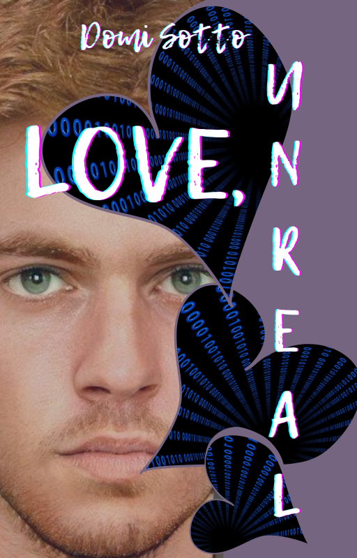
Hey, why not. Your comments on this one?

Cover
… and versions: thousands It’s a multi-object composite build in PhotoImpact, that went through lots of iterations.
The cover for book 2 uses a similar theme and layout, but very different graphics. I will add it if that makes sense, but I thought one was bad enough.
Mood
Euh, not sure what to say. Aiming for something that a. would be a little creepy, but not too much, b. would attract YA readers, and c. would NOT be the ever popular ‘pretty girl in semi transparent swirly dress with ripped guy bending over to kiss her’ on the cover, even if that would sell better.
The opening scene in the book is a run-in of the main character with another cast member at a gas station in the middle of nowhere.
Questions
Just a generic feedback would be fine, and what in general you would change to improve it.
History
I started with the font, actually. Looking for a theme that could be reused on multiple covers and installments (The ‘ParentKillers’ part, which is the name of the series.)
My original idea was very different. It was too blank for a standalone cover, so I opted for something with a more ‘photo like’ background, ie. the desert scene.
From there I added the eyes and blended those with the clouds. They’re coloured red because that is one of the parts in the story (a magical drug that turns the eyes of the users red).
I played with the light / dark zones, until the text was clearly recognizable, even when zoomed out a lot (as would be the case on an Amazon page etc.), but it should also work well if actually printed. There’s a little space at the top of the cover left for slogans and promos, such as ‘The next book bla bla bla bla bla’.
I made a screendump of an Amazon page, and then place the cover (downsized) on the page, so see if it would stand out.
2 Likes
It would help me if you could edit your post using this form below. I do have some thoughts right now, but they might not be what you’re looking for.
Form:
Cover (current and previous versions if you have):
Mood / Vibe of the Cover:
Specific Questions if any:
1 Like
Hi, still open here 
2 Likes

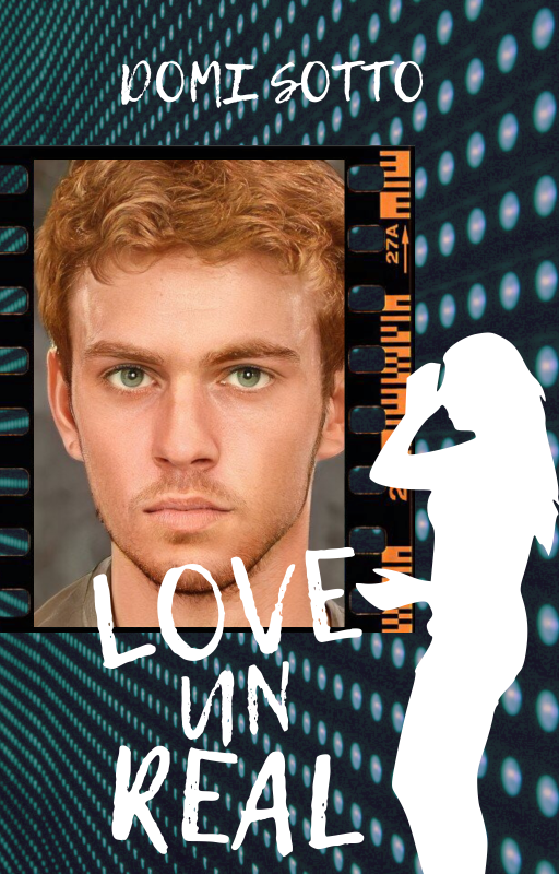
This was a fake, but I don’t particularly like this, for some reason I can’t tell.
Mood / Vibe: Darkish, nature, fantasy
3 Likes
There’s also another cover, but I don’t want to overwhelm you, so I’ll put it up after this one
2 Likes
Whoa  I quite like it
Maybe the crown and the title could have some brighter yellow or greenish gold highlights in it to make it stand out a bit more. It does camouflage into the background a bit. The “of” is really standing out, so maybe you can use those colors to add the highlighting?
2 Likes
Feel free to overwhelm me Probably won’t be overwhelmed.
1 Like
Guess I’m alone then, whoops. I usually don’t like most stuff that I make, but something about this is really bothering me, and I can’t figure out what.
Hm… maybe that’s it. (can’t make the changes anymore though, I deleted the psd , whoops)
1 Like
Alright then, here you are.
I was unable to get the castle right, and
I’m aware the title reads Empire of Lices
to some people. Otherwise, tear this apart.
And if you have any suggestions on
the castle, I’m all ears. Seriously.
I was unable to get the castle right, and
I’m aware the title reads Empire of Lices
to some people. Otherwise, tear this apart.
And if you have any suggestions on
the castle, I’m all ears. Seriously.

Mood: fantasy, intrigue, epic.
2 Likes
Omg, it does look like Lices XD Sorry to say. It’s because the swirl of the “I” is touching the swirl of the “E” too much. Maybe if the “E” didn’t have a swirl, it would look a lot less like Lices.
Took me a moment to read Lies, I’ll have to say 
I will say though, I LOVE the colors. The reddish orange and the gold are beautiful together.
Two Points of Critique: castle and author name placement.
Castle is very hard to see because the title stands out so much. I initially thought there wasn’t anything on the background but a bit of gradient. I’m wondering if you need the castle? If not, perhaps turn it into a gradient. Sort of like a grungy, rustic background. If you want to keep the castle, maybe the castle can be gold as well.
If you make the castle gold, there will be quite a lot of gold on the cover. So, maybe make the gold swirling frame on the top and bottom a little smaller. If you can, pull the bottom down a bit and top up a bit to give more space for title and castle in the cover center.
I have another suggestion for the castle. I’m wondering if you could turn the bottom border, where it’s sticking up above the author name (that little triangular point), into a castle? That would not only be cool, but also make the gold parts less jumbled compared to if you added a castle.
Second point, the author name placement. This might be a subjective suggestion, but I was once told by a professional cover designer to not have the author name on the graphics. So, you would, instead, move the author name up to the open space beneath the title. Idk if you want to take this advice. I think it can be subjective or a stylistic choice.
That’s all I’ve got
2 Likes
Yup! That’s some very helpful advice, thank you!
2 Likes
You’re welcome 
2 Likes
The first one. Less jumbled looking.
The title placement, I quite like, actually There’s no rule, particularly, saying titles have to be horizontal and centered. As long as the rest of the cover fits nicely around it, it works.
2 Likes
Thank you!
2 Likes
You’re welcome
2 Likes