boop
anyone is welcome!
If not in-depth, you can even ask me which color is the best or which design is the best if you have a mock-up or something. Doesn’t always have to be about the details of the cover.
boop
anyone is welcome!
If not in-depth, you can even ask me which color is the best or which design is the best if you have a mock-up or something. Doesn’t always have to be about the details of the cover.
 Enna, can you suggest a better swirly font for me to use for “Taitens”? Something more “fantasy warrior”-looking. The current one is too “soft” if that makes any sense
  And I don’t want to cram Taitenschild into one line because it looks too cramped
Okay…hmm… 
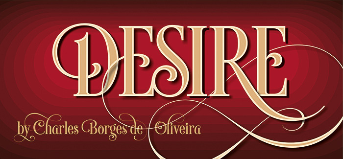
(Magento vintage style and Desire are two fonts I don’t have but seen them in action, making covers look like awesome fantasy books)
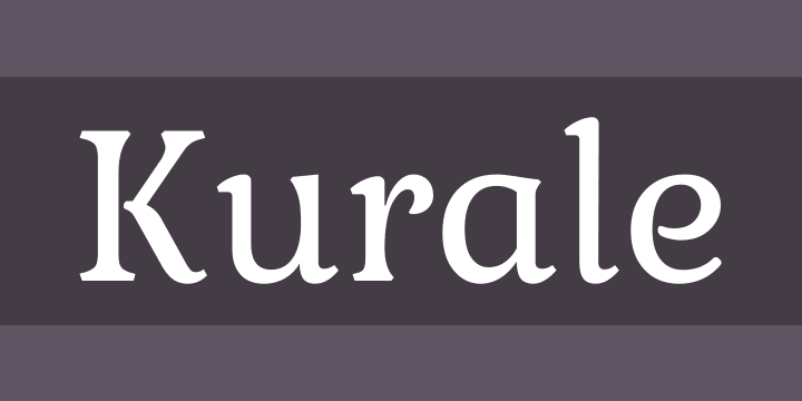
Kurale
Marcelle
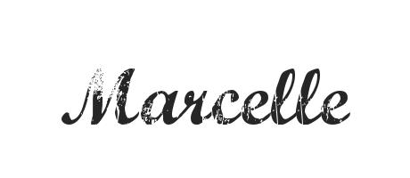
Irish Gold
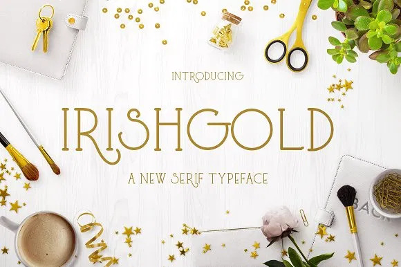
Magneto (vintage style. Be careful. There’s also another Magneto.)
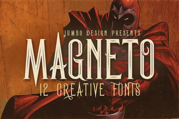
Desire
 Sometimes there’s a thing as too much swirl for some books.
Those are the ones I can come up with now  Sometimes you don’t know if they’ll work until you try them.
still open, of course 
Sorry for being late. I saw this one and then I put every notification on “read”, so I nearly missed it 
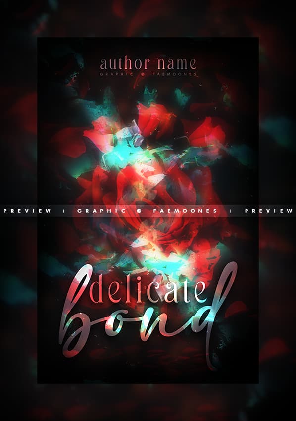
Blurry  Well, I opened it up to get a better look at it. As a thumbnail, it is quite hard to read the “delicate” and I’m almost not sure if it says “bond”. The author name is completely hidden in thumbnail, but not too bad when you make it big. The cover background is abstract, which, is not always a bad thing. Often books use abstract backgrounds for their covers and do pretty well.
Is it werewolf romance? There’s nothing about it that tells me it is. If you want a reader of werewolf romance to pick up this book, you might put a tagline that suggests werewolf romance. You can keep the abstract background this way. At least one thing that could indicate the genre would be nice.
If you don’t want to put a tagline, you might consider a simple silhouette of a wolf. Together with wolf, clear title and author name, readers can guess that this might be a werewolf story. The blurb will then tell them if it is romance or not.
Tagline or no tagline, it might be a good idea to make the author name and “delicate” a little more popping. “bond” is hard to read as a thumbnail, but not when I made it big so, you can be the judge as to if you think “bond” should be a little clearer as well.
And that’s all I’ve got 
In terms of colors, I think everything goes together really well. I’ve seen your covers a lot and you seem to have a good command of color combinations. Well done If you have any questions, feel free to ask. I’m always hovering around Wacky XD
open nepo open nepo
 no problem, I’ve done the same many times before
Ah — oops.  The wole thing was actually duplicated, gaussian blurred and then it’s opacity reduced to give that soft, dreamy glow effect.
Yikess I mean, the original request didn’t have a subtitle or anything, and the theme was “roses”, so I didn’t think about putting anything obviously werewolf in. Now that it’s a premade, I’m probably just going to keep it as a romance But I’ll try to fix up the text. Thank you for the help!
Ah, thank you!  I do try. And will do! I’ll drop a couple of covers here soon (all premades I believe), if that’s okay.
No problem! Keep in mind, these are just opinions of one person. Someone else might think differently meaning that it’s okay to disagree with me The point for this critique is to hopefully spark some ideas in your head.
You can drop as many at a time as you want, whenever you want
You know me, bulk uploading, as usual.

mood: magical, burning, the vibes of ‘Wildest Dreams’
genre: fantasy romance
specific: nothing really, just everything.

mood: magic, dark, hope - the title says it all
genre: fantasy, romance, military fantasy, epic fantasy
specific: everything. Tear these to shreds. I want the covers for my babies to be awesome.
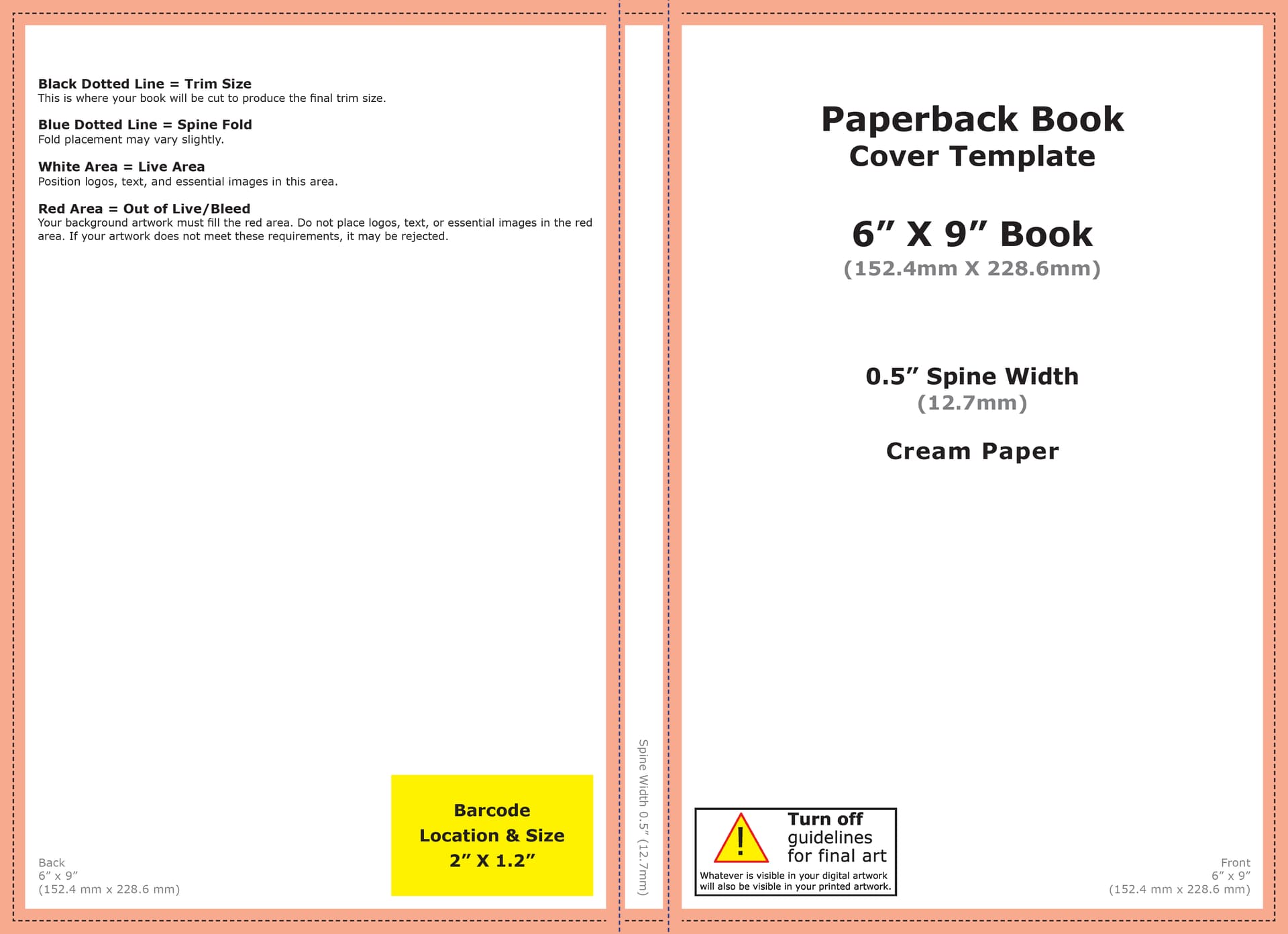
Oooh, that first one! I want to make my own book jacket, but all the margins and bleeds have me super confused. I think I’ll hire a professional. Maybe you’ll have figured it out by the time I need one and I could hire you? 
Anyway, let’s get down to business! (Mulan reference)
It’s so pretty! I honestly don’t have much to say. It looks like it’s ready for publishing.
Were you scared to open this tab? Well, this is all I have I’m also not knowledgeable in what makes a good book jacket, but it looks pretty darn good to me.
This one’s so pretty, too! How can I critique this?
The only thought I did have was around the roses feels a tad empty. Most of the things on the cover are sort of…concentrated vertically in the middle. Maybe behind the roses, the background, you could have some short, faded roses around the bottom?

Around this part. Next to the leaves on the side. Some short little faded roses or petals maybe. A bit of a rosy haze perhaps? Just to make it look not so vertically concentrated. I think it looks that way because the background is all the same.
Other than that, I love the colors and you definitely give that sad feel, but not depressed. We can still rise up, kind of vibe for sure
This looks familiar The rest of the series or revamped?
“Rise from the Ashes” and “Burn to the Ground”, I’m wondering why “to the” in “Burn to the Ground” weren’t designed like “from the” in “Rise from the Ashes”, or the other way around. Would it somehow look off balance?
Also, there’s not much texture (as far as I can tell) behind the titles… But then I squint my eyes and see something of the likes of stars. Maybe those could be a little more prominent?
That’s all I’ve got. Feel free to ask any questions you might have.
You should pat yourself on the back because you’re getting harder and harder to “tear to shreds” XD Might be just my level of knowledge, but as you keep returning, I see fewer and fewer things to point out
Oh it’s not that hard! The amazon template has arrangements made for that stuff already. This is for the random book stats I plugged in.
I would love that, honestly 
AHH thank you! I took my time with that one, for sure. I love how it’s come out, now I just wanna see it on a real book lol.
If I’m being honest, yeah, lol.
Ah that’s fine, gotta get that researched!
AHH
Yeah great! I whipped this up a few minutes, so makes sense, but I do agree with it being very visually empty. Let’s see if I still have the layered file, and I’ll edit it!
Revamped! I changed the cover, then also changed the title, and then changed the author name. Yes, a ton of changes, I know.
Hm, I don’t remember for sure, but I think the ‘t’ in ‘to’ was getting overshadowed by the ‘B’, but I’ll check again.
Hm yeah, those where there just for that extra support, but they aren’t really needed, and there’s already a ton of glow from the castles, so I kept them as they are. I’ve tried it with higher opacity, but it didn’t work quite right.
AHH Thank you! I see a ton of that improvement, and I think it’s mainly because I spend so much time doing this stuff, lol
You’re looking at someone who changed their title at LEAST twenty different times. Designed a cover for a least six of those titles and then came up with a completely different one and, if that wasn’t enough, fixed the cover for the new title at least ten times. Then, changed the tagline and the entire vibe.
So, not a lot of changes in my book XD
You’re right about the ton of glow around the castles, although I wonder what it would look like if the title glowed in the back like the castles? Would that be too much?
Paying off, definitely
Looking forward to see what you do with it
Ah it’s fine. We need things to be elusively ‘perfect’
XD lol
Hm interesting… I didn’t think of that, but will give it a try!
open open
Lemme see if I made anything recently… I’ve been on a cover making slump.
There’s this  I don’t even know what I was going for with this… just that I wanted to make something text based.
mood: contrasting, duality, enemies to lovers, maybe?
genre: fantasy.
Initial thoughts?
Orange and blue is my favorite combo of colors and my writer’s color scheme XD I’m trying not to be biased, lol
There’s this in-between-y black part under the bottom of “Skies” that seems a little awkward. Maybe a little more blending would do the trick. One thing I know that works from doing orange-blue cover designs for my own stuff is that a slight, VERY slight purple middle tends to blend well with the other colors if you don’t want to go for the natural gradient middle which is kind of a green…brown thing.
Also, this might be a personal preference thing, but the “A novel by the…” looks a tad too much with swirls and a little inconsistent because you didn’t do it for the first letters on the other words. I think it would look cleaner if that part didn’t have swirled first letters.
Also, one last thing,
I’m getting more of a unification vibe. This might be because it’s a horizontal gradient rather than a vertical one, but it might just be me because I do a lot of orange-blue covers and now see them in a certain way XD
Ooh I see what you’re saying. Lemme get back to it quick…