I shall be back for more in-depth critiques! Just one question.
Does it say…a…court of red roses? Or a court of red and roses?
I shall be back for more in-depth critiques! Just one question.
Does it say…a…court of red roses? Or a court of red and roses?
Sure, and thank you! <3
A Court of Red Roses 
First impression:
The blood? looks like claw marks, so now I’m thinking about werewolves and vampires. If that’s not what the author wants, maybe…splashes of blood rather than vertical streaks?
About the Title:
Personally, it’s a bit of a workout to read the title, but it’s not totally un-readable. You stop and read it which, in a bookstore, you’d want the reader to do. It is eye catching with the white text against the dark background coupled with those red roses. Then readers will pause and see, hmm  I wonder…OH! A court of red roses? Is that the title? Wonder what it’s about.
As for a thumbnail on Wattpad, it might be better to not have the roses and the thorns hiding the title because that font is already hard to read when it’s teeny-weeny Maybe put the roses on the sides of the “A” and around the “C” and “T” of “Court”?
I do like the font. Giving me gothic, dark fantasy vibes. Idk if I’d call it paranormal romance, to be honest, but that’s my personal opinion on what certain genres look like on covers 
About the Border:
As for the border, I don’t think it’s too much. It would look so empty and plain without. In fact, it’s beautiful 
That’s all I have. Hope it helps! 
Oh, this is what I want 
Sure, I’ll try this!
 It does have Gothic elements to it, and I guess it does go in the main fantasy thing!
Yay, thank you! 
It really does! Thank you so much! 
You’re welcome
cover:
mood / vibe:
mystery, hope, fear, danger, death, panic
genre:
thriller / horror
specific::
does the blood seem realistic enough? / is the text clear? / are the thorns visible enough?
thank you for your time! and once again, sorry for spamming that’s all i have to pester you with at the moment
Alright, thank you! And sorry for the spam
I think it’ll have to be after Christmas. If I don’t respond after Christmas, feel free to tag me in a comment here to remind me. I want to give you a response when my brain is all online
Of course! I get that feeling too xD Have a good holiday! <3
@deathinreverie
Cover: Khayrin
Apart from the candles, I’m not entirely sure what I’m looking at. The red on top looks kind of like the triple bar (triple bar wiki) which, Idk if that was intentional or not. Anyway, I do like the colors and how they contrast with each other. Let me get into the points you want me to touch on.
“the tale of” is a little hard to read small and when I made it big. I can definitely read Khayrin, so if you don’t mind people seeing that part before figuring out what it says on top, then I don’t think you have to make “the tale of” bigger or thicker. The author name seems legible to me.
I already mentioned I like the colors and I think they go well together. It’s not too wild or confusing.
Well, to me it looks typography-based even though you have a picture of real candles on the bottom. But there is a lot going on. I’m not sure what I should focus on. The candles stand out as well as the triple bar and some kind of globe or orb situation on top. Not sure what’s inside the orb. When I make it big, I see it’s a tree inside or a dear with antlers and birds. And then around the candle, there seems to be handprints. I’m getting more of a fantasy/vampire/paranormal vibe than a horror/mystery/thriller vibe because of the large amount of white.
I’m wondering, if you want the handprints to stand out, you could turn those dark parts of the cover into that white-green situation you have going on at the top. Then make the handprints red. So, around the candles will be more white.
So, okay, I just have this problem here. The cover looks nice as a thumbnail (sure, all kinds of things are going on, but ‘Khayrin’ catches my eye immediately, so it’s okay). BUT I would not guess the genre correctly. Then when the cover is made big, I don’t know what I’m looking at because a lot is going on, so, as a reader, I might not bother trying to figure it out. MIGHT not. Some people may stick around ![]()
I think that’s all I have for now for this one. I’ll come back for the others ![]() These are my opinions, my critiques from my perspective, take it with a grain of salt. Feel free to ask questions!
These are my opinions, my critiques from my perspective, take it with a grain of salt. Feel free to ask questions!
@deathinreverie
Cover: a face like glass
Okay, so, I really like this cover. The title is easy to read, I know where to focus my attention on (the woman in the middle) and the colors are so pretty! I also like that font and what you did with it for the title, making it glass-like.
The only critique I have is the author name. I didn’t even notice it was there. I thought, “this one has no author name?” and looked for it and then I found it. So, maybe choose a different, less swirly font for the author name? It’s quite hard to read and as a thumbnail, it disappears into the background. But other than that, I like everything
You nailed the fantasy, mystery vibes. Idk about hope (this is not you, it’s me, I just don’t know XD) but you nailed the intrigue and fear moods. Well done!
Cover: The house of silverthorne
As a thumbnail, I could not read the title. “The Hou somethingsomething of somethingsomething ending with an E” is what I could make out. I can see “author name”. I could only tell what the title said when I made the cover bigger, so for Wattpad, you might want to make the title more legible. It would work at the bookstore, but not so much e-book.
Like I said in First Impression, it was near-impossible to read as a thumbnail I do like the font, but I think you need to get a little creative to make it work. Maybe a darker shadow? I can see there’s some inner outline situation but maybe you need to make that darker?
Or, maybe it’s the background where the title sits that’s the problem? Maybe you need to make the background darker behind the title? Because I can see “The” and “of” quite well. It’s the “OUSE” and “IL…RTHORN” parts that are hard to read, which is a big chunk of the title. And that’s where the bright parts of the cover are. Also, that’s where the letters twine with the branches. I think that also makes the title hard to read because the font is so narrow.
I do think you can keep the font. But you might want to mess around with shadows a bit more.
So, there’s an hourglass with blood. I know about these object-based covers a little and I know they’re supposed to represent the story, but I’m not really getting the thriller/horror vibes. It looks paranormal fantasy to me. Also, as a thumbnail, all I see is the hourglass with blood. When I made it big, I saw the skeletons or a bunch of Grim Reapers on the hourglass, which also looks like an that arch you see in France. So, it depends on what’s important for the audience to see first. In terms of color balance, object placement, it looks fine to me.
So, the problem here is that I don’t really know the genre by the thumbnail, but I can guess that maybe it’s paranormal when I make it big. The mood being mysterious and hinting at danger and fear is definitely there. I don’t see any of the hope and panic, but, that’s not such a big deal Like I said, it depends on what you want the audience to see first and what you want them to know about the book.
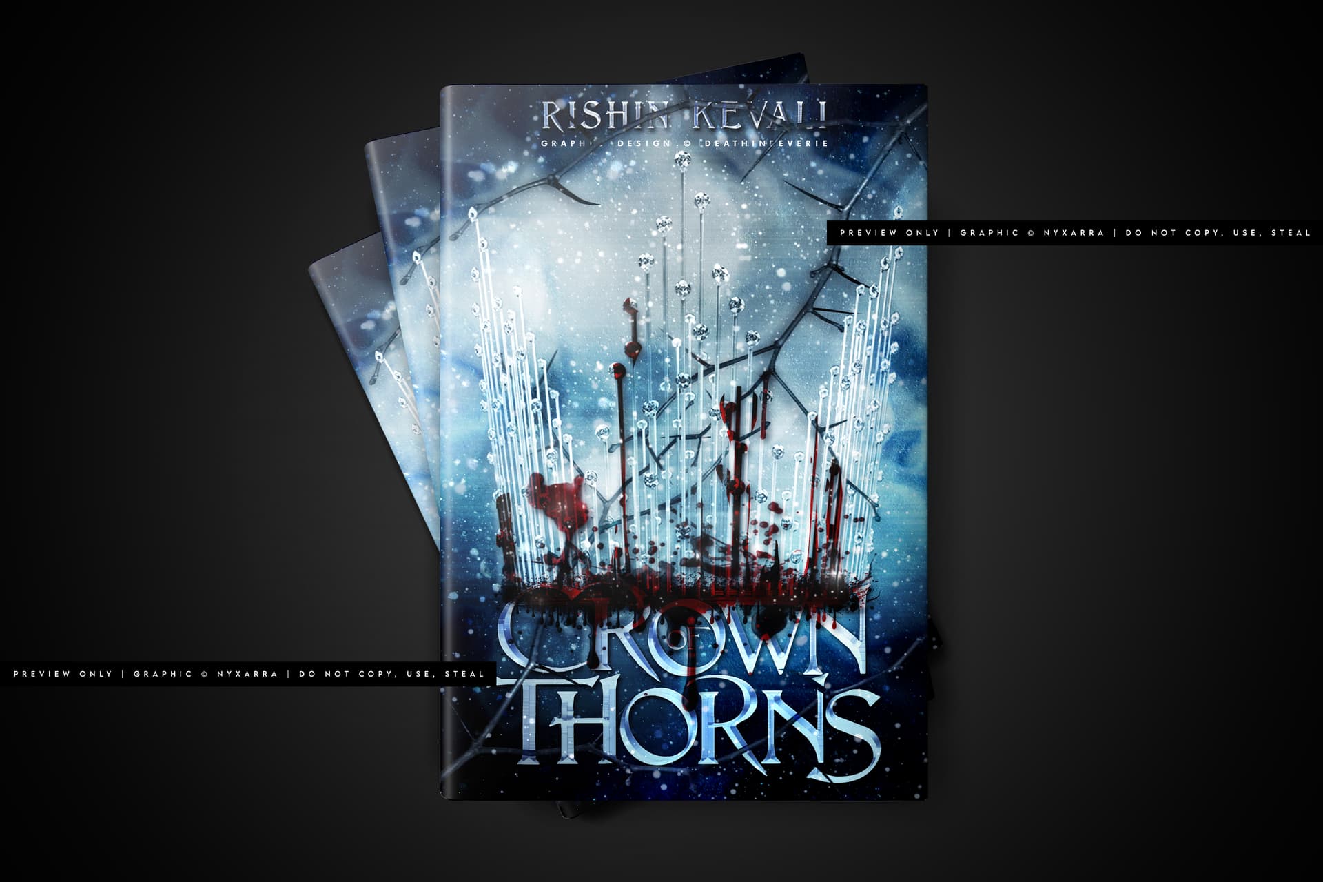
Cover: Crown Thorns
I saw the thumbnail and I was like, “Crown Thorns? That’s an interesting title. Okay.” (which, yes, I realized later that wasn’t the title, but I’ll get into that later) The ice crown I’m assuming exists, but it’s hard to see as a thumbnail. I only see the blood which is also shaped like a crown, so it kind of works I like how the title looks like ice. I’m not a fan of how squished the title looks on the bottom there and with how the blood is on the title. It’s like the title was an afterthought It would be nice if crown and title moved up a tad. It’s just so crowded at the bottom
Also, I cannot really see the author name as a thumbnail, but I see it a little bit, so maybe it’s okay. I get that it’s cold, it’s royal, and it’s bloody. Honestly, that combination makes me think of GoT But it’s a good combination
Let me cover your points next (that was NOT a cover pun ).
Does it seem realistic? I think realistic blood is hard to pull off. I’ve tried it myself. Does it look real? No. No, it doesn’t But I think that’s okay. I even think it shouldn’t look realistic. Of course it is fake.
That being said, I do know about the journey toward realistic blood. I’ve been on it many times. I have not really succeeded, but hear me out.
First, we gotta understand what’s wrong. So, let me tell you why it doesn’t look realistic right now. Because the spokes? of the crown, or the teeth? the comb part? anyway lol XD there are crevices. The blood splatter should drip through the crevices, not hang in space between the spokes. Otherwise it looks like you overlayed a picture of dripping blood on an icy crown.
You’ll need to take a really close look at the spaces where there won’t be any blood or where the blood in the front won’t connect with the blood in the back. Like in the middle of the crown where the head goes. The blood on the front of the crown won’t be connected to the blood in the back of the crown. And the lighting needs to be adjusted, too.
I can tell you tried to make it look like there was blood in front and in back with some fading? But it still looks connected and like one layer. You might have to overlay it twice, thrice, even four or five times, erasing and overlaying, adding shadow or light where you need it to make it look unified. It’s a lot of work, but the journey toward realistic blood is going to be grueling
I also noticed how parts of the thickest areas of blood look like they’ve been erased especially at the base of the crown. I think instead of having it look faded at the edges, you can make the lines super harsh if you want to. If blood splatters, it tends to sit, not softly fade at the edges
Unless it’s shy, sentient blood and…never mind, idk where I was going with that XD
Idk if I’m making sense, but I think you get it?
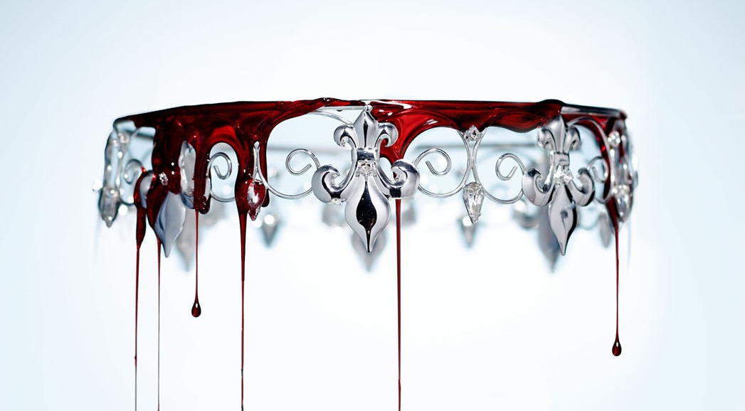
Here’s the crown from the Red Queen cover. Maybe it’ll help you figure out your blood (that sounds disturbing XD ) I think for this one, either they photoshopped realistic blood on top, or they took a picture of a crown using fake blood like the kind used in movies. I think they use cornstarch with water and food coloring, if I remember some behind the scenes of horror films. That gives the ooze effect.
Making realistic blood out of fake blood is truly an artistic skill. I still haven’t really figure out the best way to do with the tools I have. But you have far more advanced tools, I’m pretty sure trial and error, practice makes near-perfect, you can make real-looking blood and complete your journey
Aaaand that was the most I’ve talked about blood XD
When I made the cover big, I noticed it said “Crown of Thorns”. So, you might want to figure out what you want to do with the “of”. It’s really hidden behind the blood. Maybe put the dripping blood behind the title instead of in front of it? That might also open up the bottom a little bit. But I still think you could move everyone up a little bit. The crown and the title. It’s all very squishy and bottom heavy.
I like the font you chose. I also like the icy text. I don’t have anything to say about the colors. They look nice and chilly Chilly with two meanings.
So, uh, despite the title screaming “THORNS” I thought those were just bare branches I guess, no, they aren’t visible enough. You might want to either find different thorns or bring the thorns out from behind the title, more towards the top. So, the thorn branch coming from the top right corner would be almost horizontal across the top of the cover. The branch can stretch from the right or the left, perhaps?
O-KAY! That’s all I have now. As I said before, these are my opinions, critiques from my perspective, take it all with a grain of salt, and feel free to ask questions
Have a good day!
Thank you for all the feedback! I was worried about the genre messages, so I guess I’ll have to rework those since these were mostly fakes and I went off the rails . And the title for crown of thorns is actually squished because I didn’t want to resize the crown Didn’t realize that the title for House of Silverthorne was such a mess though  I’ll be sure to rework all of them! Thank you again <3
No problem
Old version (I thought it was a little too cluttered and hated the font):
The new version is a lot easier to read, and it looks a lot clearer. The image also looks better placed and the fonts look more professional than the first one.
I’m not a fan of overly processed, hard to read cluttered covers (especially when they over-process the people, I find that really annoying), so I made a minimalistic cover for my story, Happy Hour on Wattpad. I made three versions of it, with different images and font styles:
You can flick through them all. I think that I like the first one best, what do you guys think?
Yeah I definitely prefer the newer version, too, I noticed the issues with the old one and wanted to create another version. But I’m not satisfied with the new version either, so I put it on here for critiques.
I prefer the first too, but shouldn’t the author name be bigger?