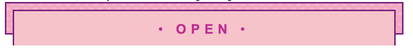
can someone help me? when I use this code:<span style="font-size: 10px;display: block; height: 30px; border: 2.5px solid purple; padding: 11px; background-image: url(https://storage.wackywriters.com/original/2X/4/4dae266c7651f9524f7220a8b416d09972504126.jpeg); margin: auto;"> <span style="font-size: 23px; font-family: ARIAL; display: block; color: #D50094; background-color: pink; height: 30px; width: auto; border: 2.5px solid purple; padding: 15px; text-align: center; text-transform:uppercase; letter-spacing:8px; margin: auto;"> • **OPEN** • </span></span>
it turns out like this, but why is the bottom line thing missing? • OPEN •
2 Likes
the border for the bottom! idk if its like this for you, but its showing up like this for me:
1 Like
Huh. I see the border on the bottom in my view.
1 Like
ooh, its probably just me then, never mind! thanks!
1 Like
It’s probably a responsiveness thing. I think your margins might be doing something funky with the code?
1 Like
Does anyone know how to code shapes like hearts and infinity signs? Tried referring to this website but it doesn’t really help, I’m waaaaaay too confused
1 Like
i went through the site you linked and tested some of the codes here. i don’t think the heart and infinity shape actually work – which might be why you were having difficulty?
here are the codes:
infinity
<span style="font-size:; display: block; content: ""; box-sizing: content-box; position: absolute; top: 0; left: 0; width: 60px; height: 60px; border: 20px solid red; border-radius: 50px 50px 0 50px; transform: rotate(-45deg);">
<span style="font-size; display: block; left: auto; right: 0; border-radius: 50px 50px 50px 0; transform: rotate(45deg);"> ```
heart
<span style="font-size:; display: block; position: absolute; content: ""; left: 50px; top: 0; width: 50px; height: 80px; background: red; -moz-border-radius: 50px 50px 0 0; border-radius: 50px 50px 0 0; -webkit-transform: rotate(-45deg); -moz-transform: rotate(-45deg); -ms-transform: rotate(-45deg); -o-transform: rotate(-45deg); transform: rotate(-45deg); -webkit-transform-origin: 0 100%; -moz-transform-origin: 0 100%; -ms-transform-origin: 0 100%; -o-transform-origin: 0 100%; transform-origin: 0 100%;">
<span style="font-size:; display: block; left: 0; -webkit-transform: rotate(45deg); -moz-transform: rotate(45deg); -ms-transform: rotate(45deg);  -o-transform: rotate(45deg); transform: rotate(45deg); -webkit-transform-origin: 100% 100%; -moz-transform-origin: 100% 100%; -ms-transform-origin: 100% 100%;  -o-transform-origin: 100% 100%; transform-origin :100% 100%;">```
i did, however, figure out how to make a star. do you want the code?
1 Like
W.L.Ink
August 31, 2020, 4:22pm
191
Can I be added to the taglist?
1 Like
Did you just… take my code?
Churro
August 31, 2020, 4:51pm
195
I wanted to see what something looked like. I’ll delete it. Sorry.
It takes me a long time to come up with ideas for designs, so I don’t appreciate people just taking it.
Thank you for the removal. I hope you don’t do this again.
1 Like
pink !!
clouds.
layersof clouds
3 Likes
Sorry for the late reply. Yes please!
1 Like
<span style="font-size:; display: block; margin: 50px 0; position: relative; display: block; color: red; width: 0px; height: 0px; border-right: 100px solid transparent; border-bottom: 70px solid red; border-left: 100px solid transparent;transform: rotate(35deg);"><span> <span style="font-size:; display: block; border-bottom: 80px solid red; border-left: 30px solid transparent; border-right: 30px solid transparent; position: absolute; height: 0; width: 0; top: -45px; left: -65px; display: block; content: ''; transform: rotate(-35deg);"></span> <span style="font-size:; display: block; position: absolute; display: block; color: red; top: 3px; left: -105px; width: 0px; height: 0px; border-right: 100px solid transparent; border-bottom: 70px solid red; border-left: 100px solid transparent; transform: rotate(-70deg); content: '';">
1 Like
 …
…
