So, was looking at this post:
And so I wanted to generate what I could:


Man, the “women” did solid. The rest would probably need a fair amount of work as a cover.
So, was looking at this post:
And so I wanted to generate what I could:
Man, the “women” did solid. The rest would probably need a fair amount of work as a cover.
Personally, I like the child angels a lot.
I was playing around with images good for a cover and generated a lot of interesting ones. What’s really cool about it is that it gives me an idea of what type of a cover I want.
And I think I’m at a point where I’m going to have to stop trying to get AI to make me a cover but rather to create me the pieces I want and then I’ll try to put those pieces together in an editor.
Afterwards, I might run them through NightCafe to blend them together with inpainting. We’ll see how far I get.
For example, this is really cool but not right for this book. If I could do this effect but with the faces of my characters, I’d be extra happy.
I don’t know. I keep coming back to the reality check that I could do what AI is doing in these images if I used the right editing tools. After all, it’s just layers.
I’ve been resisting learning how to use GIMP but the time might come to get on with it at last.
So did I. Just fiddly fingers, and background might not be as suitable, things like that.
I’m not all that picky about covers, so I tend to go for “good enough” and edit it to death.
Anyway. I got stubborn and continued trying to generate an image I could use. Finally landed on something.
I’ve also finally figured out a new title for the first book (Soul Survivor) so I’m experimenting.
The font and colors don’t match yet but it’s a good proof of concept.
What do you think? With or without the frame?
The frame looked good on the second book (Soul Seekers) so I put it on this one but I think the first book looks better without. Maybe I need a better image for the second book (plus the five legs need a fixing anyway).
In other news, looking for font and layout ideas, I googled “book paranormal 2023 soul” and my Wattpad ONC book is the first result!
Mind
Blown
I should capitalize on that. Not sure yet how.
Update: looking at them side by side here, I sort of like the frame.
Alright, then now it’s time to fix book two’s cover and I’ll have a matching pair.
By the way the title Soul Survivor is apparently pretty popular. But it fits this book very well. It’s not just a pun. So much meaning in it. I love it.
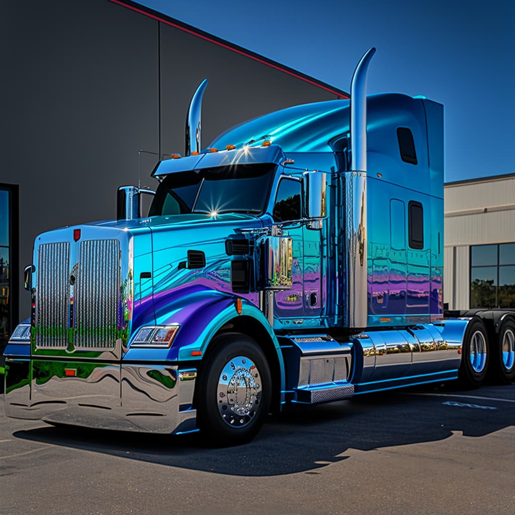
MJ seems to do well with cars and trucks, even with simple or brief prompts, although I’m still having trouble with creating friendly character portraits that don’t have goofy smiles (or any kind of decent distant / full body shots)…Judging by the reddit and civit art galleries, this is SD’s strong suit…
Alright. I’ve got matching covers. I’m happy with them for now. Will I change them later? It’s possible. I’m incorrigible.
I keep wondering if I should be calling them volumes or books or just numbers. It’s a consecutive story but one doesn’t depend on the other.
He looks like Brent Rivera


I like the first better personally
If you mean from these two, they’re two different books.
But I agree. I need one as nice for the second book too.
Omg, Pixlr is joining the game.

I’ve used this editor for years so I’m pretty excited to try out what their AI version can do.
First of all, Pixlr has changed its business model. It’s no longer free like it used to. You get 2 free saves a day, meaning, you can create stuff as much as you want to but you can only save two of them. With the amount of images I generate, it won’t cut it.
I badly wanted a good image of Melody, so I finally sat down with GIMP. It’s frustrating to use, not user friendly at all, but I was able to do what I needed to do and that’s to fix Melody’s eyes and a couple of minor touchups and voila. Finally done. I’m happy with her now.
Or are her eyes too much? Should I tone down their brightness? Ugh. It will have to wait until another day because I’m too annoyed with editing now.
They look a mild Amber, which is a legit eye color.
Still really cool
Yeah, I know. Crazy thing.
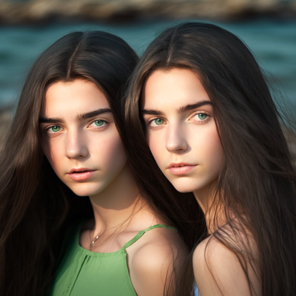
I’ve been experimenting with some portrait settings for the twins Irena and Sari. There are some subtle improvements, especially with cloth textures and finger counts. The eyes still need work though.
And for something a bit different…
In some of the pictures they look like Kristen Stewart’s Bella mixed with Gigi Hadid. But at least they aren’t plasticine.
"Mardi Gras Dragons - made with @NightCafeStudio
#aiart #nightcafe #digitalart
In case if anyone is looking for a tip how to get the AI to put multiple characters on one image.
No, it isn’t a quick hack, but results are better than getting frustrated because things don’t work out (if you’ve got photoshop skills, you can use those tips to do the last step in photoshop if you’d like).
In past trials, about 80% of results of trying to put two characters into one image was that the AI would make them both look similar. If I wanted one character to have curly hair, it would make them both curly. Forget ethnicities, age, and sometimes even genders. And if it had to create two characters, the details were usually poor quality. Anatomical disasters happened more often. Forget three characters completely.
From the platforms I’ve used, I’ve noticed that Wombo does best with starting images so I used it for this exercise.
I’ve tried a few different starting images, different positions and backgrounds. These produced the best results so far.
In this collage, notice how I added his cutout arm so AI wouldn’t make him look anorexic and her cut out arm so it wouldn’t get confused about where she came from.
It wasn’t the best. I didn’t like how young it made them for some reason. The duotone idea was a little overdone here. But it didn’t make them look like the same person so that’s progress. So I tried again with a different set up.
I envisioned a book cover that would have the grim reaper and both of my characters. I created a bunch of grim reaper images and tried a few.
In this collage, I added a crude shadow on the face of the reaper because it seemed a bit too bright. and I had to fix Ian’s arm again.
What I found in these results: it sometimes made Ian look older than her when it’s actually the opposite in the story.
Trying out a different Reaper. I put the black thing behind Melody because Pixlr went really aggressive with the cut out and removed some of her hair. So I was just trying to make up for it but
I’m learning from these collages about what influence the little changes have.
I’m also seeing a problem with coloring. I didn’t notice it until I put one of those images as a book cover and something felt off. I kept looking at it, trying to figure out what was bothering me about this cover and finally came to the conclusion that it’s the colors. There are too many colors and styles in the image. My characters are drawn in a different coloring and style than the grim reaper background.
So next step, I’m going to have to figure out how to combat that problem. Maybe the answer is in a different background image. Maybe the answer is in different character images. Or maybe I need some kind of an overlay on them to bring them all to the same style.
I don’t have a completely free reign when it comes to the style since I want to keep it similar to book one’s style. I love this cover. I might return to it eventually to make minor fixes but overall, I want to keep it.
This cover is why I was trying out the duotone collage earlier. Results weren’t as nice as I hoped which is why I tried out colorful options but that is getting out of hand so I’m going to have to get creative. The perfect image is out there somewhere. I believe it can be done.
Have you successfully created complex multi-character images? Any tips you’d like to share with the class?
Update to my multiple characters attempts.
I tried to do inpainting but results were disappointing. Scratch that idea.
Interesting observations from using different presets on Wombo:
For this collage created in Canva, I used a simpler background image (one of my previous generations). It came with a bird so I thought to keep it since there’s a blackbird in the story. I wanted to give the bird a chance. I also put a filter on both character cutouts to tone them down so it would be easier for AI to blend them in with the background style.
Here are a few I liked the most. What do you think?
Sigh. I like Melody in the first one the most, and I like Ian in the third one the most. I could potentially combine the two in an editor. Sigh. More work. But if the end result comes out the way I want it then it’s worth it, right?
As is, without editing, the cover looks like this. I think it’s an improvement over the previous. I’m not loving how young Ian looks in it so I might do the editing part after all, but I’m feeling a lot better about this one compared to the previous cover.