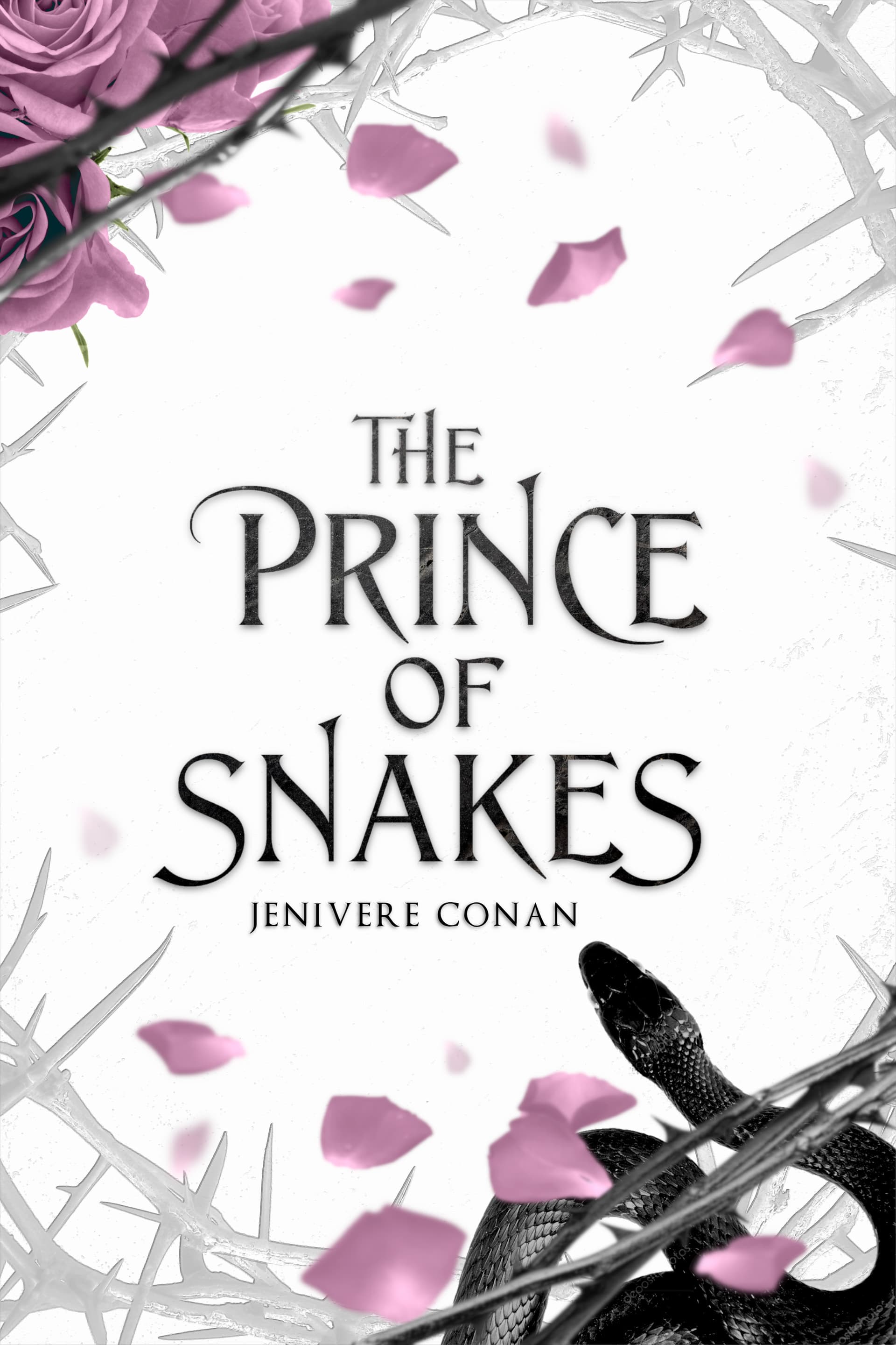
Hello beautiful people! I’m in the market for some critique on my ONC cover.
This was originally my title page, which was in grayscale, but I’ve recoloured it so it works as a temporary cover while I wait for my designer. All the recolouring work has been achieved through basic filters (hue/ chroma/ saturation). I think it shows, but I’m struggling to make the colours seem more natural (especially for the snake’s eyes, which I think will need a complete repaint). 3D typography is also something I find difficult. My skills are limited to layering a texture over basic text and giving it a drop shadow.
Do you guys have any advice on how to make the colour seem more natural, and how to enhance the 3d effect of the title? For reference, I’m working in GIMP (a free, stripped-down version of PS) with a graphics tablet.
It does look better zoomed out on the website:

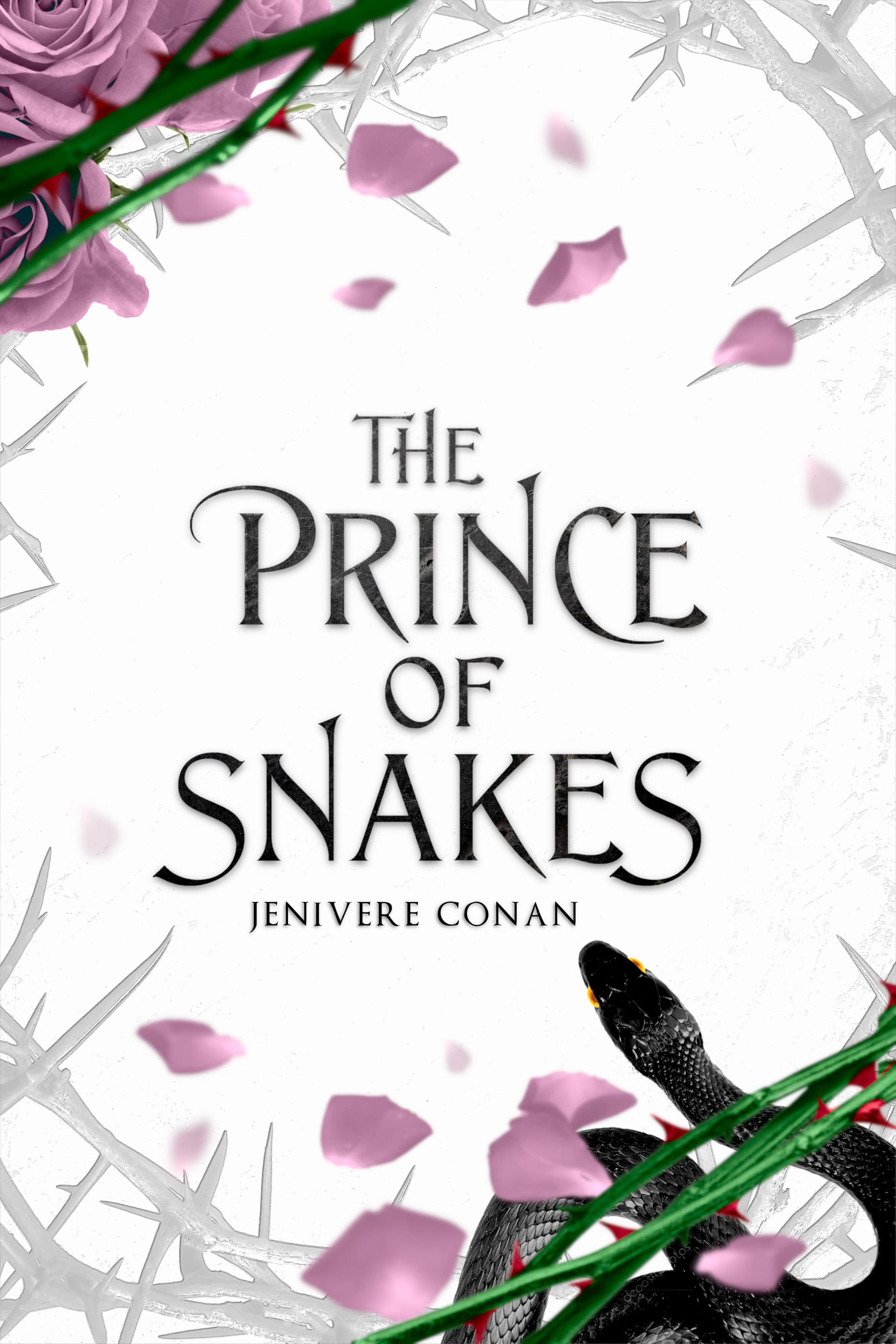
Here’s the original title page for reference: