All of these are absolutely gorgeous as always!!
So back before I was overly exposed to the hatred of AI (which I always had to edit so it’s never totally worked for me)–2023? Anyway, that year’s ONC covers were partially AI, never fully. Wound up pulling those covers.
I finally got around to redoing one, as I plan to finish the story around other work, this ONC season:

I’m probably going to change the color balance on this one, although the color scheme does remind me of local hometown authors. But it’s really because I’m not into vibrant colors as much.
Thank you! ![]()

made this for fun for @Qualeshia12 ![]()
Beautiful, Enna! I love the colours, I loveeee red!


Thank you ![]()


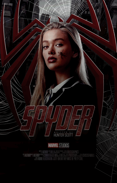
hi, i’m back again! not on wattpad for now, but still on here! i created this cover recently c: ![]()

i also created some marvel based covers, all of which i have actually lost my hard copies for :c
i have lost quite a lot of stuff actually, a lot of psd’s that i transferred over to a different drive that
ended up just crashing out and unable to be used (when i had my laptop repaired). i do have to
start anew. which is bittersweet because i felt like starting again anyways but lost basically all of
my hard work. but it’s all good. feel free to drop me a request if you would like me to create a cover c:
I’ve not been doing anything major this summer, as far as trying to make covers…
What I’ve been doing, instead, is mostly working on demo fonts on 500x500 pixels,
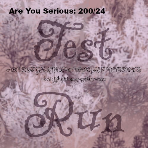
It’s a way to “grade” forts: max that will fit the size (in this font: 200), usually by 10s, and start at 30 but go smaller to fit the full alphabet. “Test Run” is set to 80% opacity and multiply. On some fonts, this makes them invisible (and therefore I may need to cull them as useless,) That’s 1 point for dropping a font. Really, it’s going to be a varaible test for a few things before I officially uninstall a few, but I need this to be easier to browse.
That, and I’m sifting to “free for commercial use” instead of private, which is going to get rid of a lot of old staples in my file.
This particular set are all those that looked interesting off of Google fonts. It’s maybe about half their database, and that’s close 550 of these tiles. I’m hoping to drop about 200 of them, even if it’s little piddling things that drop them like:
off center, can’t read the big letters at thumbnail, can’t even see the small letters at thumbnail, not unique enough, difficult ratios, etc. The whole thing is to get a base that’s relatively interchangeable without having to modify it. It’s a lot of b.s.
But it doesn’t mean I worked on nothing fun at all: