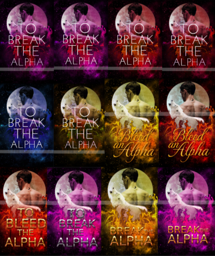
So I have made a few covers for a book. Now the thing is I have already made the base manip but when I started styling it with different color schemes and texts I’m now confused which one looks best.
So please tell me which cover you think looks best and which you’ll pick up to read if you see it.
ps. even if some covers look the same, there are slight effect/color differences in all.
I’ve been going crazy looking at these variations that everything’s starting to look the same.
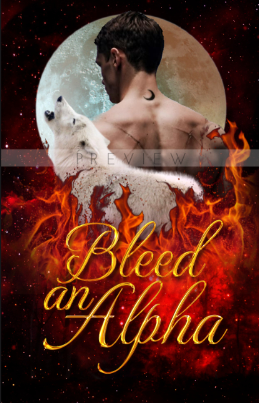
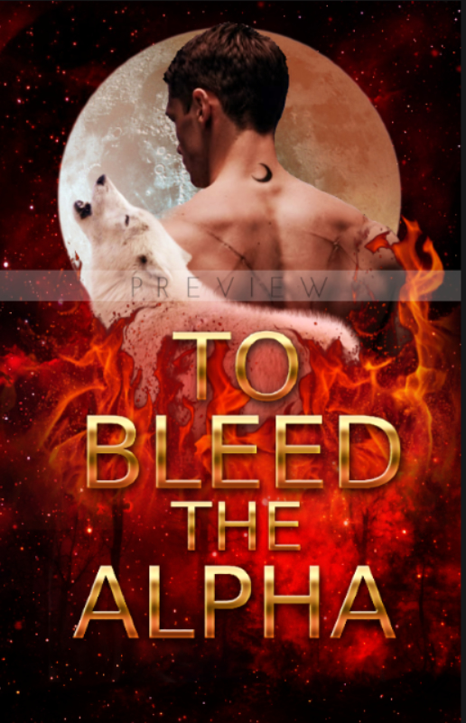
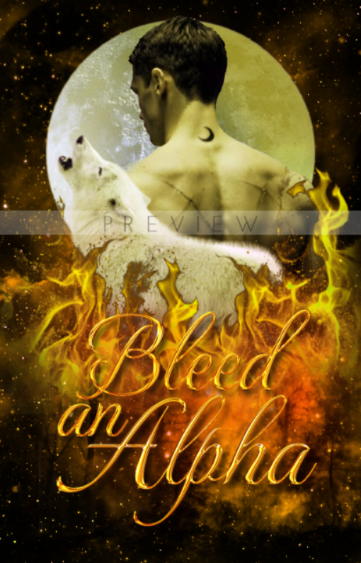
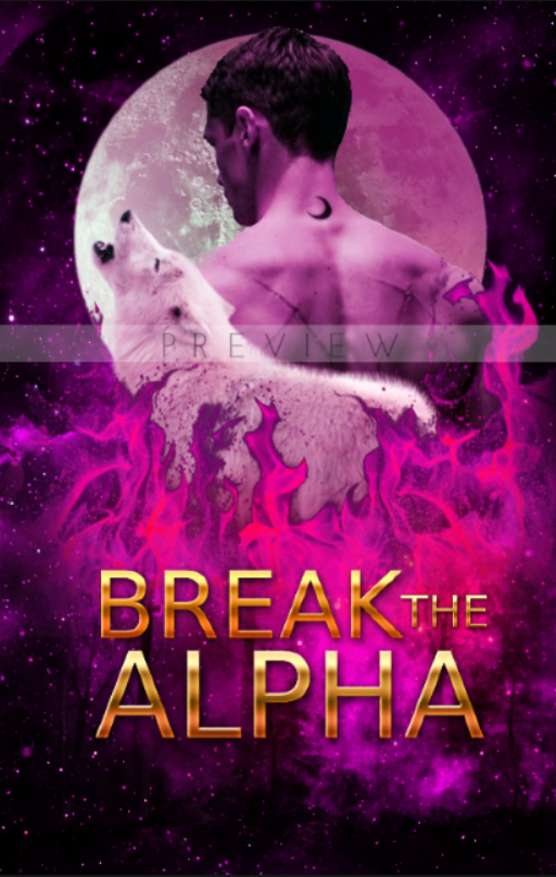
Right half of the middle row + bottom row are all way too busy. For the rest, the colours are a bit unnatural…I enjoyed the more natural colours of image 4 (as shared in the posts below), though I prefer the font shown in the top row of your collage.
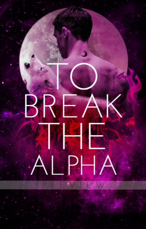
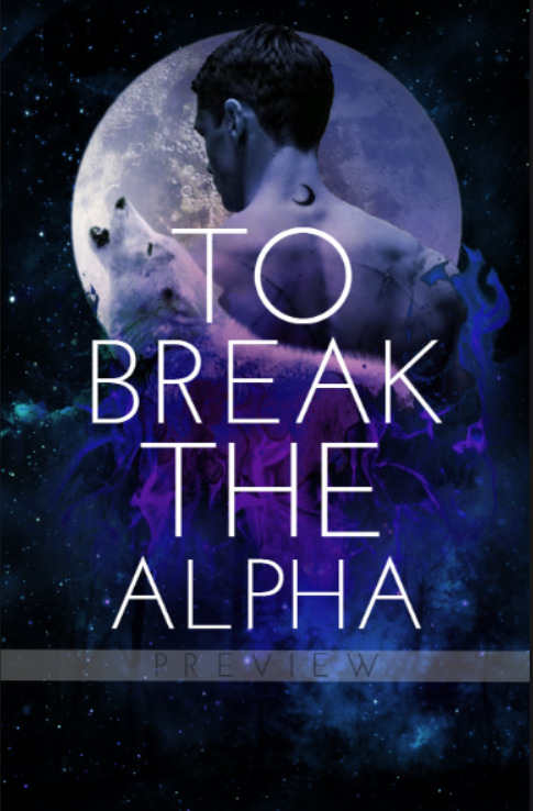
I really don’t know which colour to choose, but top row titles are much better for readability purposes (remember most readers online will first see thumbnails of your cover so the important thing is that they can read the title).
Even I feel like the title is the most readable in the top row covers but I keep wavering cs I feel like the top row covers don’t really look like paranormal/fantasy covers and they don’t seem to be doing the manip enough justice.
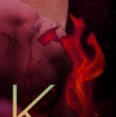
Color-wise I’m more drawn to the reddish hues on the top-right and the bluish hues on the middle-left.
I do have more suggestions if you don't mind!
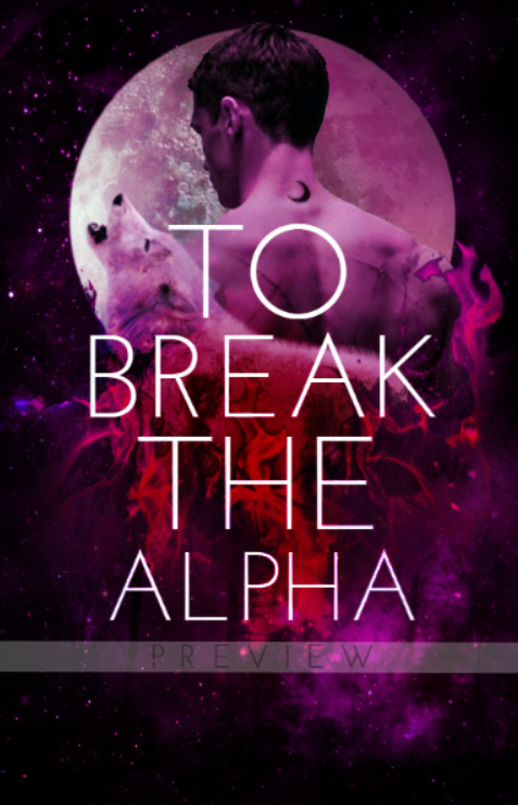
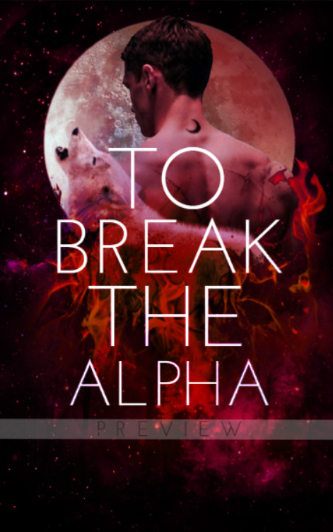
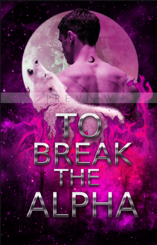
Overall I think I prefer the title arrangement of the first six covers (top row, middle-left), but I would personally shrink the words “To” and “The” by about 20–50%. The more defining/important words in the title would be “Break” and “Alpha” so I would put more emphasis on those. The arrangement of the title in the last two covers on the bottom-right is also nice, but I feel like the colors don’t work as well (the thick gold blends in too much with the orange fire and doesn’t mesh as well with the purple fire imo).
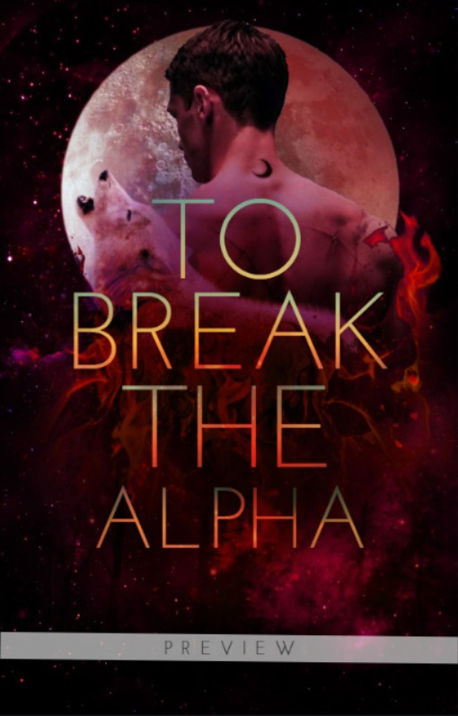
Related to the title, if you’re going to use a metallic text effect, maybe go for a text effect that is less “bold” and, idk how to word this, “wavy”? Something with a more subtle shine so that it doesn’t clash too much with the busy background. I’d also go with a more silver text effect if every since it contrasts well. If you want a gold text effect instead, I suggest a very pale gold so it doesn’t blend into the background as much.
I’ll assume you’ll put the author name later, in which case I’ll say to move the title up a bit or shrink it a little so that there’s space at the bottom for the author name.
@TheTigerWriter also has a cover advice thread where she gives advice on how to improve your covers if you’re interested! I’ve gotten advice from there before and it was really helpful (:
Oh and to make it easier for people to scroll between images, maybe you can upload multiple images in one post? You can also hide it under details
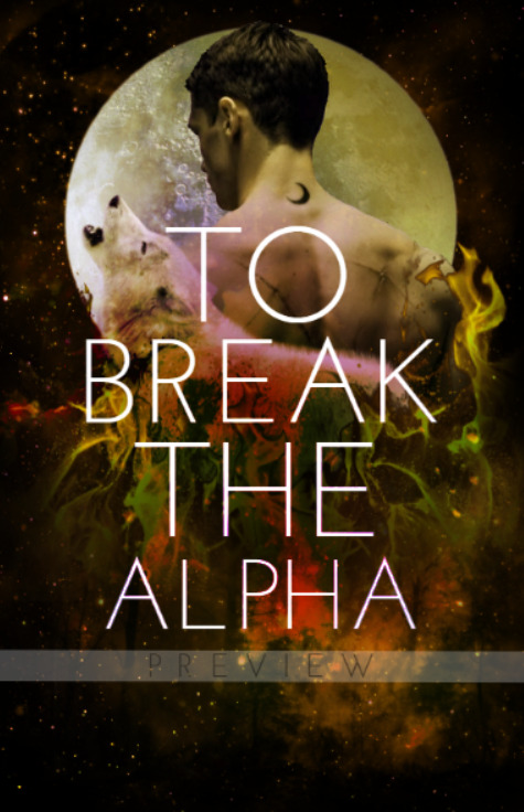
Even I’m thinking of shrinking the size of ‘To’ and ‘The’, especially ‘To’ cause I feel like it looks too big. And do you think its best to keep that text in white or maybe I could try some other gradient colors for the text? I have added a gradient version I made yesterday below but I’m not sure if this color is suitable or if white itself was better?
I wanted to upload multiple images but I’m new here and there are restrictions on the images I can upload in one post. So I didn’t have much choice and could only upload it 1 pic per post.
Gradient version (i didn’t shrink the to and the yet)
I’m looking at the gradient version right now and it looks cooler than all-white for sure! I would personally change the blue in the gradient to a really pale yellow or similar color though, since the cover has a warmer tone overall and the blue clashes a bit too much with it and yeah, I think shrinking “To” and “The” is the next move text-wise.
I’m also wondering if you can feather/blur/smudge the border of the flames in the cover? The dark borders make it look more copy-pasted, and I think softer borders can make it blend better with the rest of the background.