removed to fix
1 Like
First one looks better to me. ![]()
1 Like
Some recent stuff.


Hidden Feelings and Lost were created today. Lost took so much longer than I had expected it would ![]()
4 Likes
the first two are so nice!! I absolutely love the fantasy feel they give:D
and the three bottom ones have really nice colors!!
2 Likes
Thank you! ![]()
1 Like


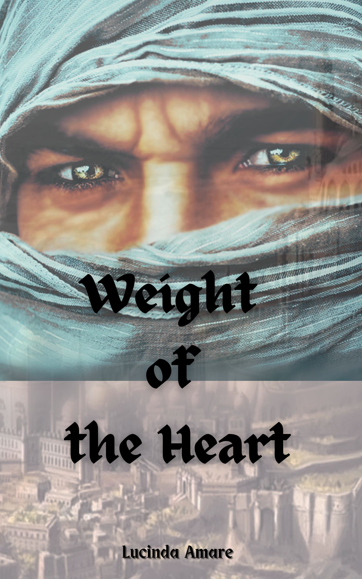
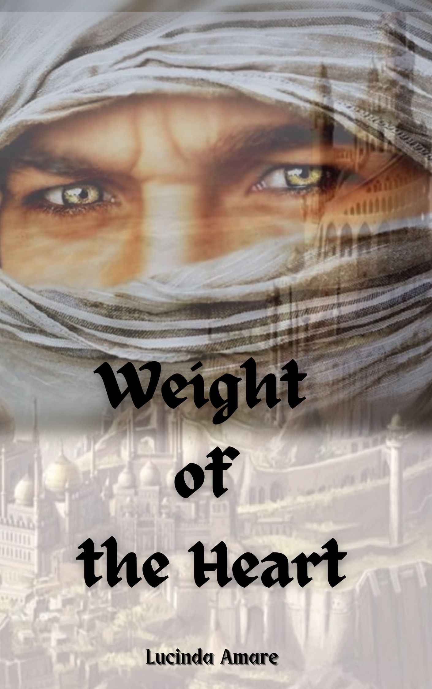
I’ll speak about the second one first, since this just needs a few touchups to really pop! You’ve chosen a great background photo, but because it’s so bright/lacking in contrast, a few adjustments to the lighting can really bring out the tiny details and make her eyes pop. Would definitely recommend adding some kind of black fade-out or vignette effect, especially at the bottom so you can place your text there. I think bevelled text would look really lovely here. You should break up your text into 2/3 lines so you can size it up and not have it so on-the-edge. Also, for this one centered text would look better, and I think you could match the casing for you author and title name. You can try out all these via photopea, by the way. ![]()
The first one same thing about breaking the text up. You could blend out the photos better with a soft brush on a layer mask, or simply layer them over each other and play around with blend modes for a double exposure effect. Colours here need a little work, the images don’t match so a few adjustments should settle it.
2 Likes


3 Likes
…that all sounds foreign to me ![]()
![]() I’m not an artist haha.
I’m not an artist haha.
But thanks for the input, I will play around with it some more. The woman’s eyes should be emerald green too to match the woman in the book but I don’t know how to do that.
As for the other one and the blending, do you mean making the back picture more visible? Because I do want the man to be most noticable.
Youtube tuts are very helpful, but if you’re going for simpler changes, simply playing around with contrasts and overlays can work wonders too!
Hue/saturation layers ![]()
Oh no, I mean it literallyjust looks like two photos stacked on top of one another. I meant blending it out so it looks like one photo, and you can still keep the man more noticeable.
1 Like
Alright, thank you again. After I played around some more I’m gonna post again, and otherwise I will ask for someone on here to help me ![]()
Would you say I’ve improved so far? ![]()
I still haven’t figured out the blending though, but I need a fresh vision,I’ve been looking at it for too long…
Uh … not really ![]() This looks even more jarring now, less like a cover and more like what it is; two photos stacked together. The text is better though, but I can’t glean the genre of this.
This looks even more jarring now, less like a cover and more like what it is; two photos stacked together. The text is better though, but I can’t glean the genre of this.
1 Like

I tried the blending thing some more and I think I’m starting to get the hang of it ![]()
the picture of the man wasn’t the right size so I added a white box underneath and blended it back together with the other picture. I still need to play around with colors en fonts though. Sorry for spamming btw but I’m trying to get better ![]()
Also, the tower sticking out next to his eye like that to me looks like it could be a scar. It was accidental but I like it ![]()
I just wanted to get a comment on the blending. I won’t post anymore until I think I’m finished ![]()
No worries, really! Though we should probably move this to private messages or something if you’d like feedback from me every step ![]()
Yup, you’ve gotten the hang of blending, now the next step would be to make it look seamless. Def try getting those colours to match ![]()
1 Like
You’re getting there! ![]() I think you could do it darker on the bottom though.
I think you could do it darker on the bottom though.
I also use the free version of Canva sometimes. I think in Canva, there’s a way to darken or make lines clearer? If you go to Edit Image and if you click on Adjust, there’s a way to increase “Shadows” which will, hopefully, only increase the shaded parts of the bottom photo. Then you might adjust “Clarity” or “Highlights”.
It’s good if you’re just starting out that you mess around with all the adjustments you can make to see what each of them do. Slide that dot to the highest and the lowest and see what they do. Experimentation is key to improving ![]()
If you’d like, I have a critiquing service where we can talk a little more about the cover instead of using a lot of space here. If I can get a more overall idea of where you want to go with it, I think I can give a few nudges and I’m pretty familiar with Canva ![]() (and the limitations of the free version
(and the limitations of the free version ![]() )
)
Here is the place.
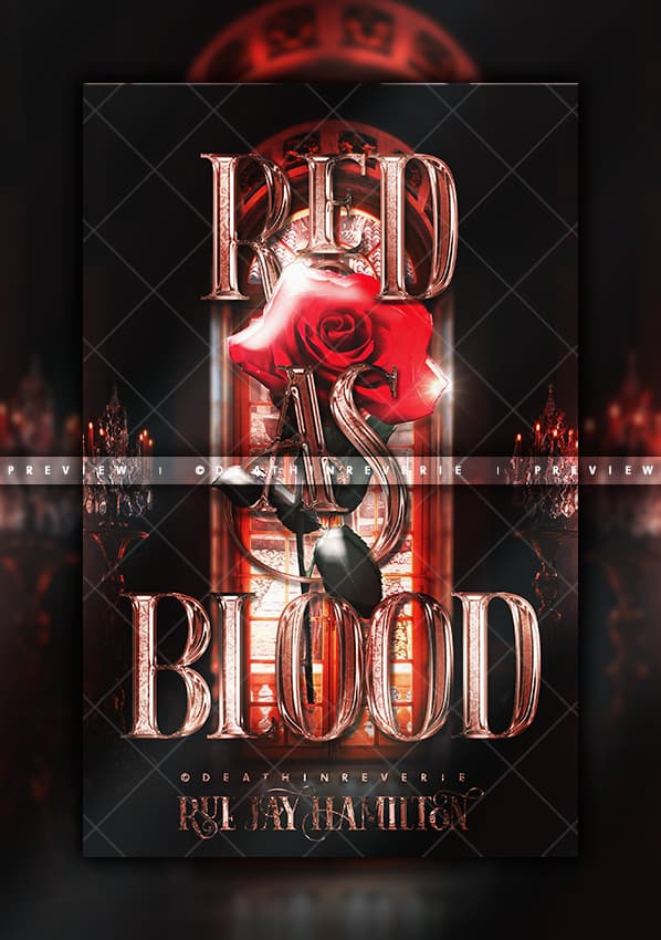
Well, it is so beautiful ![]()
Although, I do feel like the “As” has slightly blended too much into the background. It’s right over the leaves which is quite dark. The rose really stands out and I feel like it out shines the “As” a little bit bringing my eyes to the white of the rose and not the words. That white on the rose can maybe be a little dimmer?

First of all I am so sorry for the late reply, I meant to reply to this earlier but procrastination and Discord hit so whoops ![]()
Oooh, didn’t know script fonts (those cursive ones basically right?) shouldn’t be used for subtitles and author names ![]() I’ll note that for next time.
I’ll note that for next time.
Oh and fun fact, the first cover for Broken was made almost entirely on Canva. I just used PhotoScape X to cut out a silhouette of the man and then paint black over the text so the silhouette outline would be more clear and all ![]() the second cover was made purely on Photoshop as a challenge
the second cover was made purely on Photoshop as a challenge since I still hate using it a lot XD
Oooh got it got it *notes things down* forgive me for my noob question but how do you do lighting? I just brighten one part and darken the other part and hope that it makes sense, and maybe add shadows ![]()
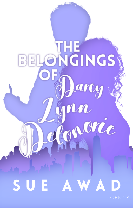
Oh yeah, you got a point. This was one of my first “manips”—they used to be PNG stacked on each other with text slapped onto them—and I guess I could’ve paid more attention to that ![]() looks like I need to work more on lighting
looks like I need to work more on lighting ![]()