These are lovely, and they definitely go together! However, in regard to colour scheme, maybe you could try to make the third one a “cool” colour as well, like the other two? And remove the glow/outline around the creatures on the last cover, since the other two covers don’t have it either? Just suggesting though, they’re lovely as is!
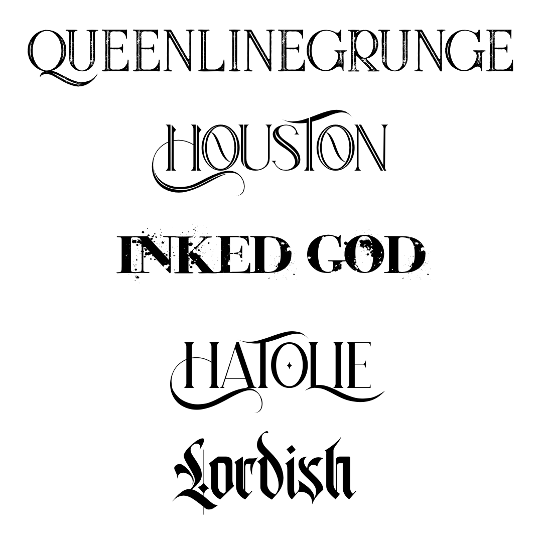
also, what font did you use for the titles? 
3 Likes
Thank you! 
3 Likes
Thank you! ![]()
There will be a fourth book and possibly a fifth. The fifth (or sixth, idk XD) will probably be orangey scarlet and black, so overall I think the color scheme would work ![]() Orange, blue, purple, and any variations of those will be on the cover, and might even have one that’s both orange and blue. Might have one that’s purple and orange…depending on how many stories I can squeeze out of this world
Orange, blue, purple, and any variations of those will be on the cover, and might even have one that’s both orange and blue. Might have one that’s purple and orange…depending on how many stories I can squeeze out of this world ![]()
The silhouettes for orange, I illustrated and they come together with the outlines. So without the glow it’s just one black blob with six ears and a weird, thin, gray outline XD I realized later that I should have made the silhouettes individually. By that time though, I’d gone through such painful newbie illustration stuff that I gave up ![]()
When I figure out how to do it better, I’ll probably do your suggestion. I also want to make them orange and not black. At least the fox in the middle.
Bigelow Rules for the main part. The other parts are EB Garamond.
2 Likes
Ah, okay! But whoa, six book? I barely have the patience to write out one xD Oof, must have been a lot of work, but I wish you luck with it!
And thank you! 
3 Likes

6 Likes
Thank you!
Hm yeah… The spacing comes in because I wanted it to be balanced and there wasn’t space to increase size itself… Well, I’ll try that later
1 Like
Hm yeah, I can try that too! Thanks!
1 Like
Thanks!
Six maybe seven maybe eight, idk XD I want as many books as I can write out of the one world ![]()
1 Like
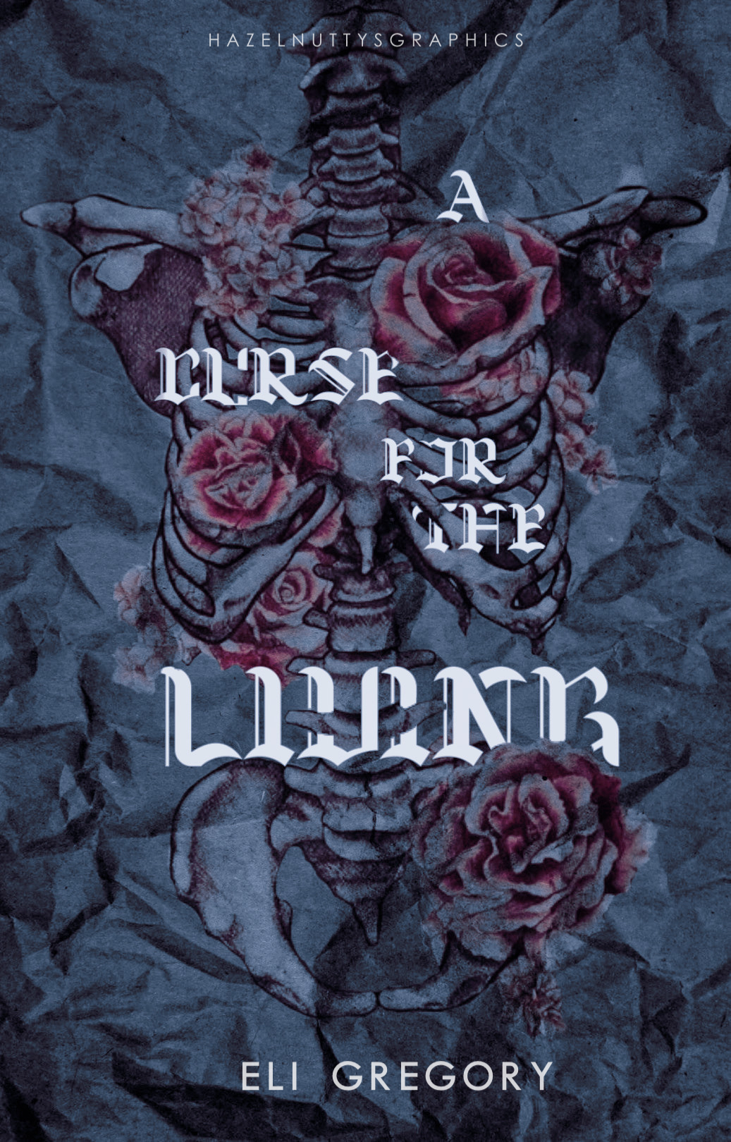
I like the colours a lot, and the ribs. The texture of crumpled paper is also pretty nice!!
I think the main issue is, for me at least, the title is almost completely unreadable. A Curse is legible, for the isn’t readable at thumbnail, and I am unsure what the final word says.
Other than that, I really do like the idea. It’s gorgeous.
4 Likes
4 Likes
@CoffeebyNight yes, i thought the font was pretty weird too  thank you so much !!
@TheMidnightAssassin omg thank you !! 
2 Likes
Np!
2 Likes
Yup! There’s something off about spacing on that one, and I need to go back to the drawing board on it… Weirdest thing is that this was already a remake of a failed attempt.
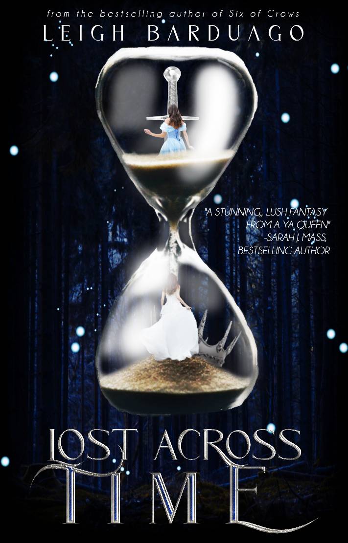
Thank you! I didn’t really have much in mind, but I did have something similar in mind when I made Lost Across Time. As for Among Broken Branches, I was inspired by the cover of These Violent Delights
Oh my god thank you!
3 Likes
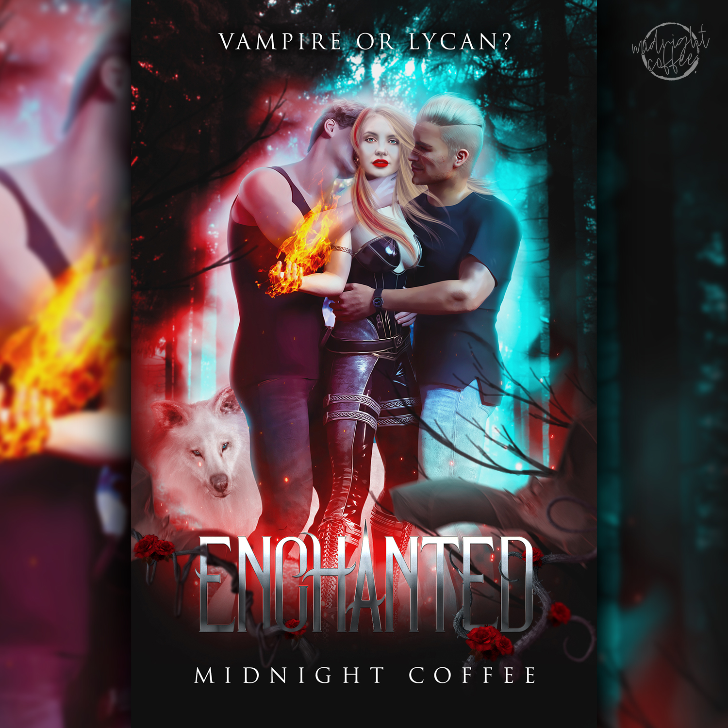
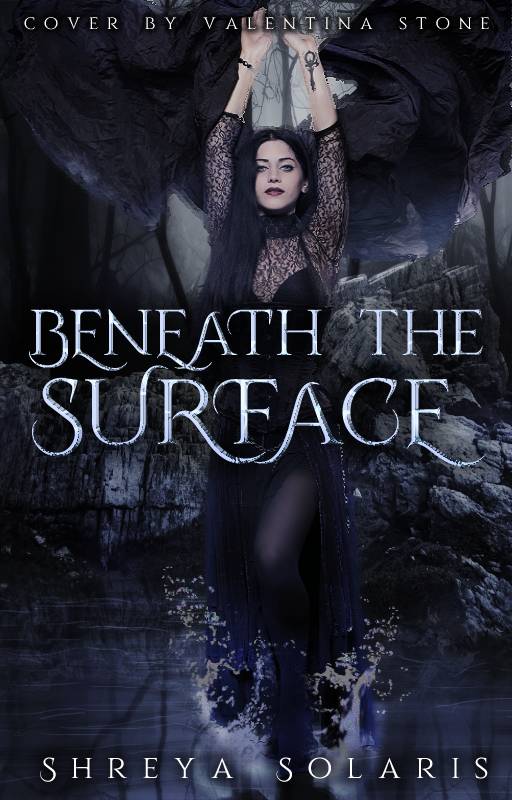
I will moooore than likely redo this at some point. I haven’t slept so it didn’t turn out 100, lmaoooo.
7 Likes


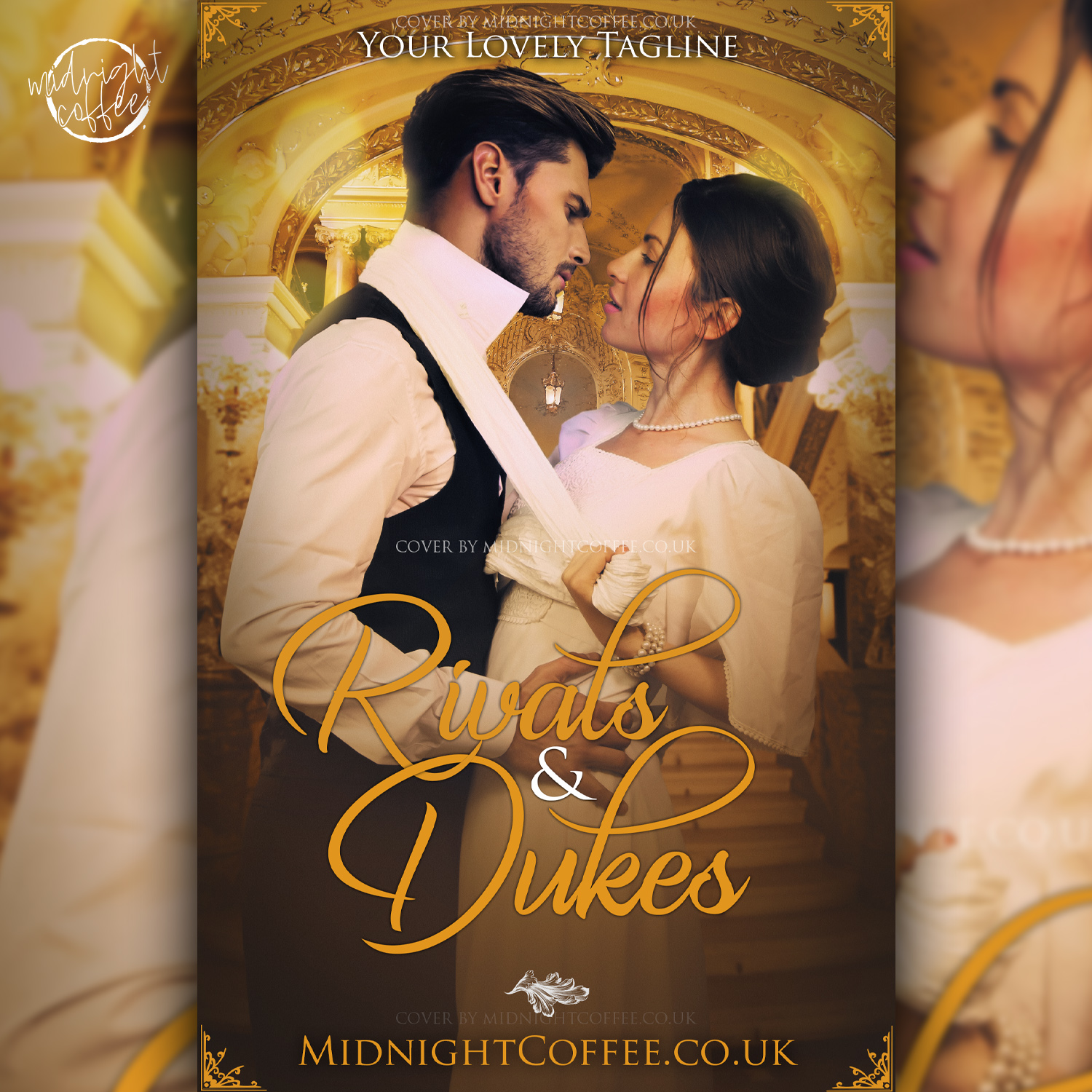
Made this for a req by domisotto, but she’d already found her cover by the time I decided to stop being lazy and make it 
8 Likes
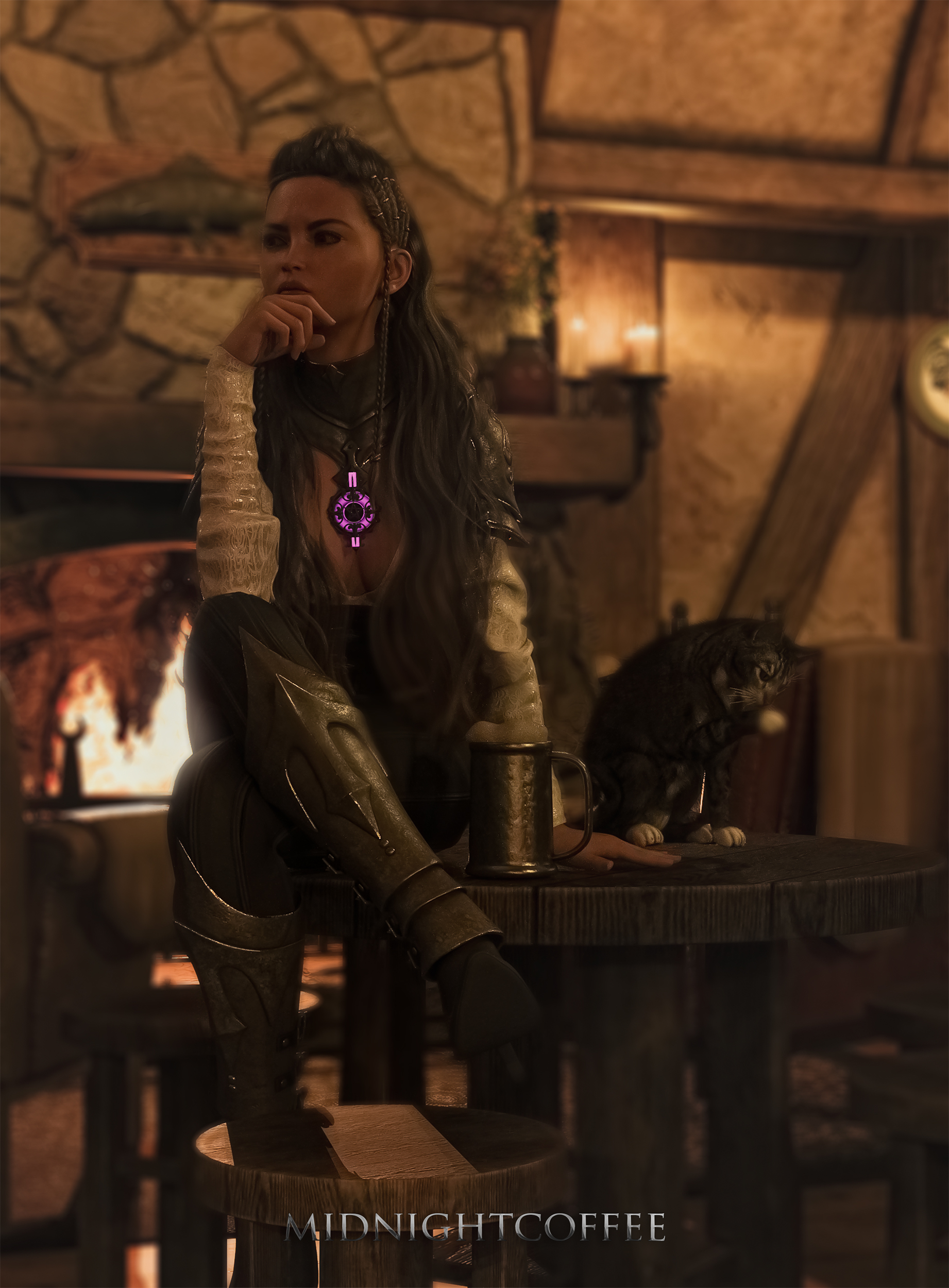
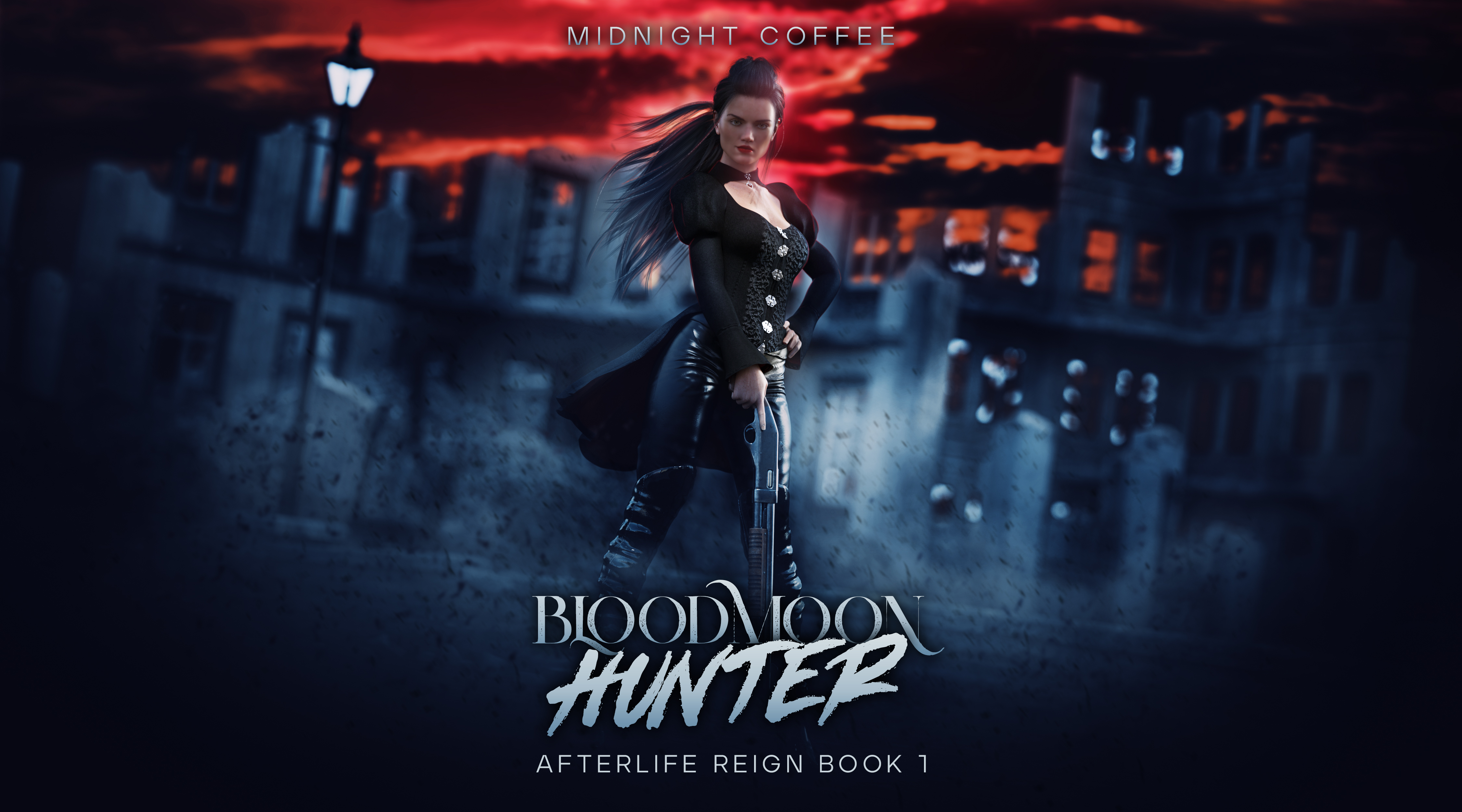
Made this render today. It needs re-rendering as I messed up my settings and cancelled it before it was finished… but I really liked it. This scene is from one of my fantasy novels.
8 Likes
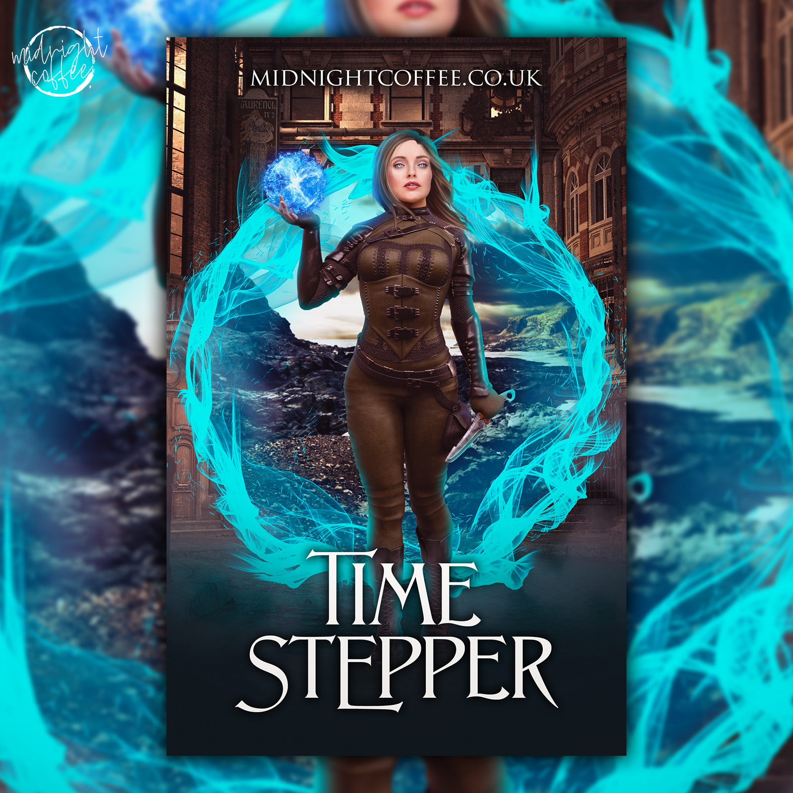
This cover was fun. It is animated, but it’s apparently corrupted on my website because it slows dooownnnnn so I need to re-export it. https://midnightcoffee.co.uk/product/1014
5 Likes