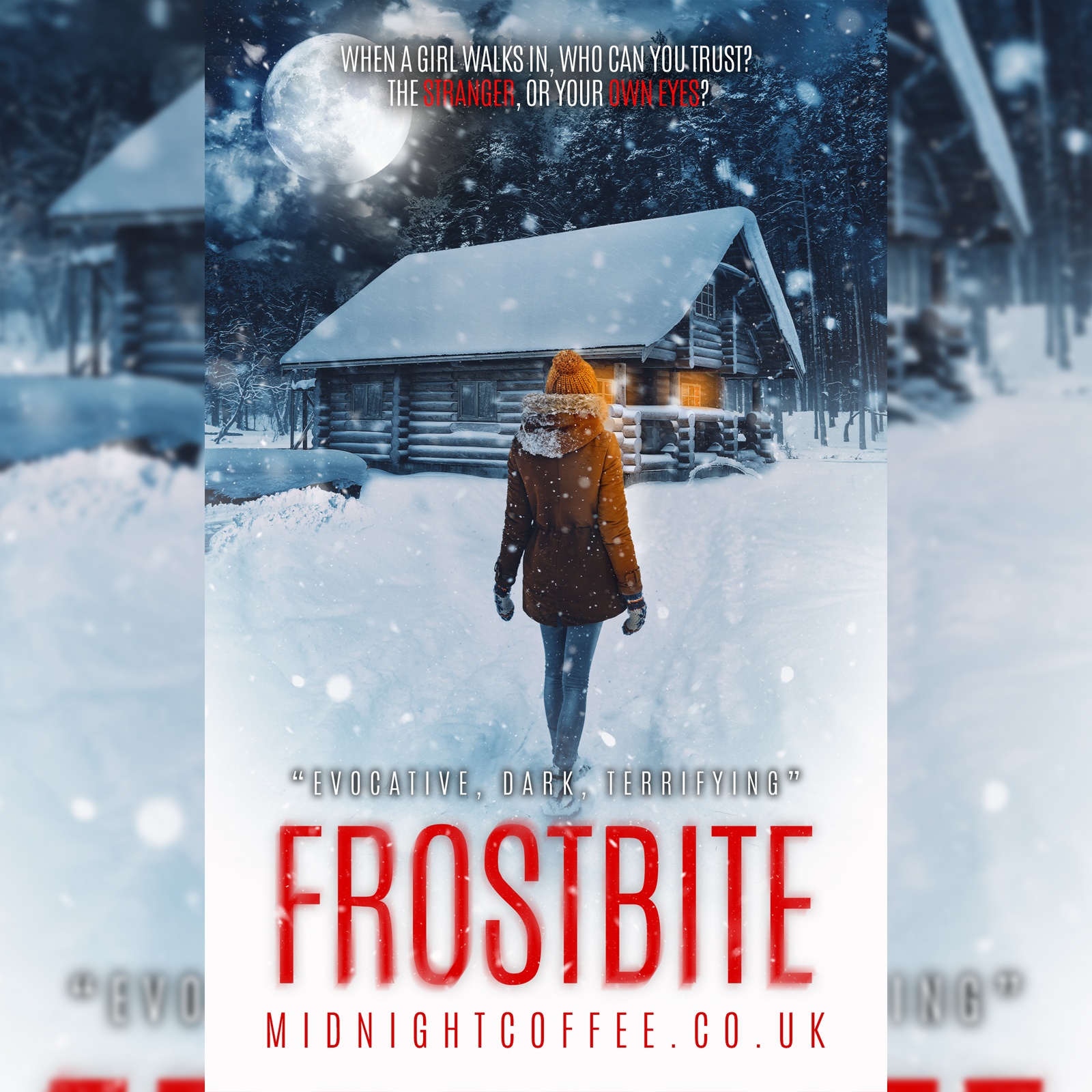
7 different images T_T
Vella (and regular) premades!
Oh, these are all so lovely! 
THAT IS GORGEOUS- what font is that?
Thank you! ![]()
I was expecting this xD It’s Artisan ![]()
The older covers are better for horror
1000% agree, they’ve lost their charm lol
oop- thank you!
No problem!
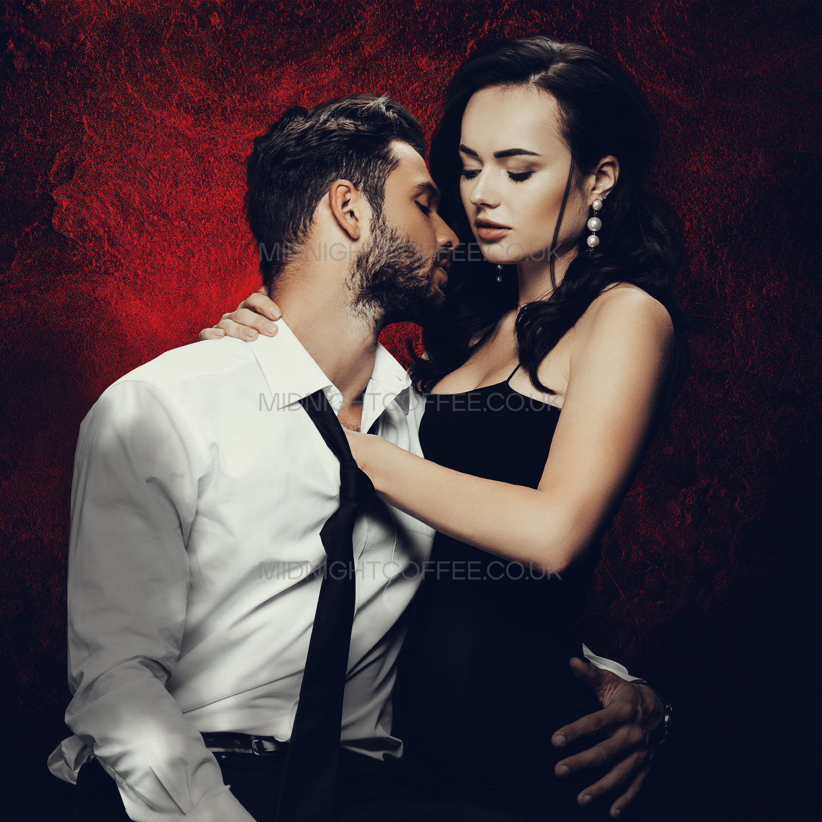
Here’s a cover for my book (one I’ll likely never use, but I love making it.):
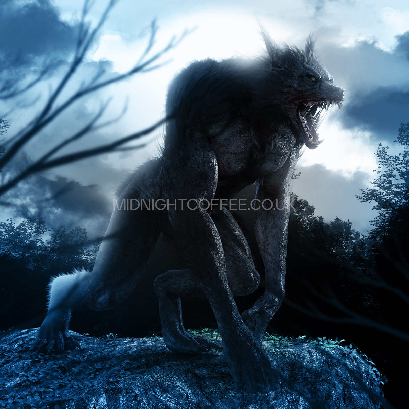
And I made this for a friend:
(and I trust you peeps, so no watermarked showcase right now. Besides, I’m sorta lazy)
Pretty covers!  Just a note though; perhaps reduce the letter spacing in Empire of Lices? It’s a bit much
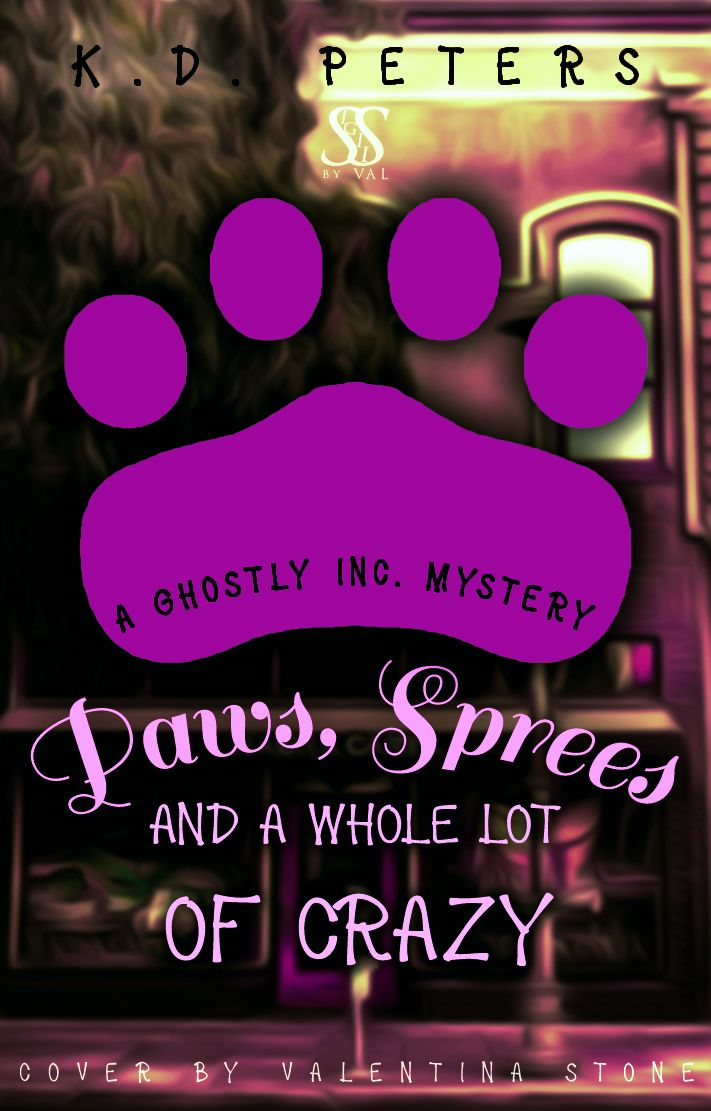
  in my humble opinion of course Also, for the Paws, Spees, and Whole Lot of Crazy, standardise the title font except for keywords, and reduce the shadow on the paw? Just my thoughts tho!
Omg, these are so nice! Empire of Lies is so gorgeous, and the second one is so fun! I would definitely read these!  I love what you did with the colours, and that paw is such a nice, fun touch.
I also really love how the text is laid out on the second one, with the curve? That’s great!
The only thing I wanna say is not to use all alternates for Desire, it took me a minute to figure out what it said. No matter which bundle you got for Desire, you paid for alternates and the basic letters, it’ll really level it up if you use a mix!
The colours <3 Sooo pretty. ;-;
Thank you! 
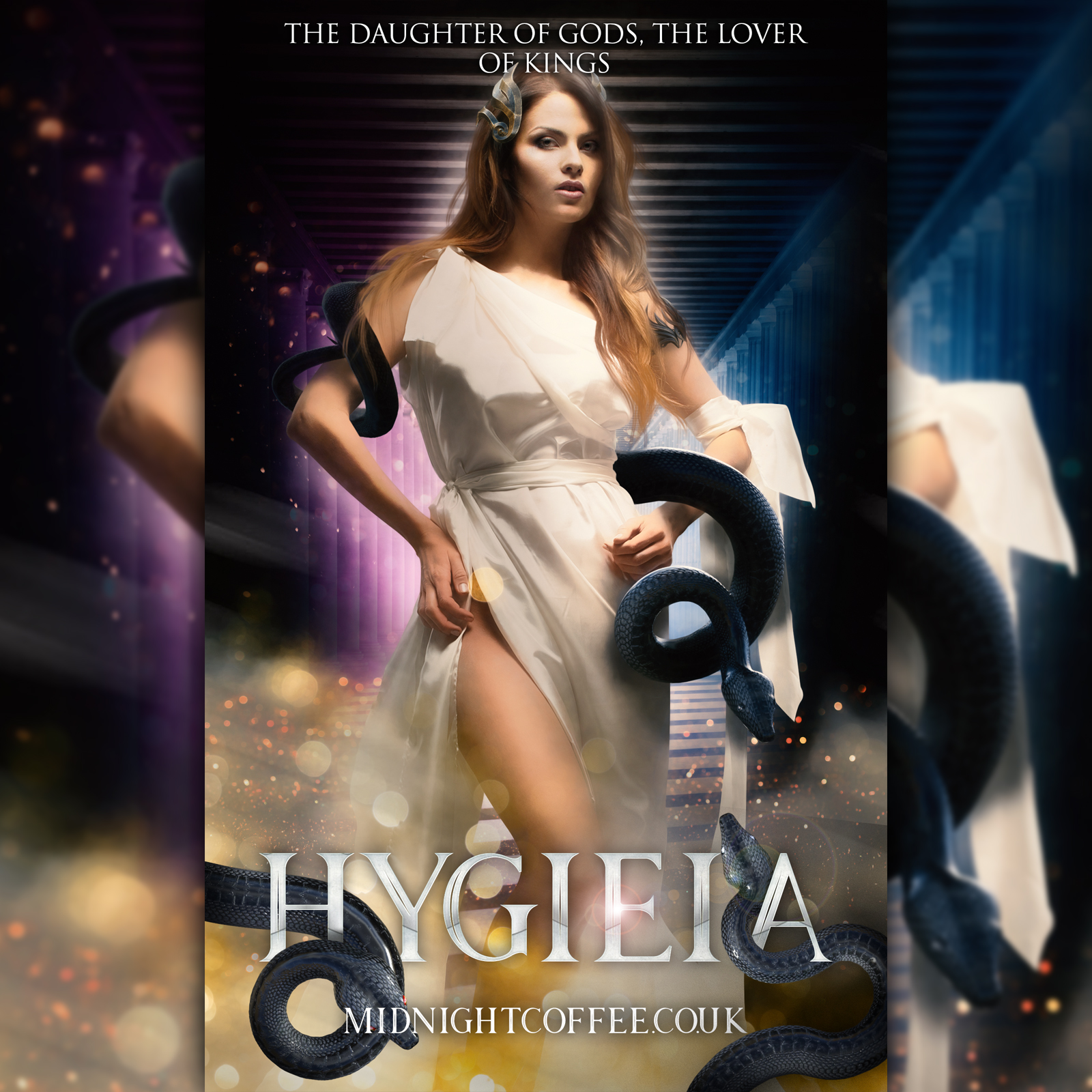
I am really unwell, but business must go on for this weeks premade drop. I’ll probably look at this when I’m well again and think “what the actual F is this pile of crap” but for now, whilst I’m on my death bed, it looks fine. I hope. My boyfriend was watching Plebs and I wanted to make something, but make it Greek. So here we are.
Oof, I hope you feel better soon! Also, it definitely is not crap xD it’s really nice, though for a moment my sleep - deprived brain went “Wut are those black curls??” xd
Awe, thank you ;-; Yeah, I’ll live, I hope, but for now I’m in a sort of constant state of half asleep, groggy, headache… fun fun. Haha yeahhh, black sneks are masters of disguise
just throwing this out there, but chamomile/peppermint/herbal teas really help in such cases
yes, they definitely are 
Thank you <3
I LOVE it- just a suggestion, the text seems kinda small and unproportionate compared to the rest of the cover? idk just my thoughts