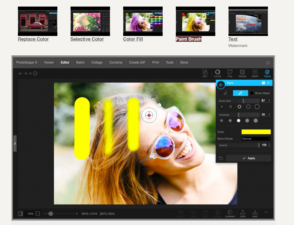
Oof, sorry, you use Photoscape X, correct? I checked out their tools and, assuming frames means layers and you can change layer blend modes, use a paint brush? I don’t really know tho, I just checked out the help
Ah - maybe erase the letters instead then, if it’s easier - or duplicate the background, move it on top and change the blend mode (assuming again you have that )
Oh, I just realized they had a brush Thanks a lot for the help I’m still a noob at all of this. It’s near bedtime where I am so I’ll fix it tomorrow
That’s actually what I did. For layering stuff I usually use Canva because you can sort of “crop” the layers (I don’t know how to do it in Photoscape X yet) I actually edited the post, hope it looks better now
happens to us all! you’re welcome, and good night!
ohh - checked it out and it does look better, though I think you should add shadow to the blood so it looks 3d, same for the veins since the text just looks cut though
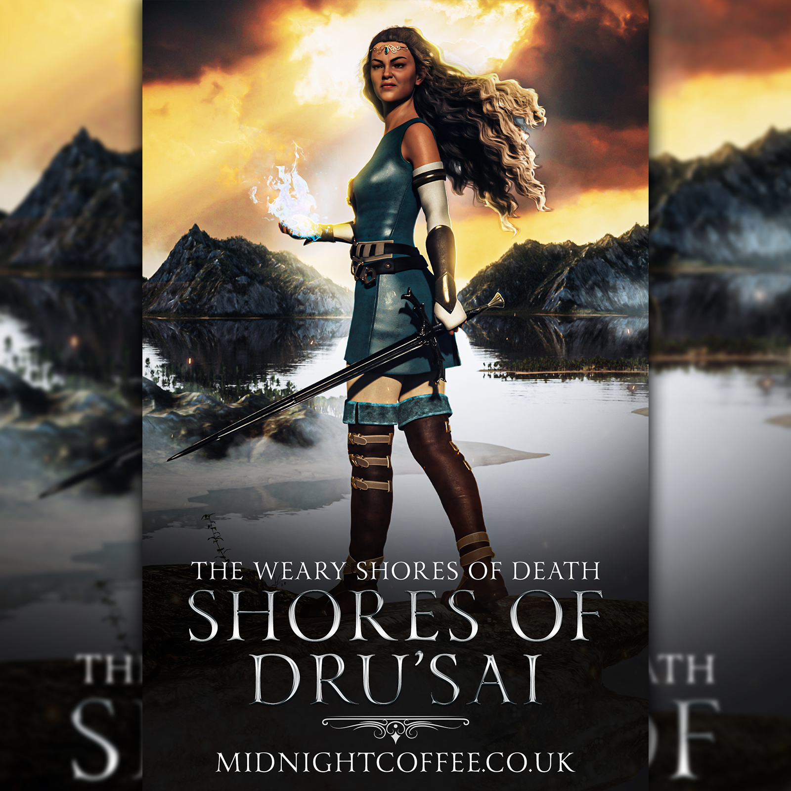
Todays premade. This was fun. I did a Discord server launch today so Im a bit behind, and Im off to the cinema tonight. But at least I managed to get one thing done xD
this is a background i made for a school poster, but i love it so much! sadly i have no reason to use it cause i stopped making covers for awhile if anyone wants it pls let me know! i used adobe after effects (everything is from scratch) so i can also give u the file if u want to change colours
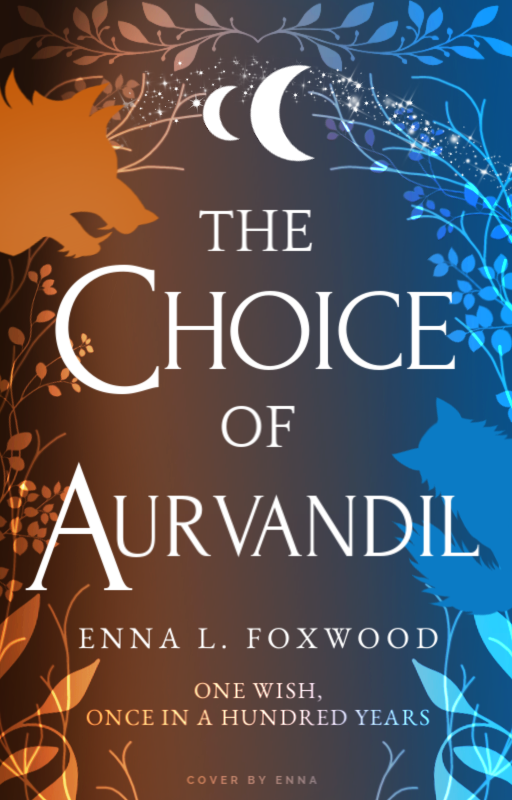
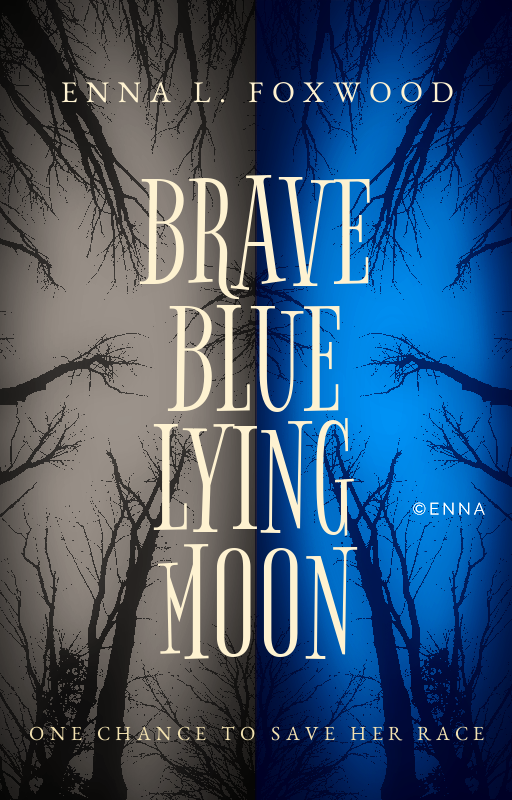
I thought about what you said. I think you’re right about the colors being the issue I was being stubborn I think I figured it out. The MC is a blue feline creature which is why I used blue.
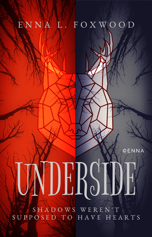
This is still a wip. What do you think? I tried to show the light and dark with the same color, but also tried to put the “light” in the title.


 if anyone wants it pls let me know! i used adobe after effects (everything is from scratch) so i can also give u the file if u want to change colours
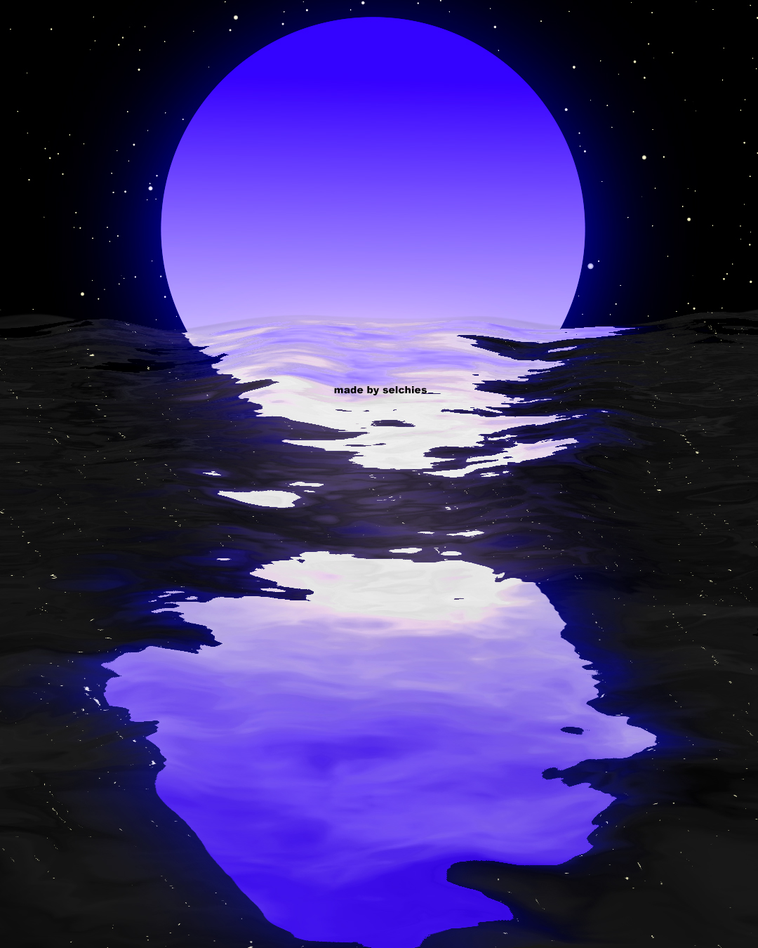
 I was being stubborn
  I think I figured it out. The MC is a blue feline creature which is why I used blue.
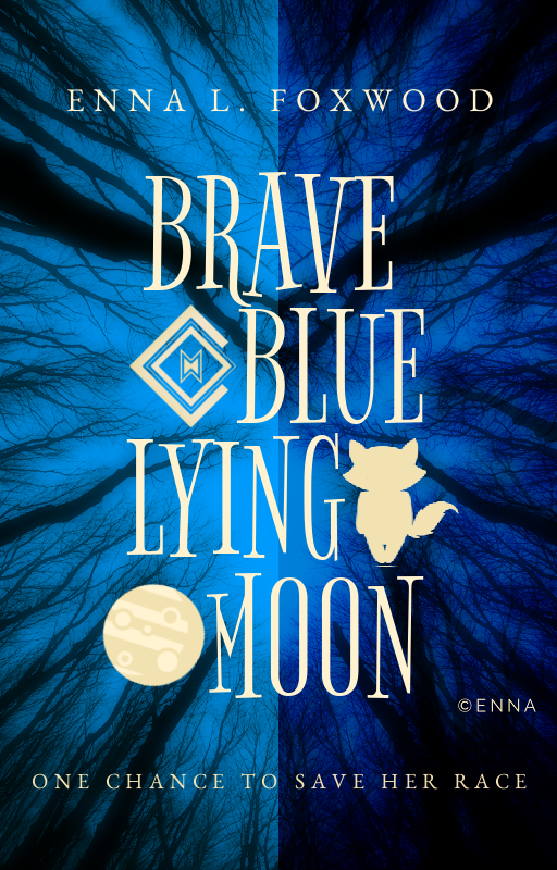
 I wish I had something for it!