So, I decided some time this year that I’m doing headers on finished books. Oy.
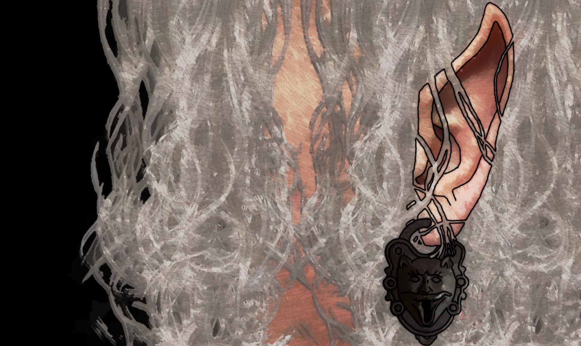
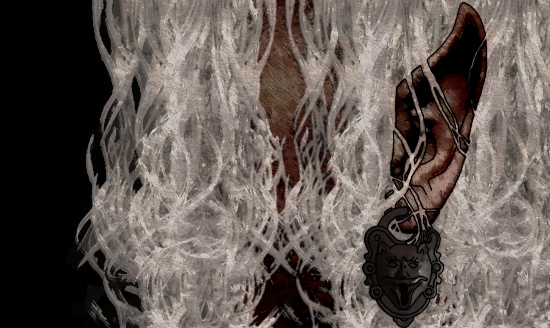
Well, Elves, I don’t much like what I see out there, especially since I’m looking for Dark Elves, which means not just darker skin, but a MUCH less red tone skin (from the tradition of the Drow). For the most part, I’m taking preexisting pics and doing the mod to them: which I don’t really consider “Mine” when I do that.
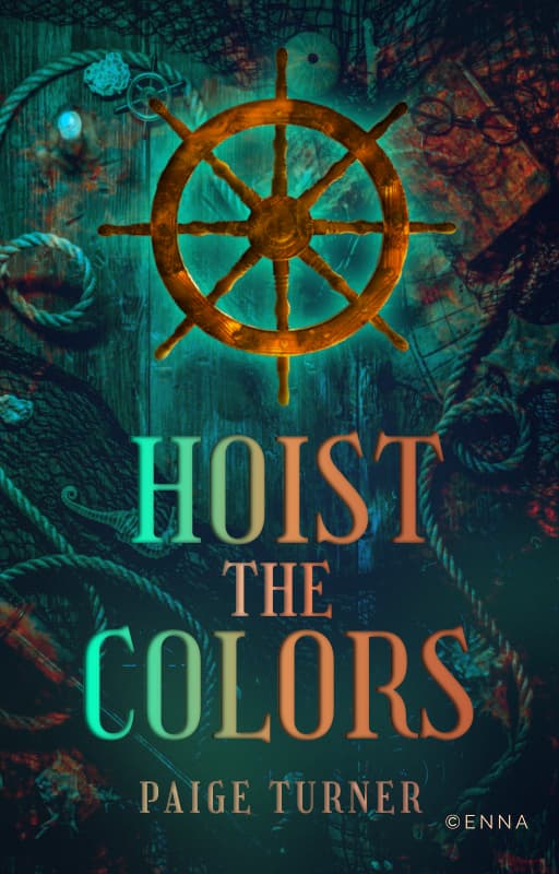
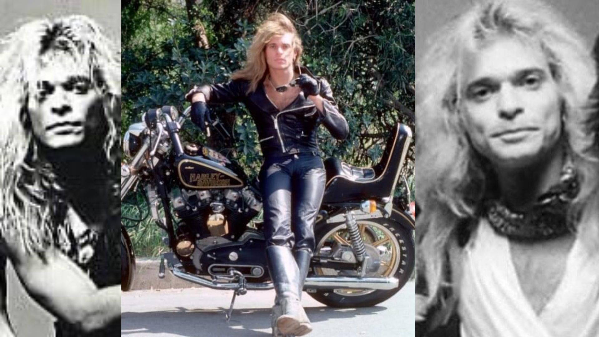
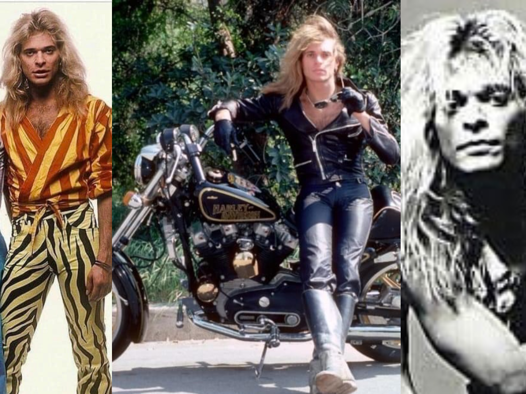
But this one I had to put too much together on it, for it to even be recognizable:
Maybe the font should be white inside and colored outside? That makes it feel and look much brighter. @/Vintaginity gave me similar advice for one of my designs and it worked out really well!
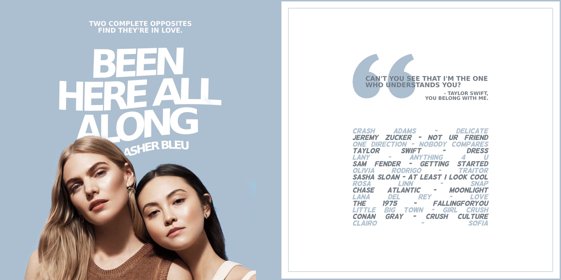
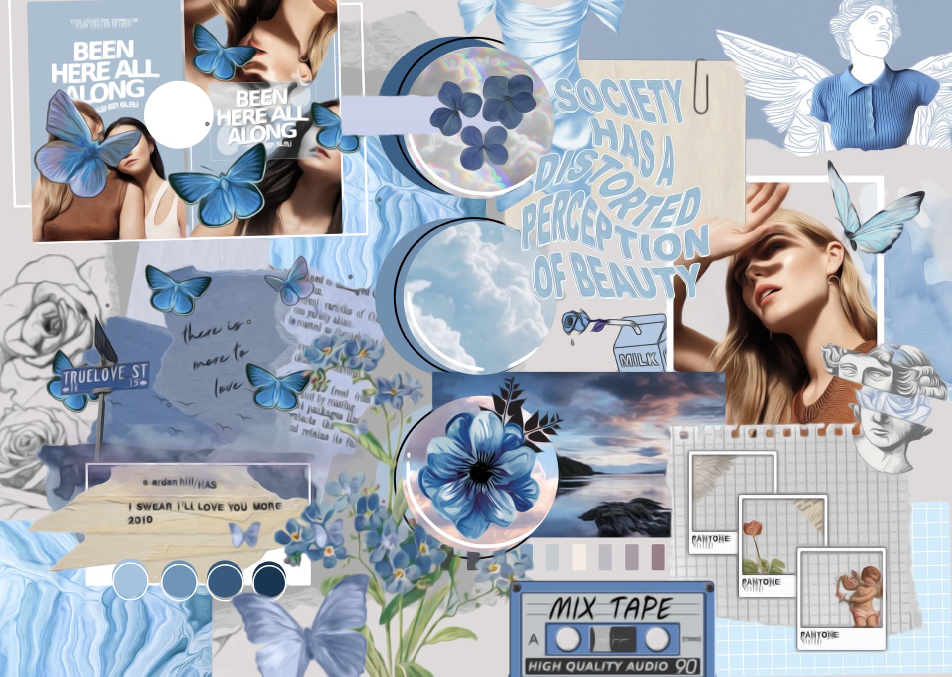
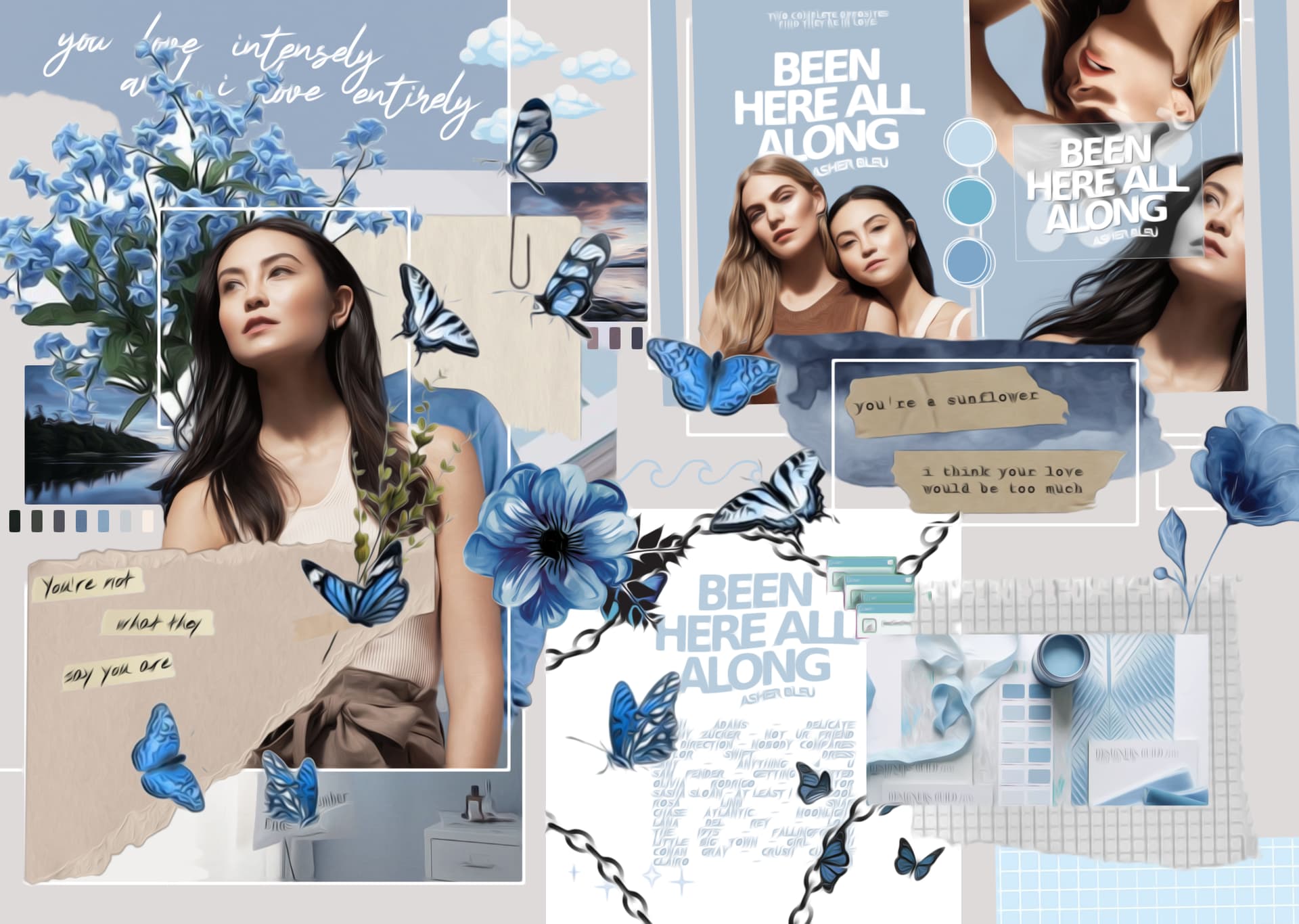
i usually do a lot of simple covers, but never really tried mock-album/playlist-type covers and moodboards, and i don’t ever usually do banners either. so this is just marking the first time i’ve done any of those things. i use a lot of the same kind of images, for the consistency and keeping the theme the same with the colours and the same models. so it’s a little repetitive but it was at the authors request. this is strictly for wp, and the models used are martiza veer and mika van winkle in their bareMinerals fall winter 2018 photoshoot.
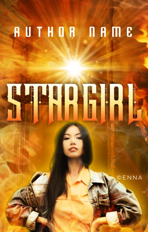
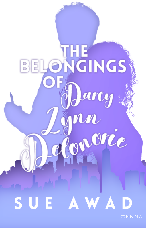
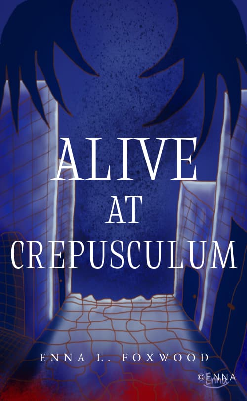
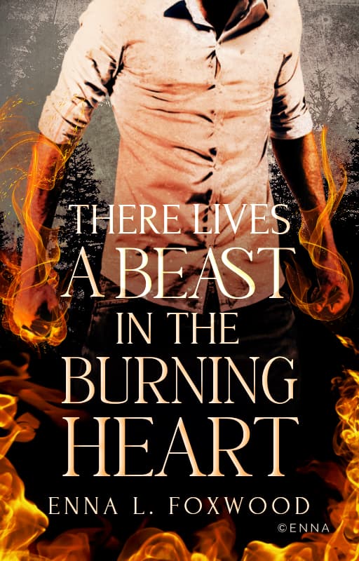
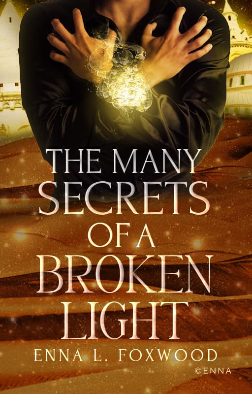
so the first image are two book covers that i conjured up for a new author on wp, the first one is being used. the second was made for if the author wanted to switch it up every now and then.
this is the album-playlist-type cover thingy, idk what to call it but it’s what the author wanted. a lot of authors on wp have this, mostly to try and capture songs that pretty much explain and demonstrate the kind of story that you’re getting into, whether romantic, angsty and so on.
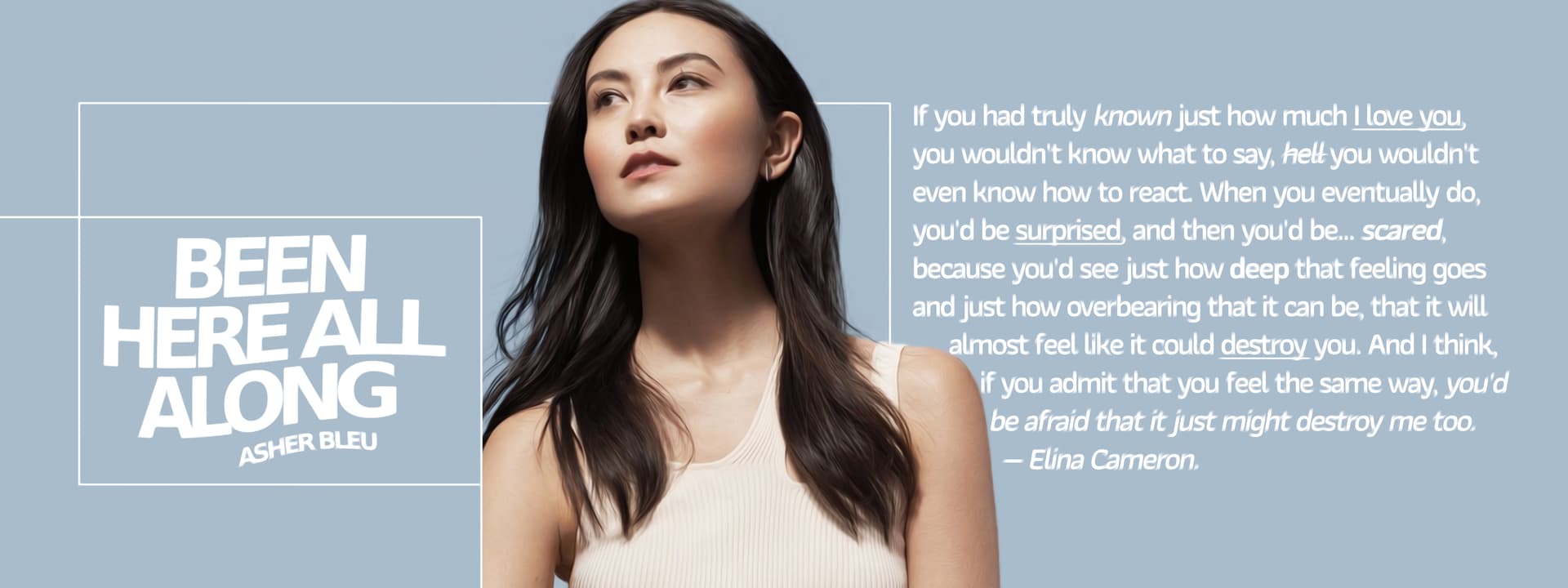
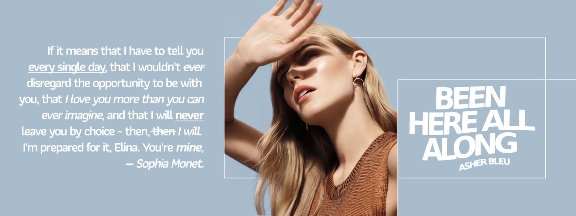
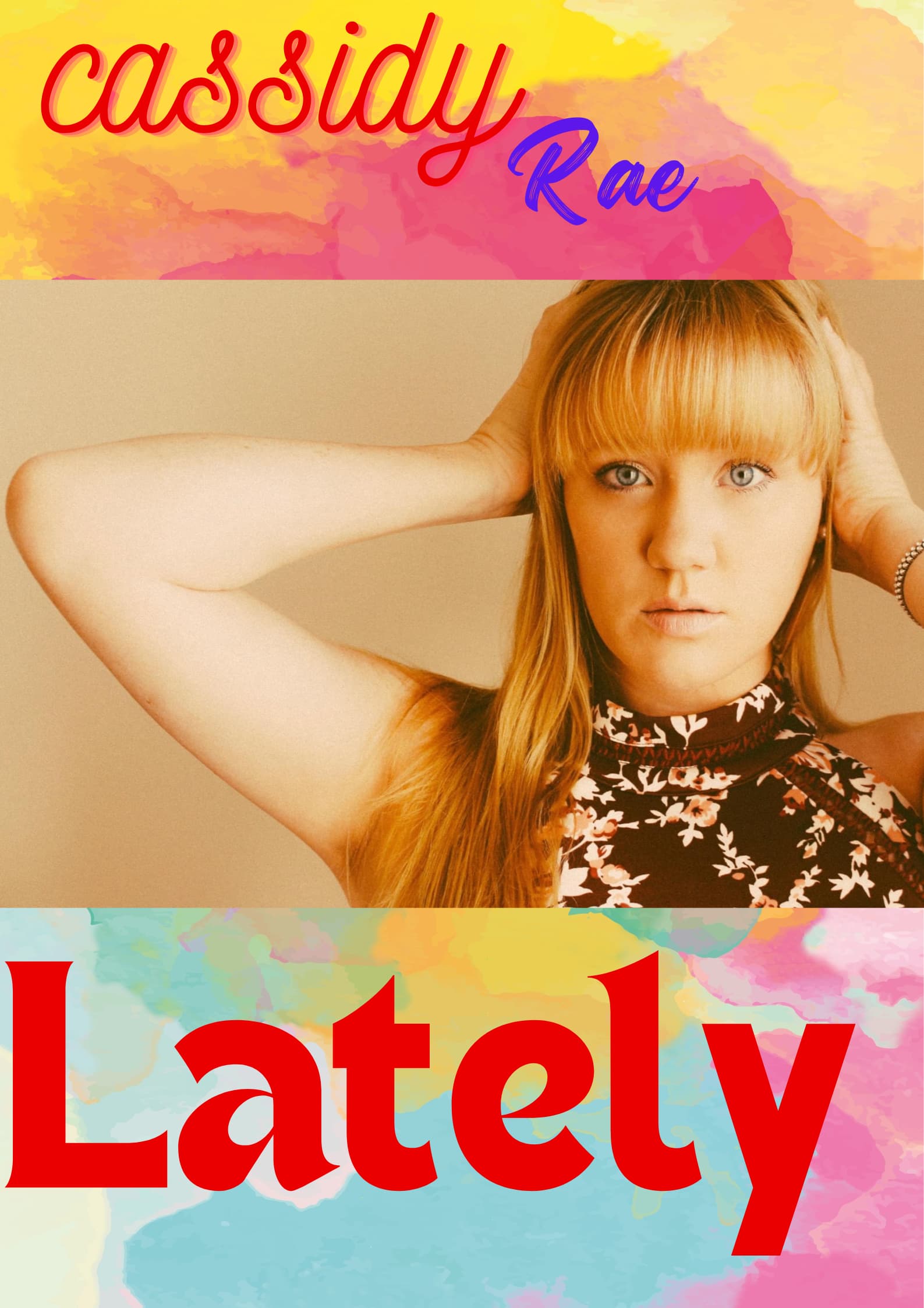
idk if you’d call these banners but there are only two, with a quote from each character of the story. the author wanted it to be simple and plain, without too many distractions or additional pictures. so i opted for the rectangles
this is the first ever moodboard-kindofthingymajig that i did, it looks weird but the author was happy with it so, it’s alright.
it’s supposed to capture the chaos and messiness of the character [sophia] it’s for.
this moodboard is a lot more neat and has less things in it, mostly because the character [elina] is a pretty careful and neat person, or at least on the inside. she’s supposed to be a lot more artistic and creative but at the same time, have the motivation of a turtle. which is relatable.