ooh its super pretty!
I love the fading title and futuristic feel:))
1 Like
Thank you 
I saw that fading title idea and thought I’d give it a shot.
1 Like
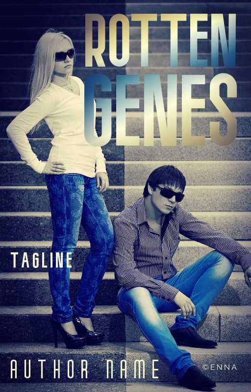
That’s definitely the way to use that. Find a coffee and cream colored one and you could go for Jupiter.
1 Like
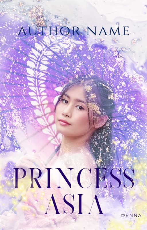
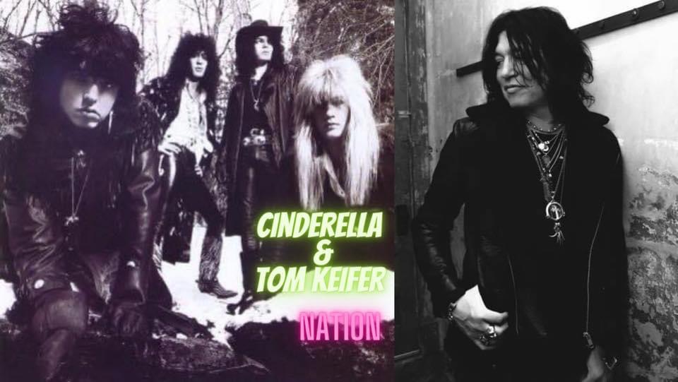
this gives me cinderella vibes 

2 Likes
What I was trying to do for the second one, I did for the third one. Idk… it’s been a while since I made covers for people.
1 Like

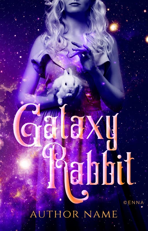
 Galaxy rabbit
2 Likes
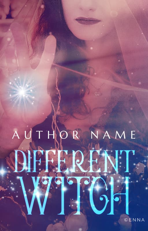
Feel free to take the title 
Oh, lord, I’ve already got a Mini Moo and in Old Soul they’re hunting frogs. Rabbit next? Jeez.
1 Like
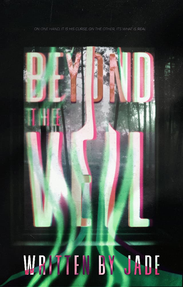
Everyone’s graphics here are so amazing! I’ve missed stalking this thread but rarely posting anything. I designed my first cover in at least 3 years. What do you guys think?
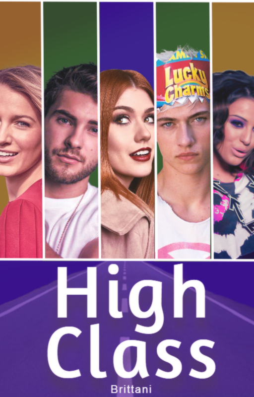
Not sure what to do on the bottom half of the cover so we may have to redo it later. I’m a rookie and forgot to save it before I merged all the layers, so I can’t really edit this one, but still have all of the images to remake it haha.
1 Like
Open this pic up and just add whatever you’re going to on top of the words.

So, I decided I’m going to get a hair more serious about putting up header pics for each online chapter: it’s free to do.
And so, I have an Elf drinking coffee:
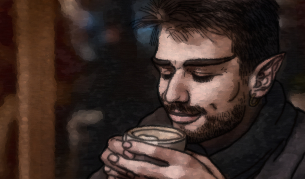
Shifted the jaw, ear, brows, and cheeks after widening the pic, traced out everything of him to give bold lines (mostly off edge detect, of some sort, to only catch the harsher lines on him. Lines had 3 layer duplicates: 1 has a Gaussian blur on it (layer down to 50% and remerged to the main line layer. The other was merged to the background. 3 layers on the warped photo, one Oilify, one Cubism, and one Gimpressionist (to add the lines), and then they were set at whatever percentages blended into this thing.
This is a lot of work for a simple header. But I don’t like most the Elf stuff online, for what I need, so work it is. Argh.
And yeah, I need to go back and edit the earring. dang it, lol
2 Likes
Looks pretty cool. How long did it take?
A premade.
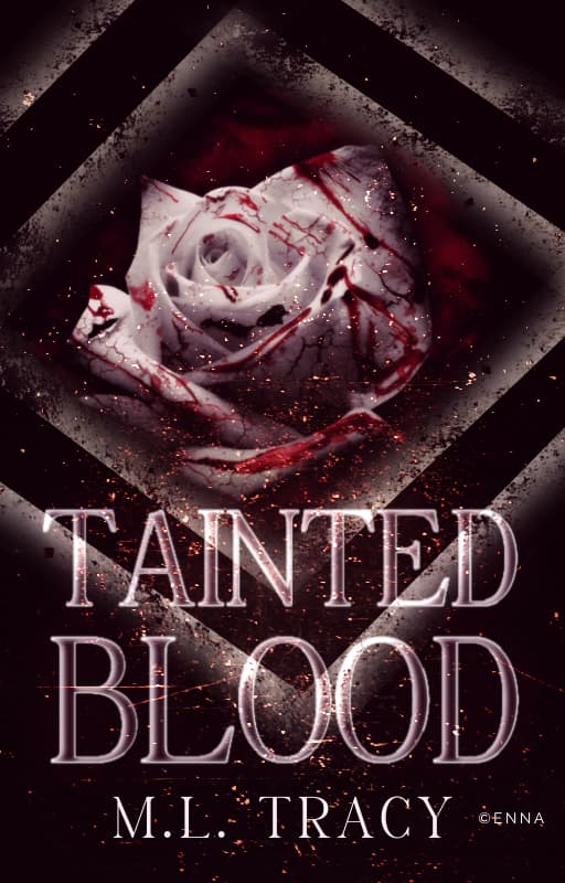
Quickly realized while making this that an all-pink cover is a bit tricky. You need some other color to get the title to stand out otherwise everything is way too blended. Unless, you make the title white which I didn’t want to do.
2 Likes
The tracing what I want outlined is the longest part. That takes 10-15 minutes, sometimes longer. Part of it is because I draw better on a pad, not a computer. The rest of it is a cakewalk so all of the other things described takes about 10 minutes to do.
Now, since I need Dark Elves, when working to darken skin but keep the saturation down, that’s another 15 minutes on its own. Choosing a black model is a ton less work due to just dipping saturation to almost nothing.
For those whom I add white hair to, I can be fiddling with hair adjustment for a good hour.
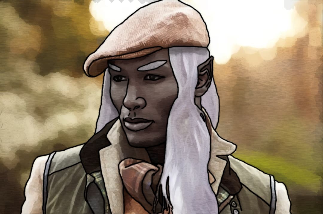
This one’s hair didn’t take a full hour. His cheekbones are very “elven” in the first place.
I think I need to increase the hair contrast, though.
1 Like

