Very modern.
1 Like
I don’t like it and I don’t know why. Now, I read what you intended it for in that other post, and LIKING it would defeat the purpose. My brain is having a hard time with “coloring outside the lines”, for certain.
1 Like
There’s part of me that wants the border a red that fades into it, for some freaking stability, but that again would defeat the purpose.
I can’t be a good critique on this one. lmao
1 Like
Well, it should be a headsmack. I’m more an editor than a creator in the first place, when it comes to artwork. Part of that being because I don’t see things in my head before they are made, all that often. I think the only reason I do decently is that I’m friggen pedantic. lol
1 Like
Ah, you’re not visual then? ![]() Are you more auditory or kinestetic?
Are you more auditory or kinestetic?
![]() I can relate to this in so many ways
I can relate to this in so many ways ![]()
1 Like
I have a lack of focus that gets in the way of auditory. If I keep busy, like sewing while listening to a sermon, I remember the sermon more, and I’m good at memorizing things I do a couple of times, so definitely a kinestetic bent. Not that I cannot learn every which way, though. My grades were high no matter the model used in school. The older I get, the more hands-on I want to be, though.
There’s also a severe case of self-importance to my recall, too. If I deem it important, I’ll be able to recall it fairly easily, but if I dismissed it as trivial, I’m not going to have a friggen clue what it’s about–which means I don’t recall the details of most conversations because they’re really only important to the person speaking.
Now, since I’m TYPING this, I’ll recall this conversation better than, say, my spouse reminding me that it would be nice if I washed his uniforms–I’m not working, uniforms aren’t important. lol (Most often he puts up a load when he gets home because I’m not to be counted on.)
1 Like
I call it Absentminded Professor. Everyday life is trivial.
1 Like
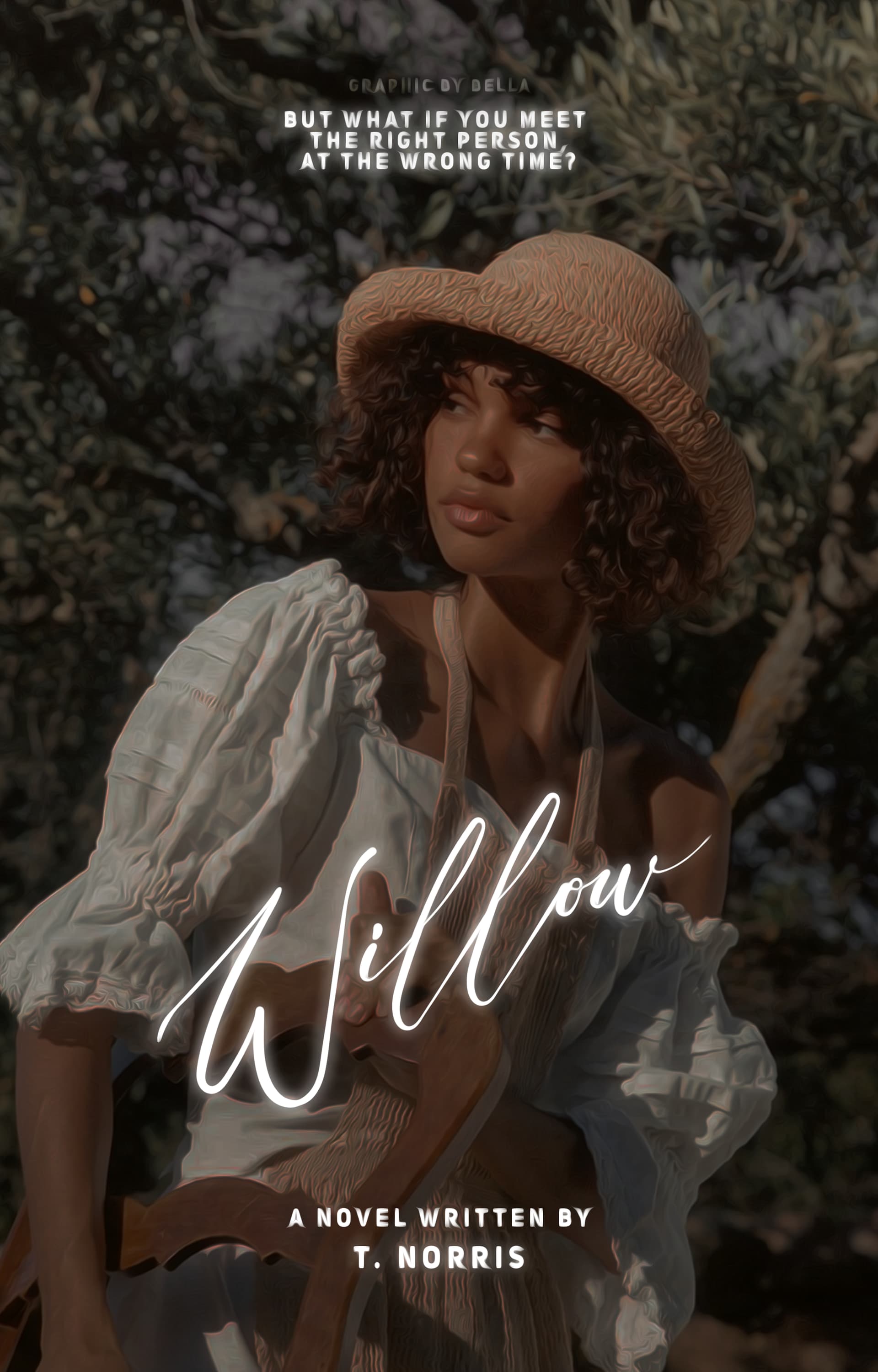
Can’t read “we are”. Make that line about 20% bigger and I think I can handle it.
1 Like
Will do! 
1 Like
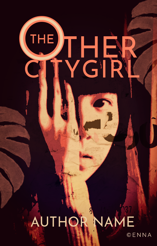
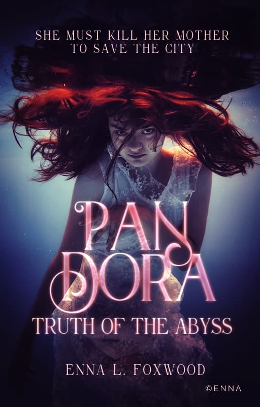
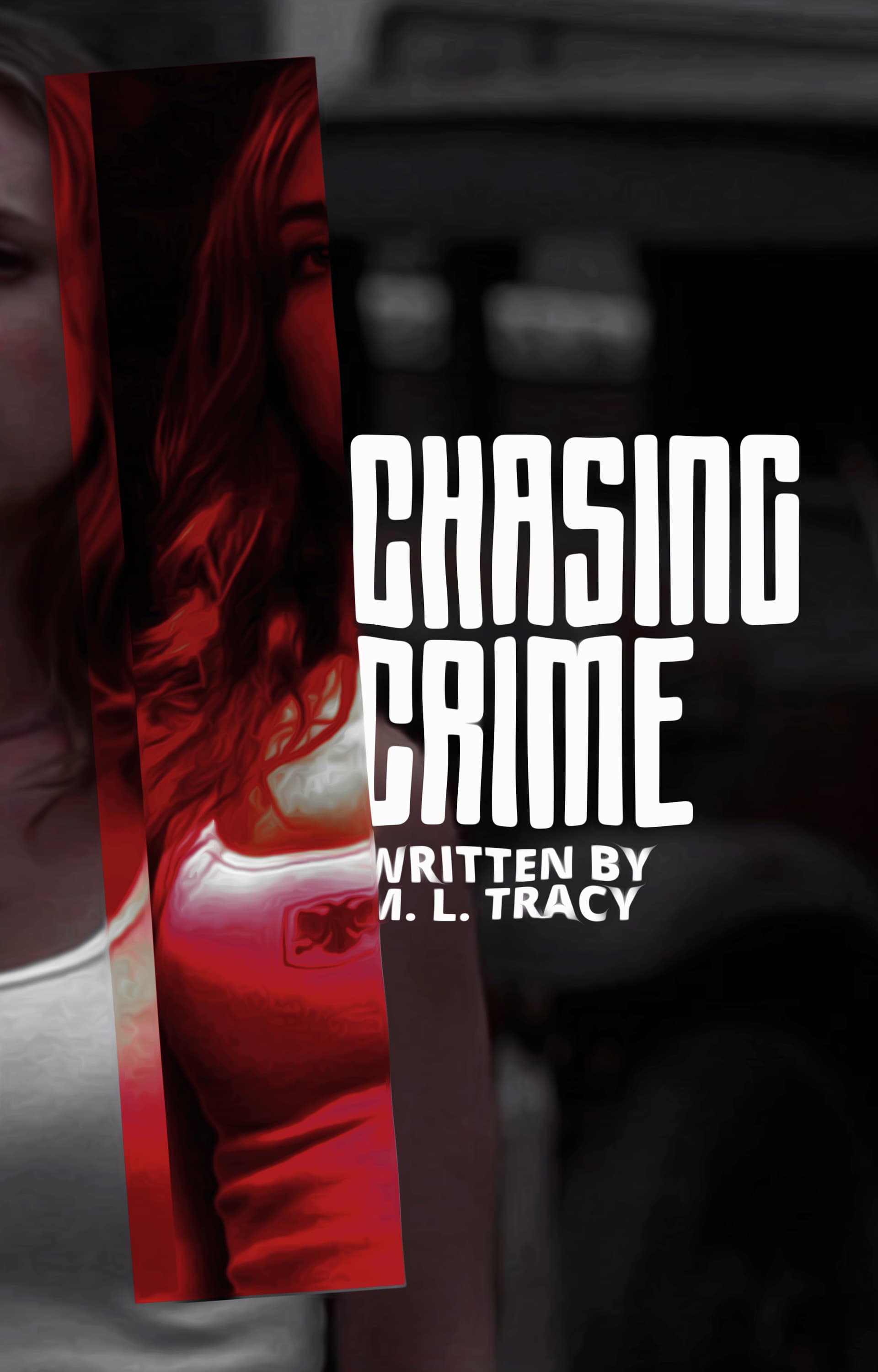
The T in city doesn’t really work, but otherwise, it’s great
2 Likes
It’s a premade so the title is a placeholder  I don’t like how the “I” is on the finger either.
It’s just overall…idk how I feel about it XD
2 Likes
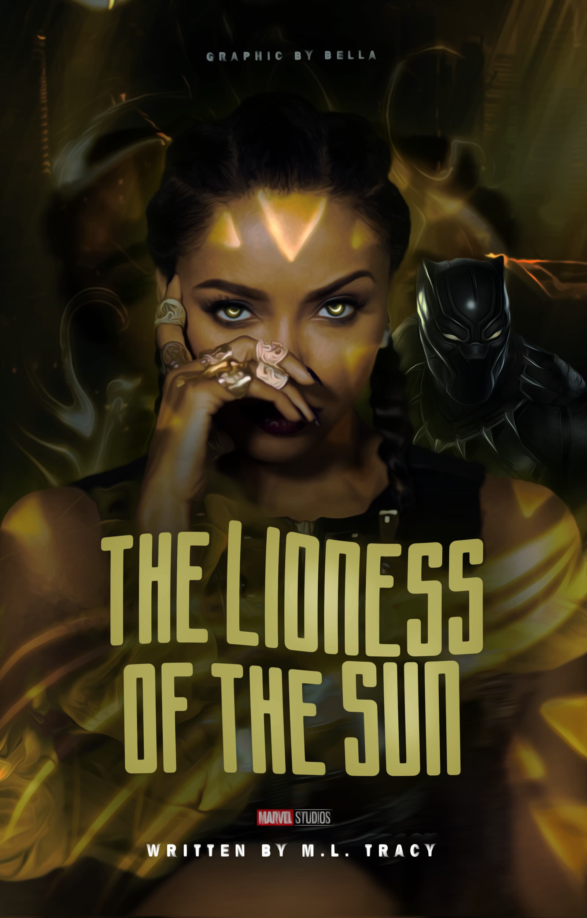
Switch the colors to green because you can see more green shades than any other color, double-check it to see if you like the details with more detail.
I really dipped and came back to this being blown UP. I adore everyone’s graphics!! They look beautiful!!!
2 Likes

2 Likes


4 Likes
These are nice! You’ll get better as you do more
1 Like