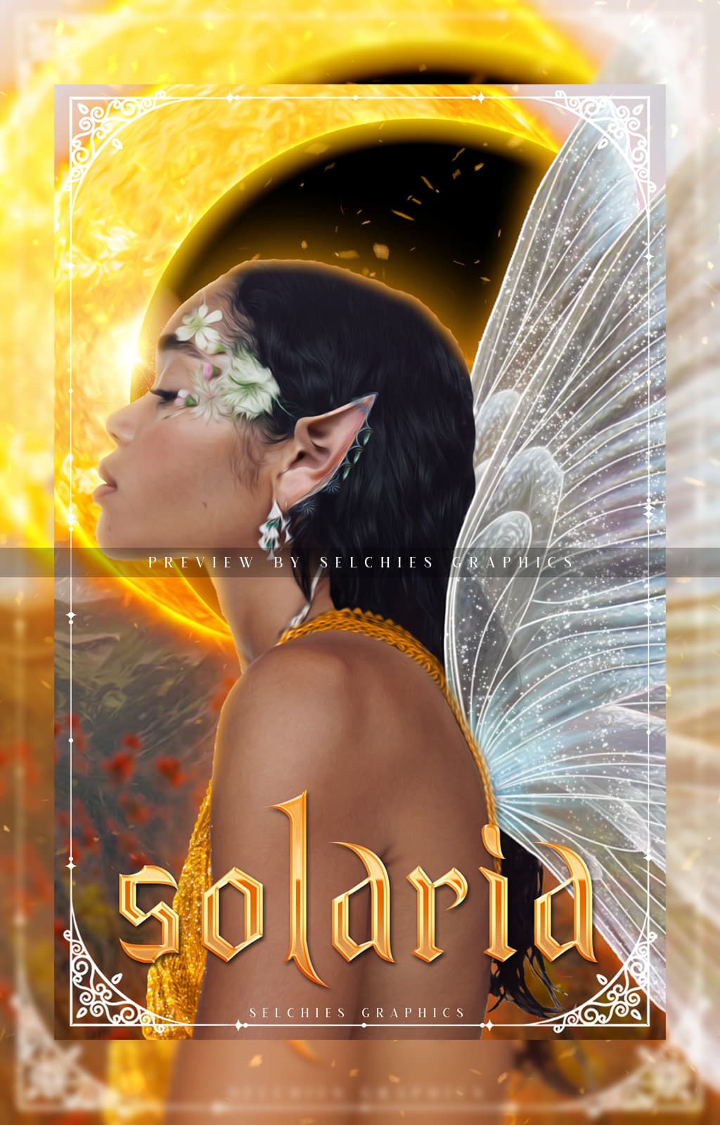
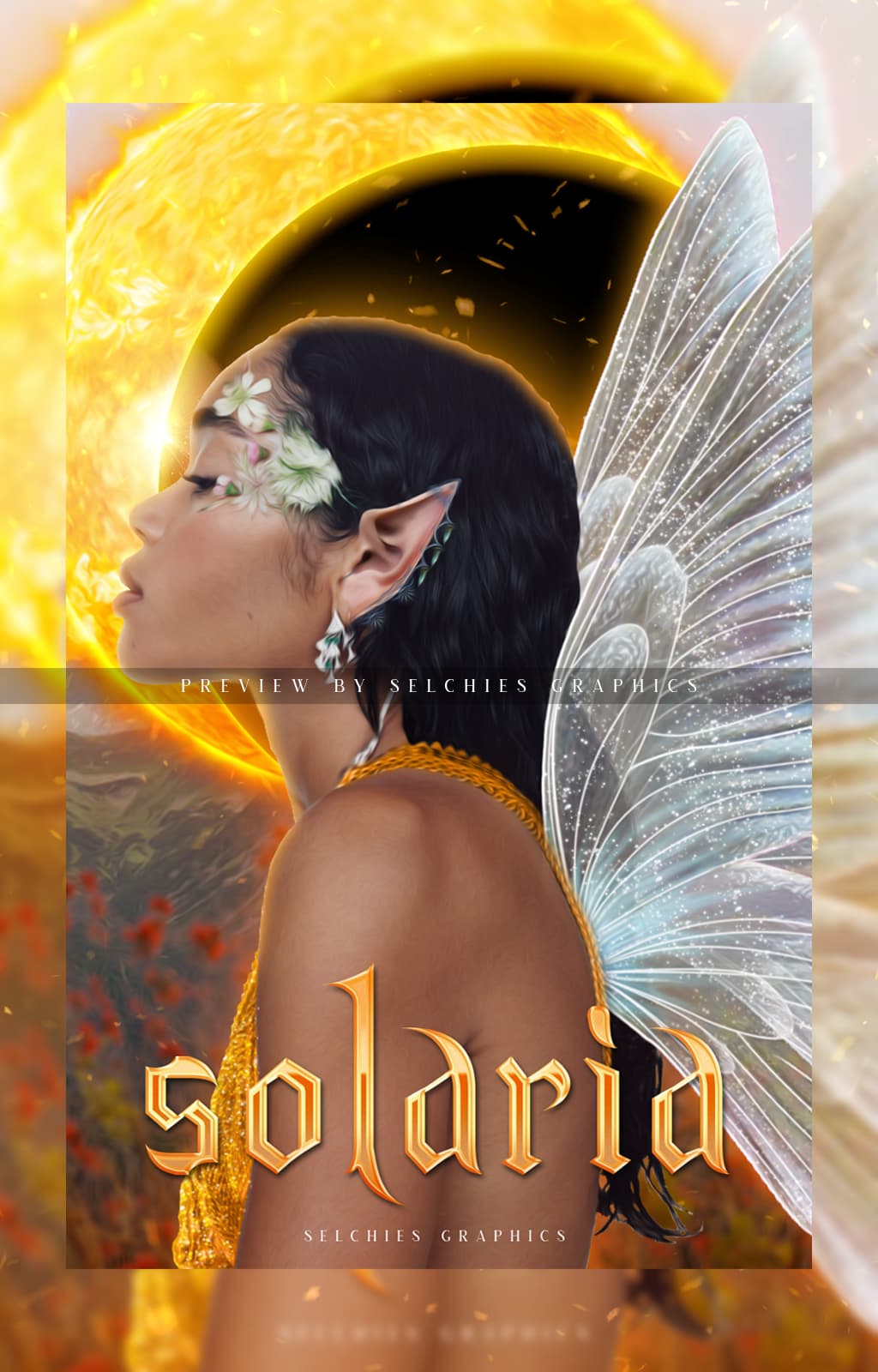
This one works. The whole backgound of the lettering is darker than the letters, so the eyes can handle reading it.
1 Like


what font did you use?
1 Like
Silver guilded, even That’s spot on.
1 Like
 Thank you!
1 Like
Not often you get me to quit grumbling about the readability either. lol
1 Like
 I thought the same when I saw your reply
1 Like
I mean. I’m decisive in a GETOFFMYLAWN sort of way. I’m not the arbiter of all things. I pity someone who would rad it that way. lmao
I take teasing well…
1 Like
![]() it’s good — your feedback is very helpful
it’s good — your feedback is very helpful
![]()
![]() gooddd
gooddd
2 Likes
Blue not teal–lettering competes with the background less. Biggesst drive of my ICANTSEEIT.
1 Like
The backgrounds. Blue 1st. Teal 2nd. The 2nd one is busy.
1 Like
You know what’s coming…
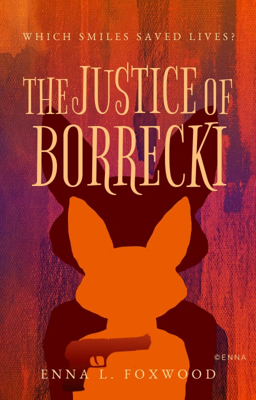
the eiffle towerneeds to be in between his jacket color and the letters (for coloring), to quit telling my old brain there’s an I between the R and E.
Otherwise, epic.
1 Like
I did and I’ll try to fix that up! And thank you!
1 Like
If all I do is clear up readability, then I’m useful. lmao
1 Like
yes you are
1 Like
I love that! what font is it?
I have no idea. I’ll let you know when I check it xD.
And thank you!
1 Like
This is GORGEOUS!! 
2 Likes