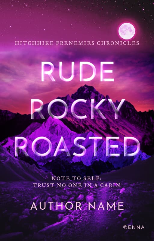
I rarely work with green. Somehow I have trouble with it. But today I was just messing around to create a quick foresty-nature cover and somehow, without meaning to, ended up making something of a Black Panther fanfic inspired thing XD
Made it in…about fifteen minutes Sometimes these miracles happen.
Green is the color humans see the most shade variations in. It’s what makes it harder to work on anything with green because green, in nature does NOT match, whatsoever, but when we’re working with it, using anything beyond a very narrow range on the color wheel kills our ability to appreciate the work.
It gives different note shapes for the scale. Which means you can read it without being able to read music.
Sacred Harp is the extreme style of singing that’s associated with it. That’s very brassy and loud voices. Videos face each other with doubled parts.
I grew up in church of Christ (not Latterday), and they are closest to Baptists, but are mostly autonomous yet strictly against instruments. So, more pleasent sounding.
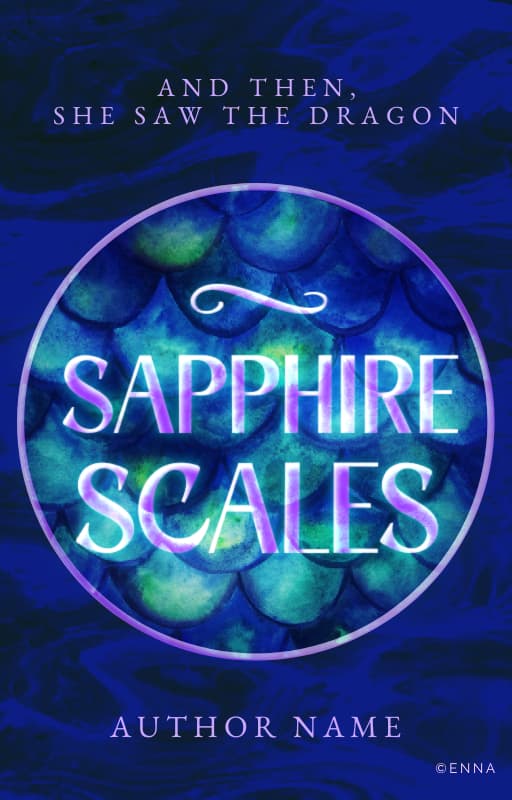
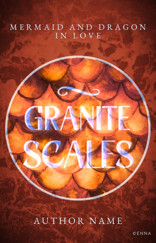
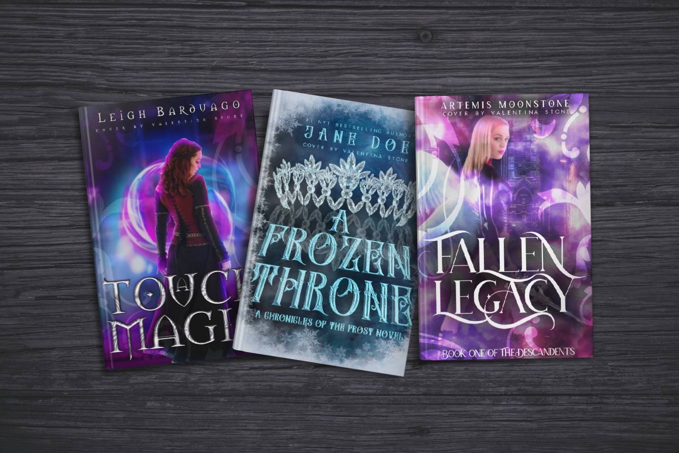
Don’t lose the glow, it looks great. Maybe use a darker color for the title? Or reduce the glow of the scales and increase the glow of the title? So that would look something like the titles on these (A Frozen Throne / Fallen Legacy specifically)
Lovely, but I agree with Kira in regards to the titles. Try removing the gow and using the background color for the text. Maybe add an inner shadow so it looks engraved?
 Sometimes these miracles happen.

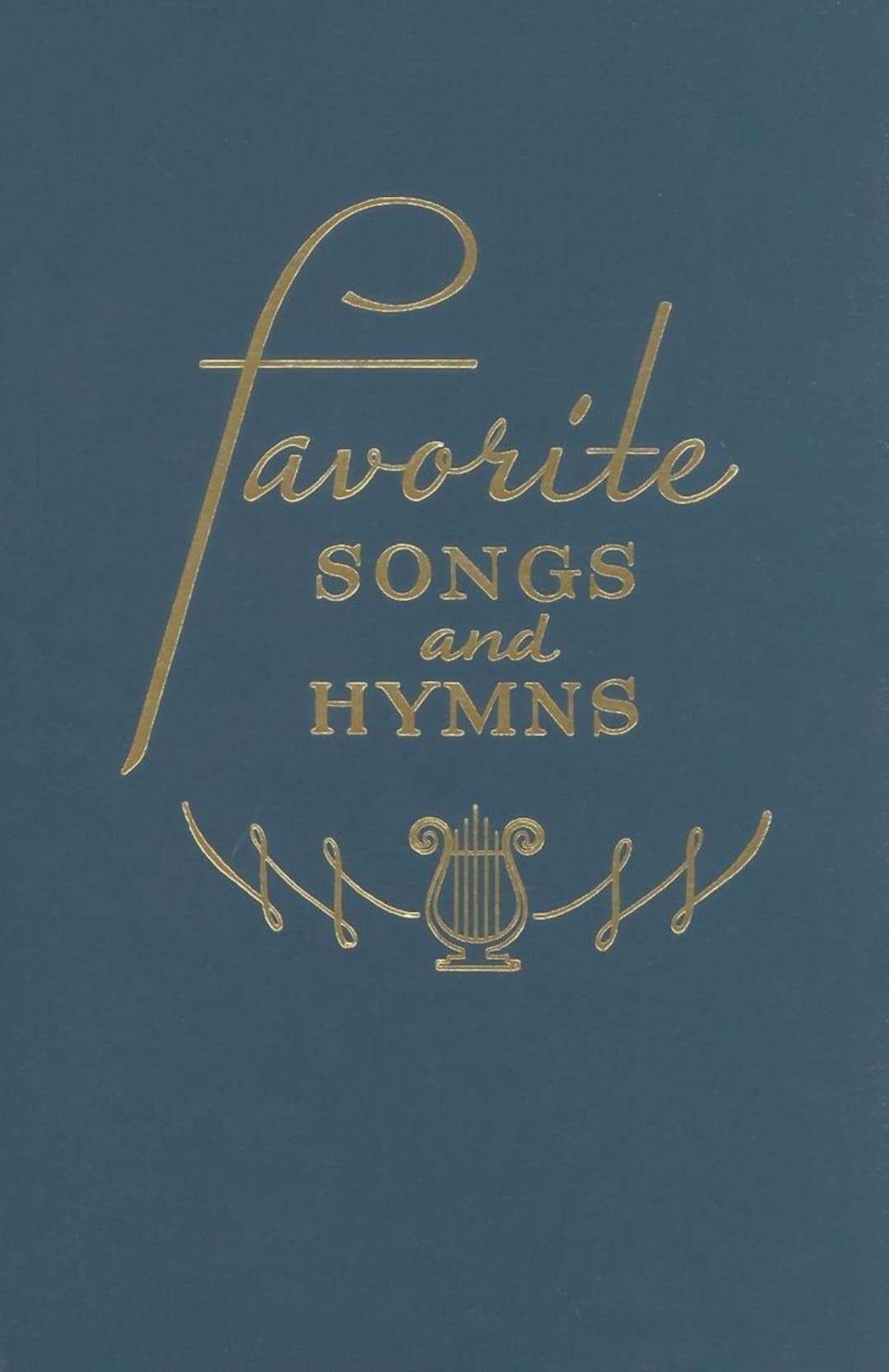
 : Thank you so much! And I have to agree with you about that hymnal feel