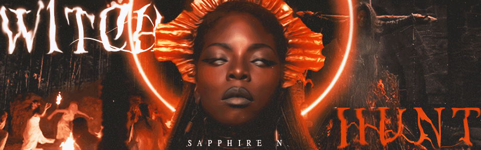
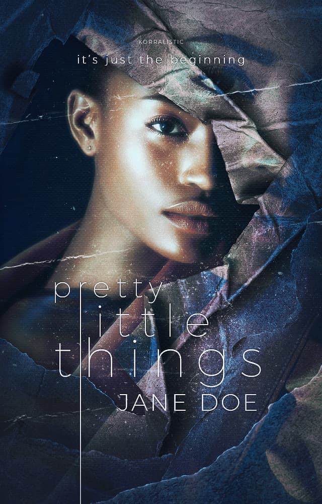
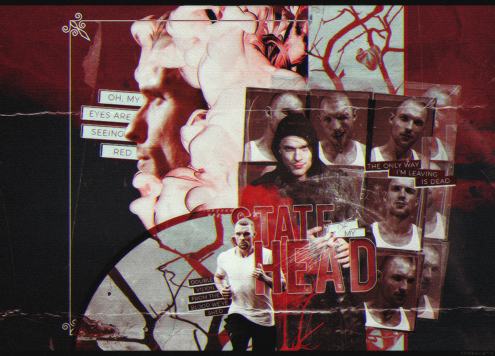
the glow on her face is the model’s makeup i just added highlight to accentuate the makeup she already had on. i’m still a noob at covers so i’m not sure how to shift it to more bronze/gold, but i’ll figure it out.
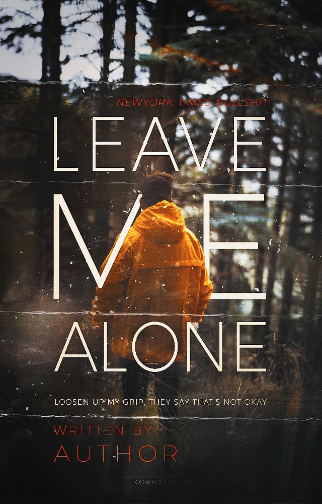
i feel like there should be something added to the bottom, but when i put smoke it made it look very cluttered
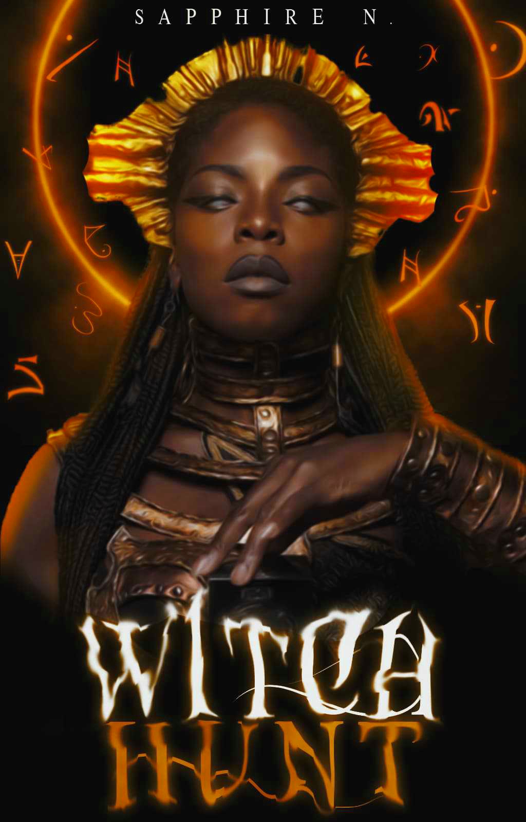
The problem is that the font graphics are a flat color while everything else is far more variated… but if you try to do it through other means than texture to the letters itself it makes a mess. And the shape of the letters is fancy enough to where you really notice the flat.
that’s what i noticed with the flat colours. i added a satin, but couldn’t figure out how to make it look like it wasn’t just grey lines. i wanted to make it look shiny and that was the only way i knew how
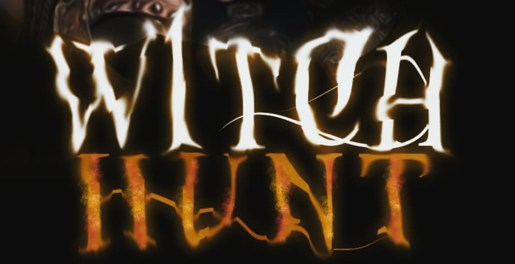
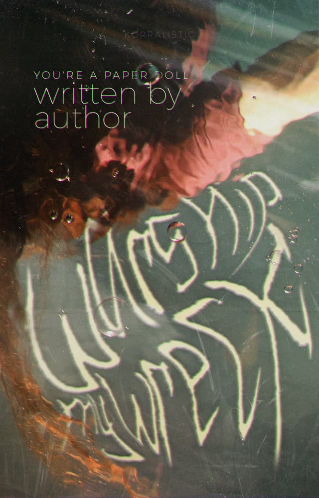
I don’t trust my phone to be high quality enough for a large photo edit, on details, but it does show how to work around this. Just sampled Hunt’s color, used a graphite pencil paint brush and shifted the color around to less saturation and brighter, 2, 3 times, to make a little smoke line. I used that to highlight, then dropped saturation, shifted to a slightly more red, and dimmed the highlight on that same doodle to darken it. It’s not crisp to the edge of the lettering. That’s something that could be taken care of in most programs, though.
Anything that annoys me, I hand dabble in. Computers allow you to go in pretty close.
For the white, color dabbling would need to be towards a cream, to reflect all that glowing. Slightly towards the lightest lavender for shadows, possibly.