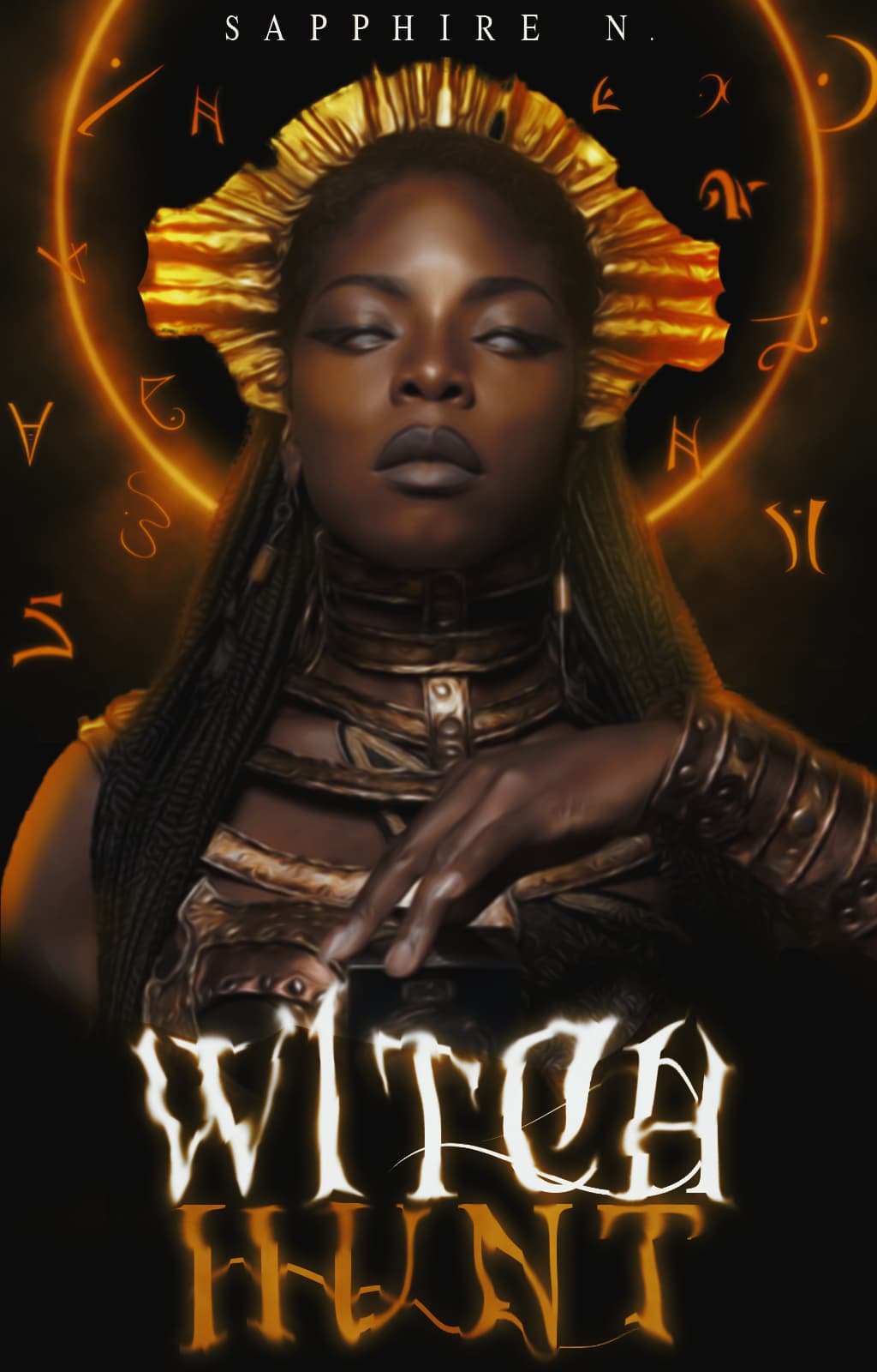
Pretty! Just a couple of thoughts; maybe try brushing out the roses at the bottom so they fade better and adjust the layer effects on the text?
2 Likes
what font is that?
Enchants - @/CoffeeByNight linked it in the multimedia thread paid though
1 Like
thank you!
No worries!
1 Like

3 Likes
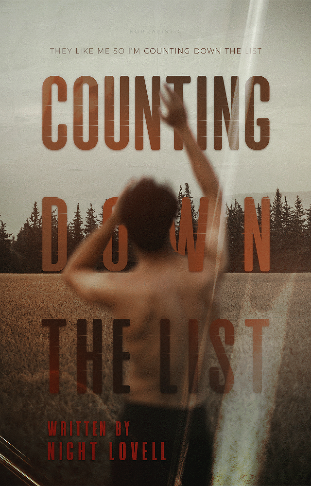
THESE ARE AMAZING-
1 Like
tysm!! :’’)
1 Like
so pretty!! 
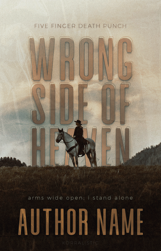
though, seems to me that the horse and man in wrong side of heaven seems “pasted”, in a sense 
2 Likes
thamk u!!! and bdhdhsh everyone thinks it’s a guy that’s a woman LOL
idk what to do abt it looking “pasted” bc its not a png, it’s literally the photo i just put the text behind her specifically 
1 Like
oops - my mistake xD should have enlarged it
ohh - maybe a shadow might work? idk xD i’m sure it’s fine tho
1 Like
beauty
2 Likes
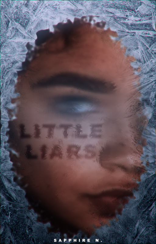
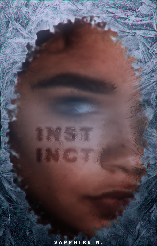
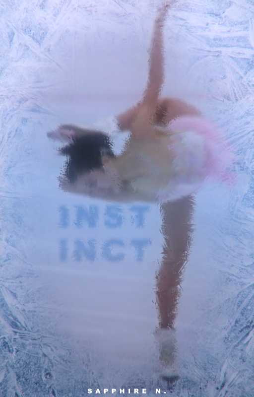
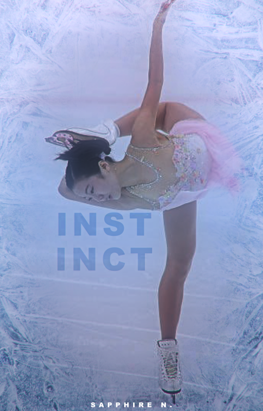
here’s my first cover made today! i haven’t made a cover in months so please critiques are needed lmao. this is for my underworks gxg ice skating book, the title is being debated. [program: adobe after effects]
4 Likes
I’m more a meme maker and obnoxious mod type, so my covers don’t look professional, to me. Lmao
Let’s see…
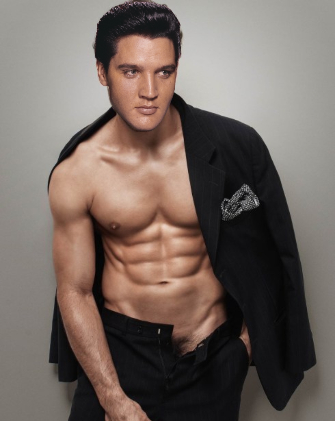
That’s the last modded pic for fun up on my phone.
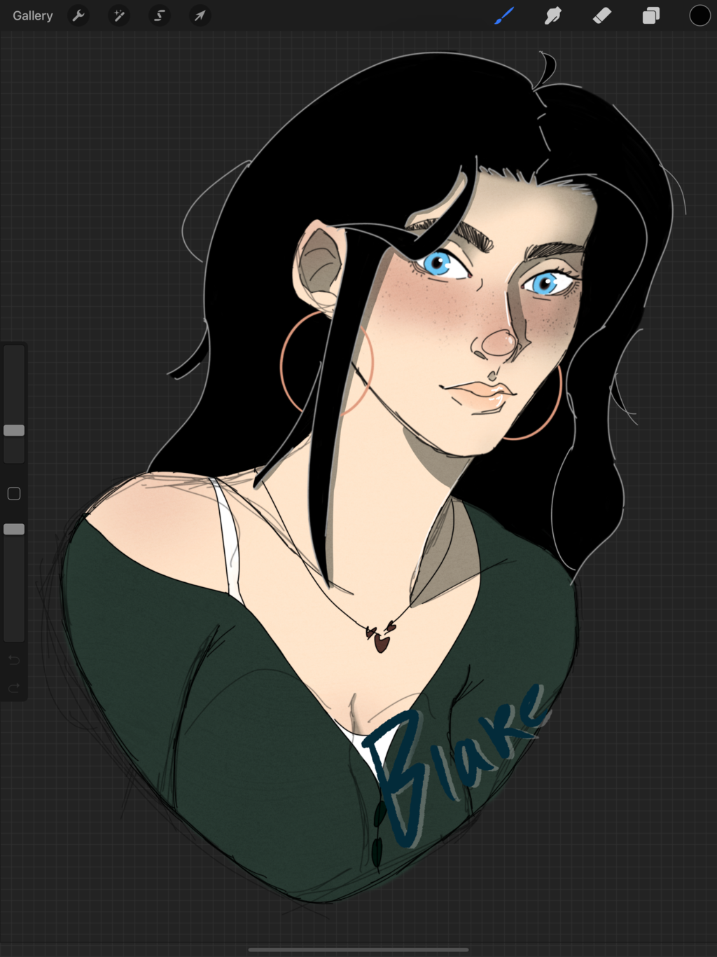
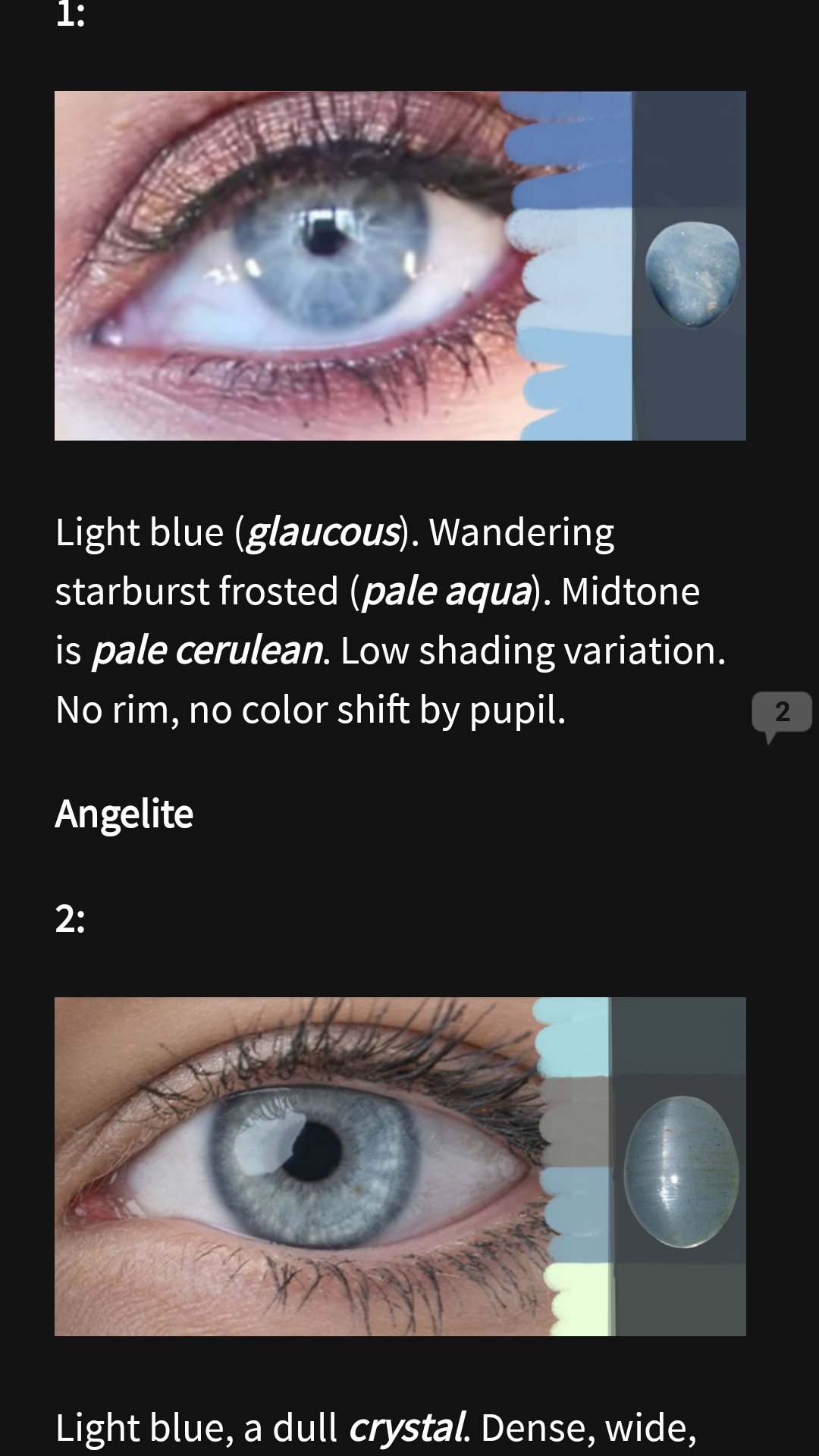
Up on Wattpad, I’ve got this monster just started that’s specifically to expand people’s freaking vocabulary when it comes to descriptions–specifically mine. Blue eyes, bah!
1 Like
thank you so much! 
1 Like
the title font seems out of place compared to the rest of the cover’s style but it’s absolutely gorgeous!
1 Like
Ah yes, the text stumped me at the end so I gave up somewhat.  And thank you so much!
2 Likes
If this could be made thicker (depends on the Bold aspect and the program its in), it would be interesting.
1 Like
Try using a narrow, tall, pointy sans serif.
1 Like