it’s busy… the title gets lost up there, I had to search for it. And the only part clear for me is the girl.
Maybe it’s just me, though. I usually have very simple graphics.
1 Like
Hmmm … you might have a point, I’ll look at this again in a bit :’) Thanks for the heads up!
2 Likes
Whoa, though, it looks amazing!
1 Like
Thank you so much! 
2 Likes
That icy, glassy font is so cool (oop, didn’t mean any pun I swear XD)
1 Like
 I’ve discovered a new style.
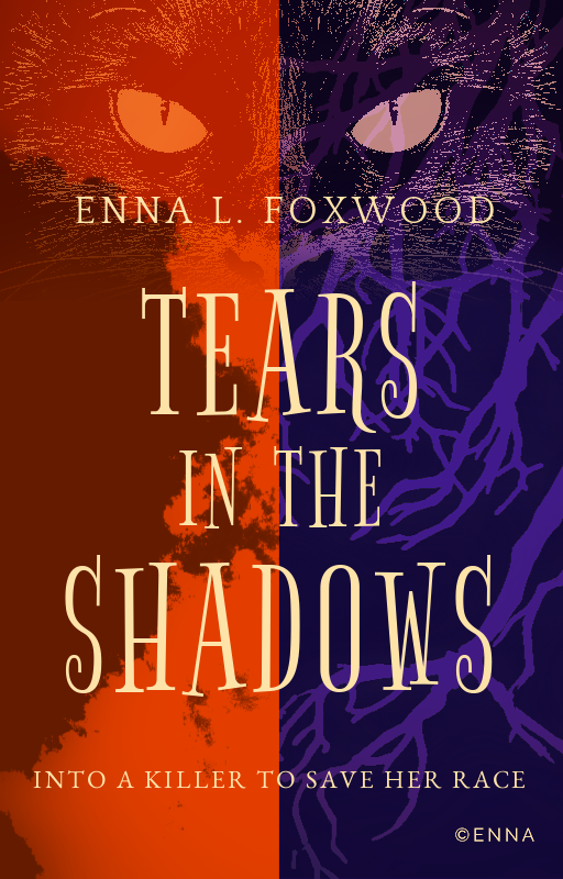
 You sure about the pun thing?
 And thank you!
2 Likes
Nicee Though, maybe you could remove the watermark off the pic?
1 Like
Thanks, but I don’t know how to remove the watermark
1 Like
You can try free online ones, though it’s not guaranteed to work the way you’d like. Or maybe find one without a watermark? Reverse-searching images on Google usually have good results.
1 Like
redacted
2 Likes
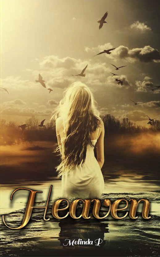
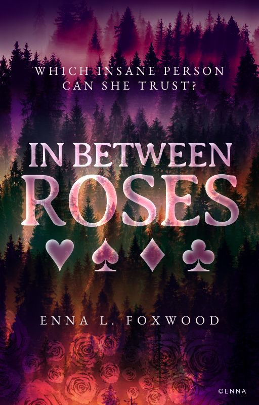
Can’t decide if I like this or not… I think it needs something else… Maybe just a normal Title? I finally learn how to do better title fonts and all, and wanted to do it well, but I think this might need just a typical title…
What do I need to change?
3 Likes
After staring at it for a long time, you have a lot of empty space at the top and many lines of details at the bottom of the graphic. Like the water is very textured compared to the sky. I do like the title and it’s not hard to read I just wonder if the image will be more balanced if the title is in the sky area instead
3 Likes
Let’s see about this one…
I’m just doing random fakes I made up to see if I improve on covers :). I’m still light Years away on being okay… ha!
4 Likes
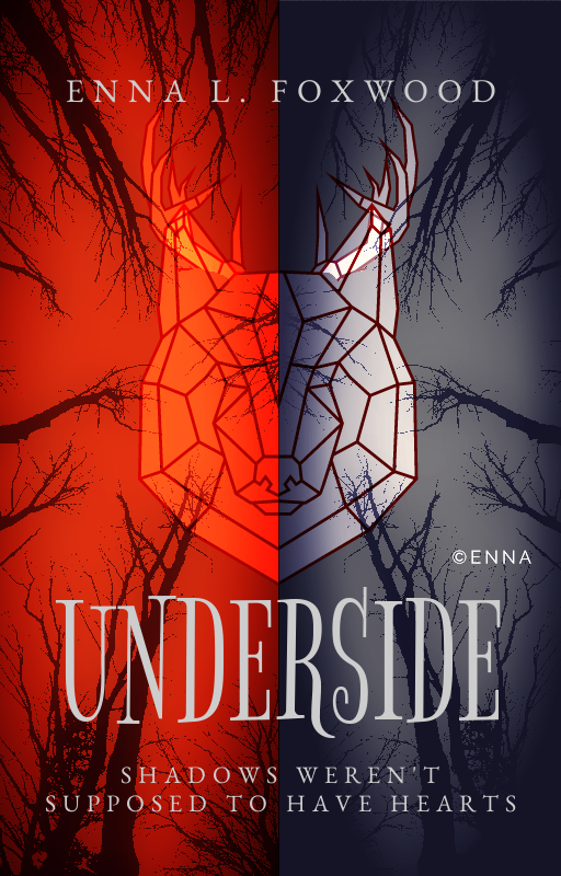
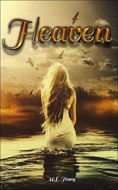
That’s looks much better to me! I really like the cover
Good luck with cover creating! I know I just gave feedback but I’m terrible with actually making the covers so I feel that to some level XD
3 Likes
Thanks!!
3 Likes
No prob~
3 Likes
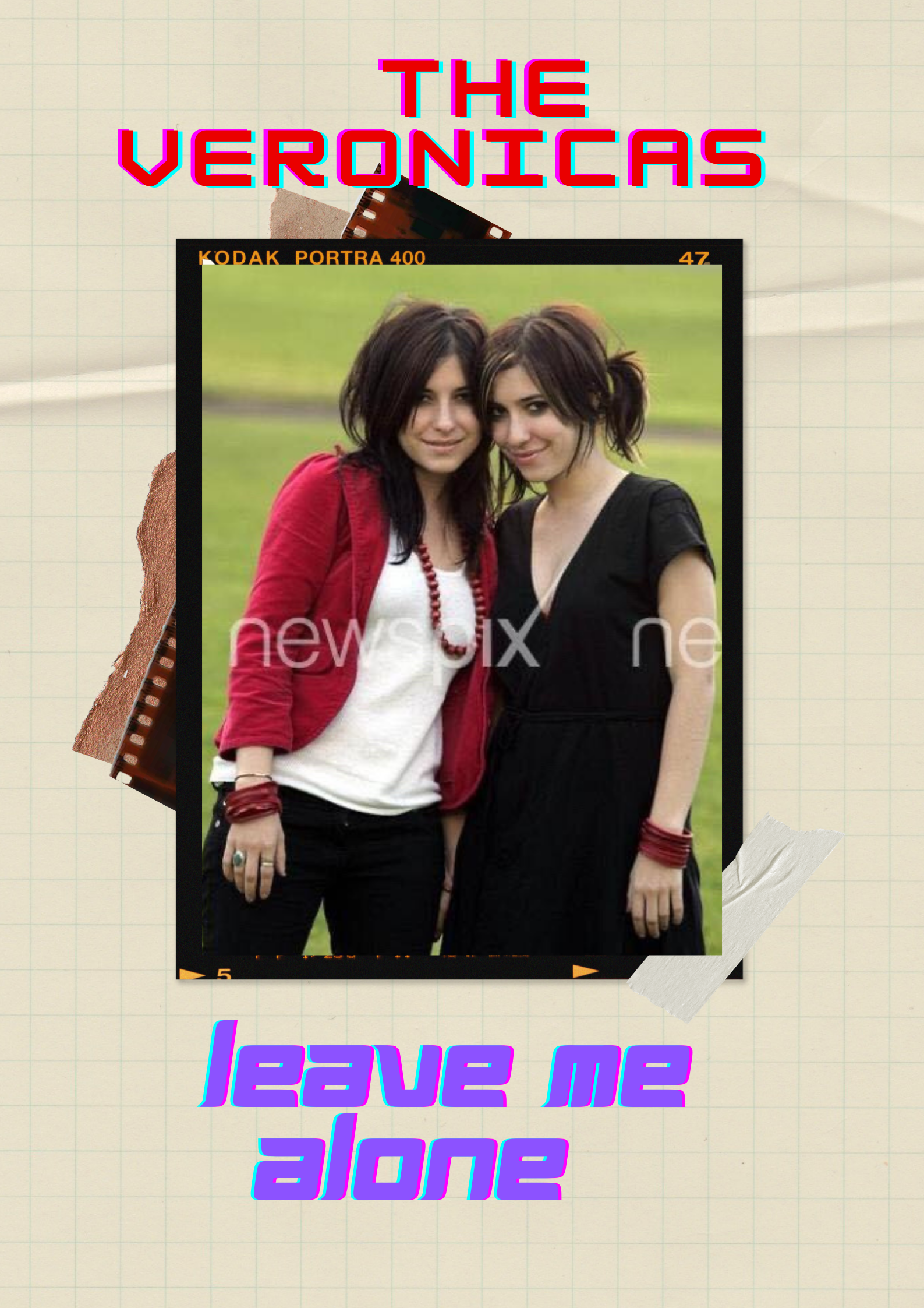
Oooh, I like that background! Although couldn’t tell if those were trees beyond the lake or a city  Not a big deal. One thing though, not sure if you need the shadow behind the title. It looks a bit disconnected from the cover. What would it look like without the shadow?
2 Likes