Woah, this was the first time you’ve tried manip? It doesn’t look like it. They’re really cool!
3 Likes
I would give you feedback, but I’m guessing I shouldn’t since it’s my cover contest lol
3 Likes
Thank you so much! <3
3 Likes
THAT. IS. AMAZING.
1 Like
i must know what fonts you used
1 Like
UMMMMM… I made it myself~
I basically destroyed Apple SD Gothic Neo (the A’s are edited by me as opposed to built in) and flipped the K. The subtitle is what the font looks like unaltered (less kerning tho).
The author name is in Kannada MN, unaltered.
If there’s one thing you can’t do in photoshop, you probably can’t make an A a J in mere seconds without using backspace.
1 Like
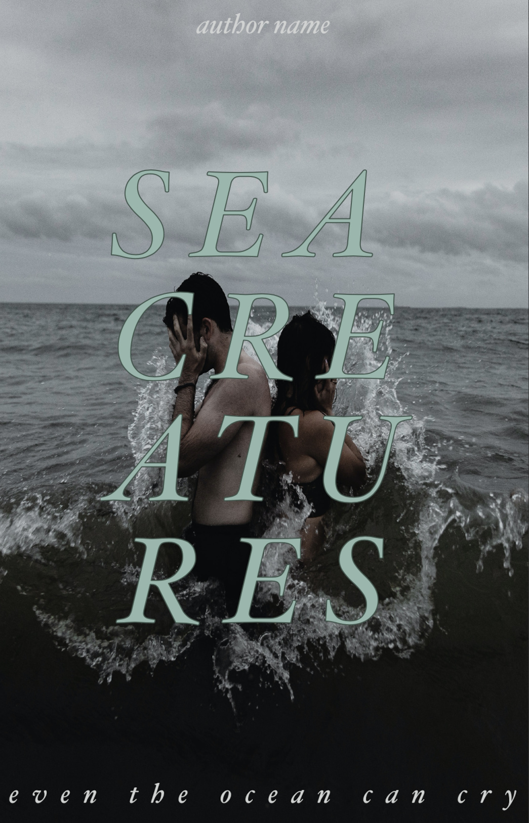
On the first one big thing i notice is that SEA is not lined up with the rest
Other than that its not a bad cover 
2 Likes
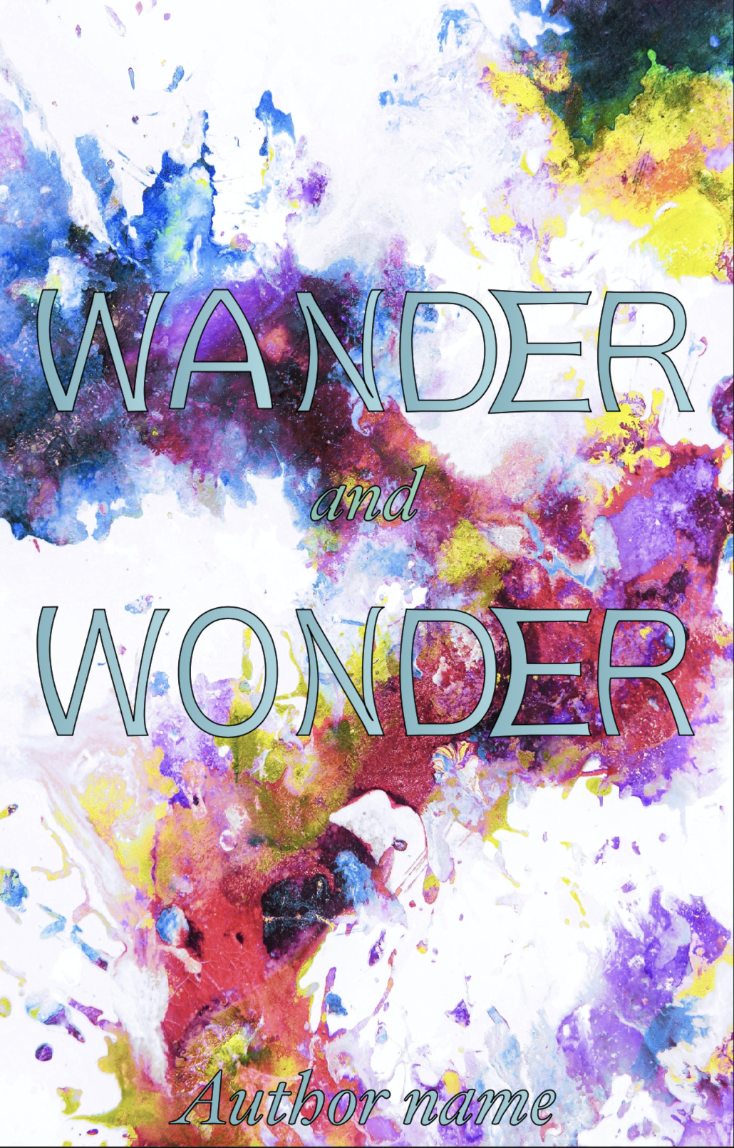
OoO THATS GORGEOSU
what fonts did you use?
2 Likes
Thank you so much! <3
I used atline otf for the title and vanadine bold for the subtexts <3
1 Like

looks so cool!!
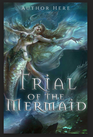
The last word is very close to the edge though
1 Like
yeah i should fix that, tysm
2 Likes
REMINDERS TO EVERYONE POSTING, PLEASE REMEMBER TO GIVE FEEDBACK TO THE PERSON BEFORE YOU BEFORE POSTING YOUR OWN GRAPHIC. WE ALL WANT FEEDBACK AND WE ALL WANT TO GROW
@anon25068527 sky crystals - I like the graphic overall, the text placement is a little weird, i would suggest centering 'sky’and moving ‘crystals’ below it
cursed countess - all the elements need to be blended together so it wouldn’t look like you slapped everything together. I am also not a fan of the font? Try wrapping the title around the knife
dreamland - Try experimenting with font combinations.
alaska - I like the font you’ve used for the title. the subtitle below and the author name’s placing are a little weird, a two line subtitle above and the author name below would do
sea creatures - I like this overall, try experimenting with placements? Like maybe erase some parts of the letters to make it look like it’s wrapped around the models
wander and wonder - The background and font choice + color don’t match? Try using other fonts and colors
@dark-shadows dude those are amazing O.O
@dumplingbabe ginormous improvement jade! Also I’ve already given feedback to some of those 
@merinnie ooh love these. I do have one minor comment on the fame circle, please limit yourself to 2 fonts per graphic unless it’s a typography
@trappedinabooknook I already gave feedback on this right? i can’t remember. Also! pretty! Blend the model more to the sea by erasing some of her skirt at the bottom?
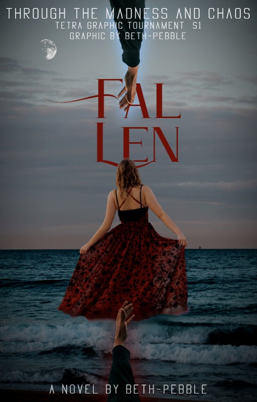
@Manya707 oooh pretty graphic! I’m with beth on the title touching the edge of the graphic. reduce the author name size?
6 Likes
idk if this is just me, but the ‘wander and wonder’ the ‘and’ and ‘authors’ name’ isnt that visible…
2 Likes
Thank you! Is there anything you would change particularly in regards to the manip one?
1 Like
I don’t use photoshop, people! I can’t do the wrapping suggestions given! > - <
1 Like
aahh gotchaa~ thank yoouuu~
1 Like