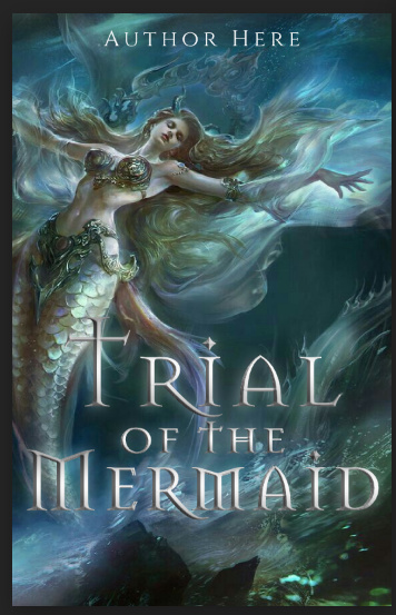
@anon25068527 i really like your first cover! a few things, though: ‘sea’ isn’t centered with the rest! and i can tell the image is squashed, you shouldn’t resize photos like that! also, maybe have the subtitle a bit farther from the edges :> for the second one, the author is a bit hard to see imo! @trappedinabooknook i like the vibe of your cover! but the glow on both of the arms don’t really work imo, maybe try a glowing outline instead? also, try and blend the skirt into the water a bit more! :] @Manya707 i don’t really think the spacing of the letters work here, i think your cover would benefit from the letters closer together! also, it’s really bad to have text cut off by the edges, like ‘d’ and very slightly ‘m’ are! and maybe have the author beneath the title to have a more cohesive composition, but other than that it’s nice :]
some recent stuff;; the banner is the first one i’ve made in like a year lol. i usually go for a very realistic-irl-book cover style so i tried to go back to a more wattpad-y graphic style, not sure if theyre good tho
@dark-shadows Love the first siren, maybe fix the lighting from above to the models. As for the Eden’s garden, maybe add inner glow to blend it to the background more
@anon25068527 you can always use the eraser tool and erase some of the text, you don’t have to use ps to do that
aa thank u!! ive been the opposite somehow this past week i just got a blast of motivation and idk where it came from;; if i could give u some of that motivation i would
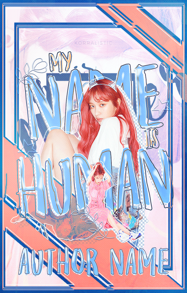
@Manya707 this image and text style go pretty well together! I do agree with some of the suggestions already made, like maybe tweaking the letter spacing to be closer together if possible
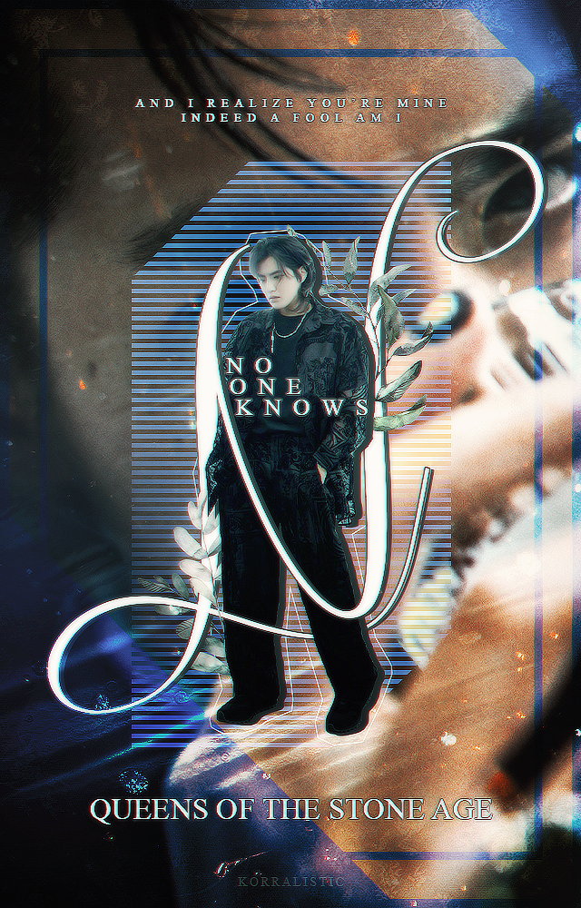
@korralistic yo I just plain love these, idk where you people get your creativity & motivation. if I were like forced to find something to nitpick, I feel like my eyes don’t easily know where to focus on the banner and hey, you like queens of the stone age?
@terraxxa I really love those! im bad at giving critiques sorry but for the bottom left one maybe you could have squatted down so that the proportions were more even, ive seen most pros do that o.o rather than a standing position
@terraxxa Very beautiful! I think with a bit of Lightroom work, they would look close professional stock images.
@Manya707 definitely looks better than before. Personally, with the font, I think it would look better if the T and M are not capitalised. I think it makes the component looks a little unbalanced. But that’s just my preference!
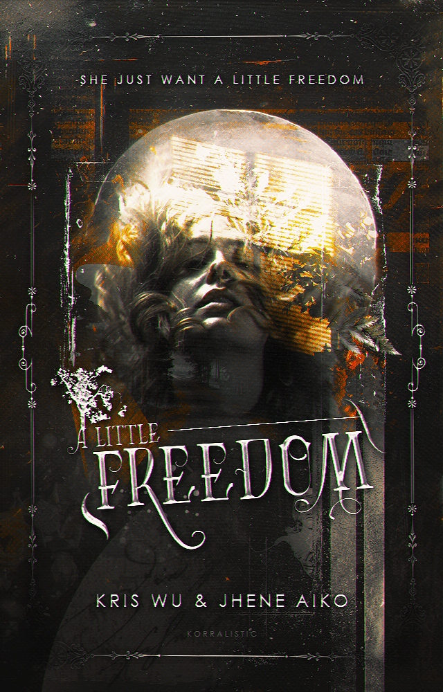
@panaceia THANK UUU i am spiritually sending all of my motivation i hope u receive it @terraxxa tysm!! trust me i have no creativity i just open a canvas with either a “ooga booga light cover” or “ooga booga dark cover” mindset then randomly slap pictures and textures till something clicks LOL. it’s my first banner in a very long time so i’m definitely rusty on composition ^^;; hopefully i’ll improve a few more banners down the line! also, your photos are gorgeous :’)
and yes!! atm only old 2000s queens, i really need to listen to their recent stuff but i found them from their songs for the deaf album so that’s all i’ve been listening to;;
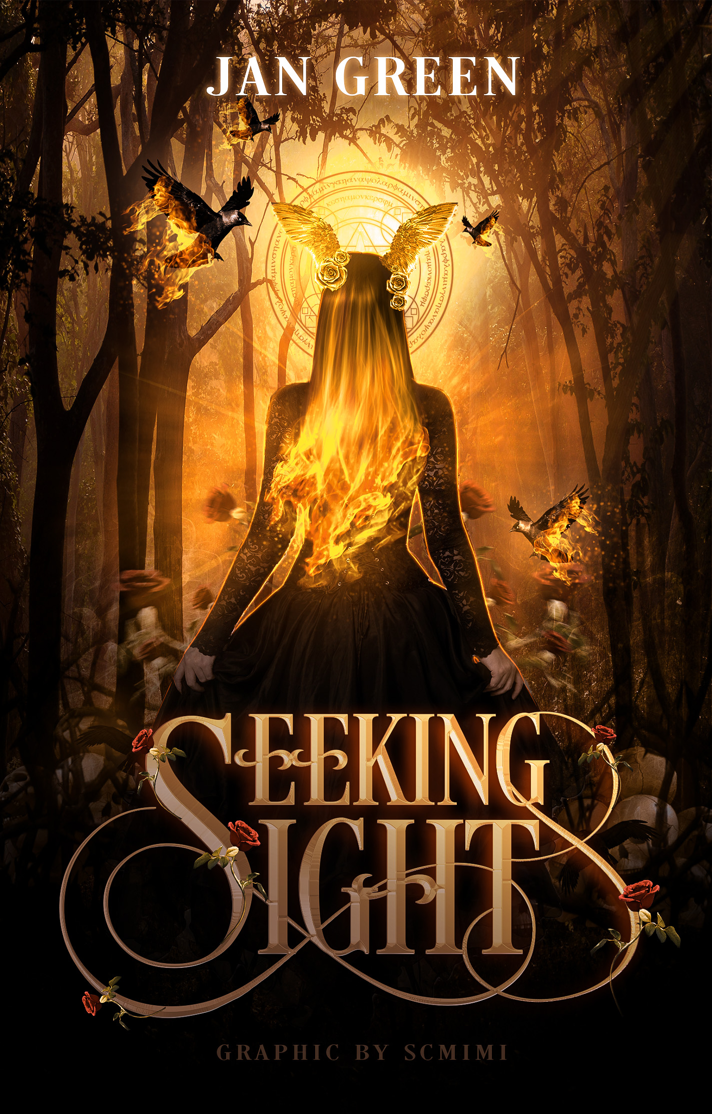
@Manya707 thank you!! :’] @scmimi coming from u that’s a compliment of the gods thank u sM !! your covers are beautiful as always but the only thing i wanna say is maybe less/no gradient on ‘seeking light’ ;o?
@Manya707 Thank you! For the first one, I used Trajan Pro and for the second one I used Desire Uppercase, but I modified it myself by adding the swirls.
@korralistic thank you, I’m very flattered >< and I’ll def get that fixed! My PC was on full brightness, but now that I’m on my phone, it does look really dark.
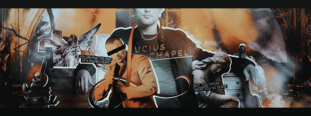


 I saw the other graphics you posted