I think they meant to respond to @Novel_Worm ![]()
Instead of working on my red witch girl, I made this. Does one or the other look more dystopian fantasy? Does one or the other look like the better cover? Thoughts on either?


2 Likes
No, everyone in general haha. It was just late when I wrote that and i wasnt sure what i was trying to say since it was right after designing and way past my bedtime. ![]() I was looking for feedback just from anyone who had some.
I was looking for feedback just from anyone who had some.
2 Likes
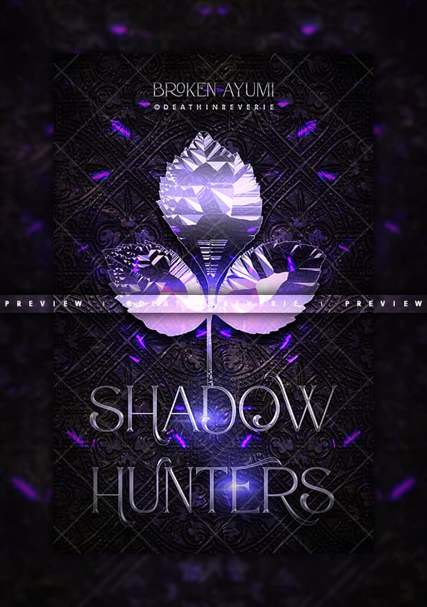
The first version of broken is so lovely! ![]() It’s simple, and yet the colour combination and layout of the text absolute has my heart XD.
It’s simple, and yet the colour combination and layout of the text absolute has my heart XD.
The second version doesn’t give me as much of an angsty vibe so yeah … also, this is a general rule of thumb but never use script fonts for subtitles/author names etc.
Fated Desires has a really lovely layout, but I do think you could have given more focus to the lighting. ![]() So, the wolf will be backlit, and the girl frontlit. You could up the contrast, increase the moon’s glow and darken everything else before using curves for the highlights on the girl’s hair, the upperparts of her arms falling inwards (if that makes sense) and on the wolf’s fur.
So, the wolf will be backlit, and the girl frontlit. You could up the contrast, increase the moon’s glow and darken everything else before using curves for the highlights on the girl’s hair, the upperparts of her arms falling inwards (if that makes sense) and on the wolf’s fur.
As for When Our Stars Collide, once again, nice layout. Some lighting and depth work here could really pull things together. That swirling thing in the sky (which could be centered imo) can be casting blue light onto the tops of the manor and on the grass. Since the light’s coming from the back towards the top, the manor should be casting a shadow onto the grass.
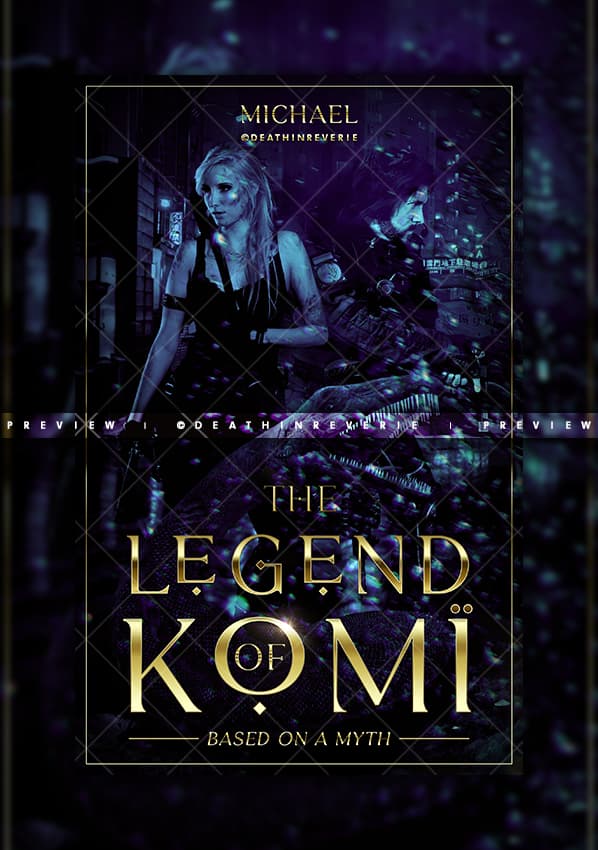
@TheTigerWriter post | Honestly, neither give me dystopian fantasy vibes. ![]() I find both to have more of an urban feel. But here’s stuff a little more in-depth:
I find both to have more of an urban feel. But here’s stuff a little more in-depth:
You’ve got a lovely colour scheme for the first version, and I think here you could have really made gradient text pop. ![]() As for the girl, she should have just a touch of light from that backglow on the inside of her, if that makes sense.
As for the girl, she should have just a touch of light from that backglow on the inside of her, if that makes sense. ![]() I think the gray suface at the bottom of the cover is a little out of place, so maybe darken that to be more towards black, and that also would make those purple swirls pop more?
I think the gray suface at the bottom of the cover is a little out of place, so maybe darken that to be more towards black, and that also would make those purple swirls pop more?
The second version also really cool colour scheme, but the top part is kinda unbalance imo. There’s too much of an overlay kinda darkness there, so maybe you could either remove it for a gradient or stretch it out so it spans both top and bottom evenly? Nice text effect, but I think Shadow should have that yellow glow and Glowing can have the blue at the top, so you’ve got an alternative effect. Shadow kinda looks empty rn in comparision with glowing. And I think you can move the subtitle to be at the top.
2 Likes


5 Likes
Thanks for the suggestions ![]() It is an urban dystopian fantasy, so I guess I need to work on the dystopian fantasy part of it
It is an urban dystopian fantasy, so I guess I need to work on the dystopian fantasy part of it ![]()
I wanted the gray to look like ground that she was running out into. If she’s running out to it, maybe there should be something in the forefront? Or maybe the ground should have a purple hue fanning out because the light behind her is shining on it?
I debated on this. Shadow did feel kind of empty, but I wasn’t sure if putting any glow on would actually complicate the cover. I’ve been in weird phase of overcomplicating covers recently and trying to get out of it ![]() Your idea of putting yellow glow on Shadow and a blue tint on Glowing is a great idea
Your idea of putting yellow glow on Shadow and a blue tint on Glowing is a great idea ![]() I’ll try that later.
I’ll try that later.
And yes, the subtitle, idk why I ended up putting it down there. I did have it on the top initially then moved it to the bottom to fix the gradient on top. Forgot to put it back. I think my brain saw it on the top when saving it XD
No problem!
Hmmm … It should definitely have purple highlights because of the light, but I think for it to look more like ground, you could add some kind of texture? And using that texture, create shadows where the light doesn’t reach and all. I don’t know what you could put in front of it, other than to add a bit of motion blur to the girl to show she’s running. ![]()
I get that, I tend to overcomplicate things myself XD All the best with the text!
![]() Totally understandable
Totally understandable
1 Like
Sorry about that long title ![]() But you did such a beautiful job!
But you did such a beautiful job!
1 Like
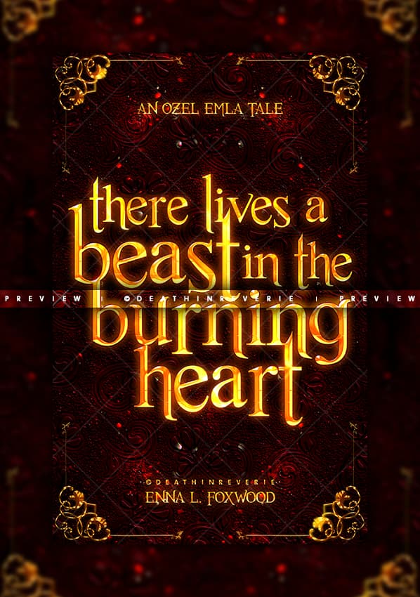
Oh, it’s a very interesting title for sure! My problem was figuring out how to have it styled without spoiling the dagger’s look XD And thank you so much! <3
1 Like
Both versions came out awesome ![]() Thank you for tackling the long beast of that title XD Now you can add on your resume: “Tackled long beast of a title. Made it out alive.”
Thank you for tackling the long beast of that title XD Now you can add on your resume: “Tackled long beast of a title. Made it out alive.”
1 Like
Thank you! ![]() Also, that’s a fab idea
Also, that’s a fab idea ![]() I’m definitely doing so!
I’m definitely doing so! ![]()
1 Like
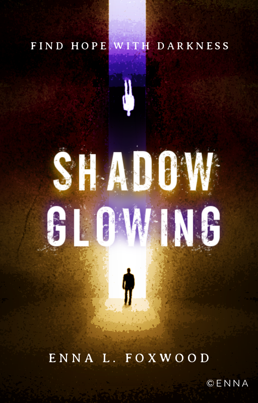
I find the font out of sync with the rest of the cover, honestly. It gives total 2010s era dystopian vibes, while the background gives me more of a contemplative apocalyptic book vibe. I think you could swap the font for something that’s elongated and thin and then keep the text effect you have going on at the moment - that could really elevate the cover.
I’d also suggest using a sans serif font for the subtitle and authorname.
Perhaps you could also pull the image down so that the man in the yellow portion starts off the bottom and it forms a column of interest to the top.
If you really want to elevate the fantasy feel, you could give the background more purple swirls sort of things which coelace at the centre of the column of light, giving it some sort of depth, as well.
1 Like
Lol, it’s definitely a 2010s story XD I’m not going to use the cover for the story, but I thought the alternating colors and the upside down people were kind of unique looking, so I’ve continued to mess with it ![]()
The font comes with the text effect, so I can’t really do much with that ![]()
I could definitely mess with some swirls though. I’ll have to go and discover some good ones in stock later ![]()
1 Like


I’m so sorry I’m never any help when it comes to feedback on other covers. Honestly, since I’m just learning I usually look at everyone else’s covers and can’t think of a single thing that’s bad about them. XD. So It’s hard to give critiques and feedback. ![]()
Holy crap these look so much better on my phone then on the conputer version.
2 Likes
Preetttyyyy
1 Like
Feedback can be hard to give, don’t worry <3
Looks great.


Just a casual dump of stuff bc I haven’t been here in a long while kekw did the forums get an update bc i cant see any of this in the pane next to it to make the images smaller :x


Hope everyone is well and doing good <3
4 Likes
Both of these are very clean but there’s a couple of things I noticed. The first one, she’s got a drop shadow effect, which isn’t quite realistic.From what I can see, the light is coming from the left so her shadow should be stretching out on the ground to her right. Also, maybe move her layer behind the fog/smoke or brush it onto her, so it seems she’s a part of the scene?
The second one is interesting, but I don’t get the point of that little path around the model. Is it intentional? And if it’s possible, maybe you could try centering the model?
You don’t have to give feedback or a critique per se, just your general thoughts will do. ![]() I doubt people dislike compliments either XD
I doubt people dislike compliments either XD
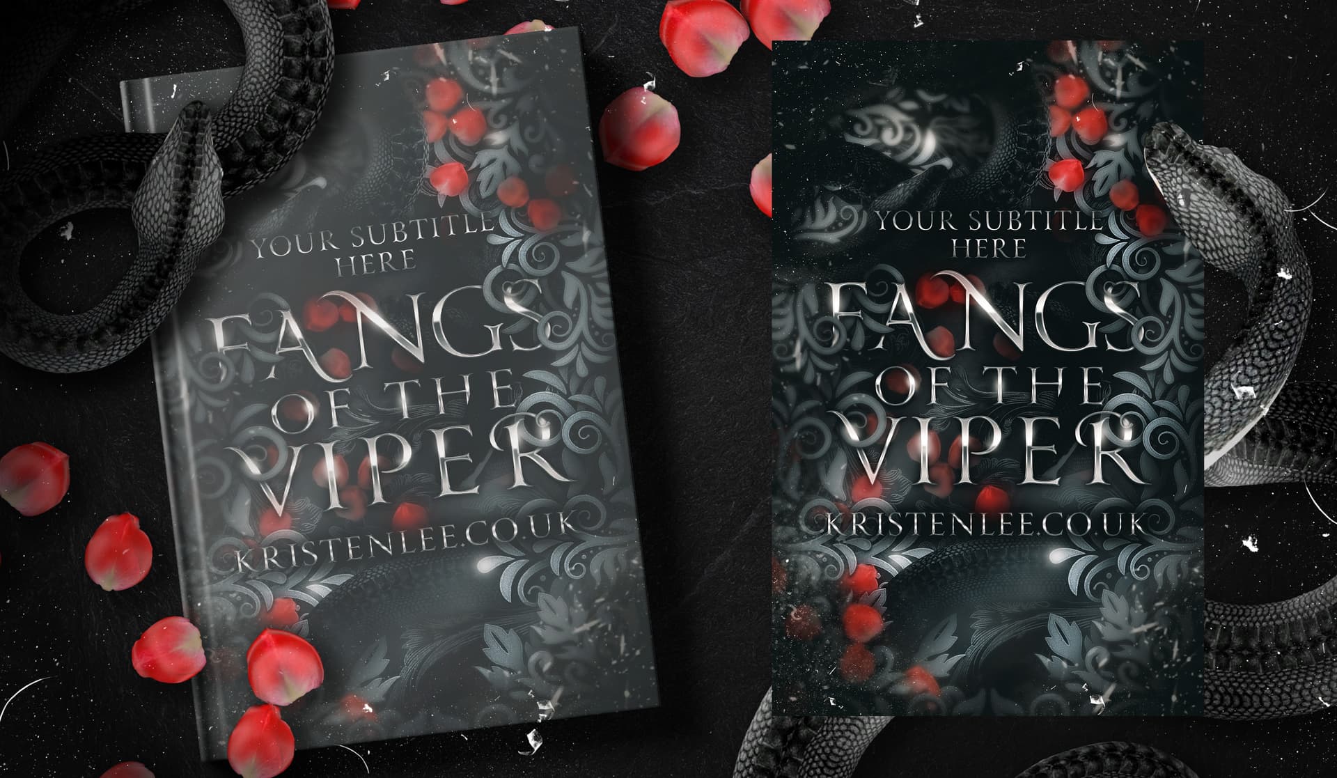
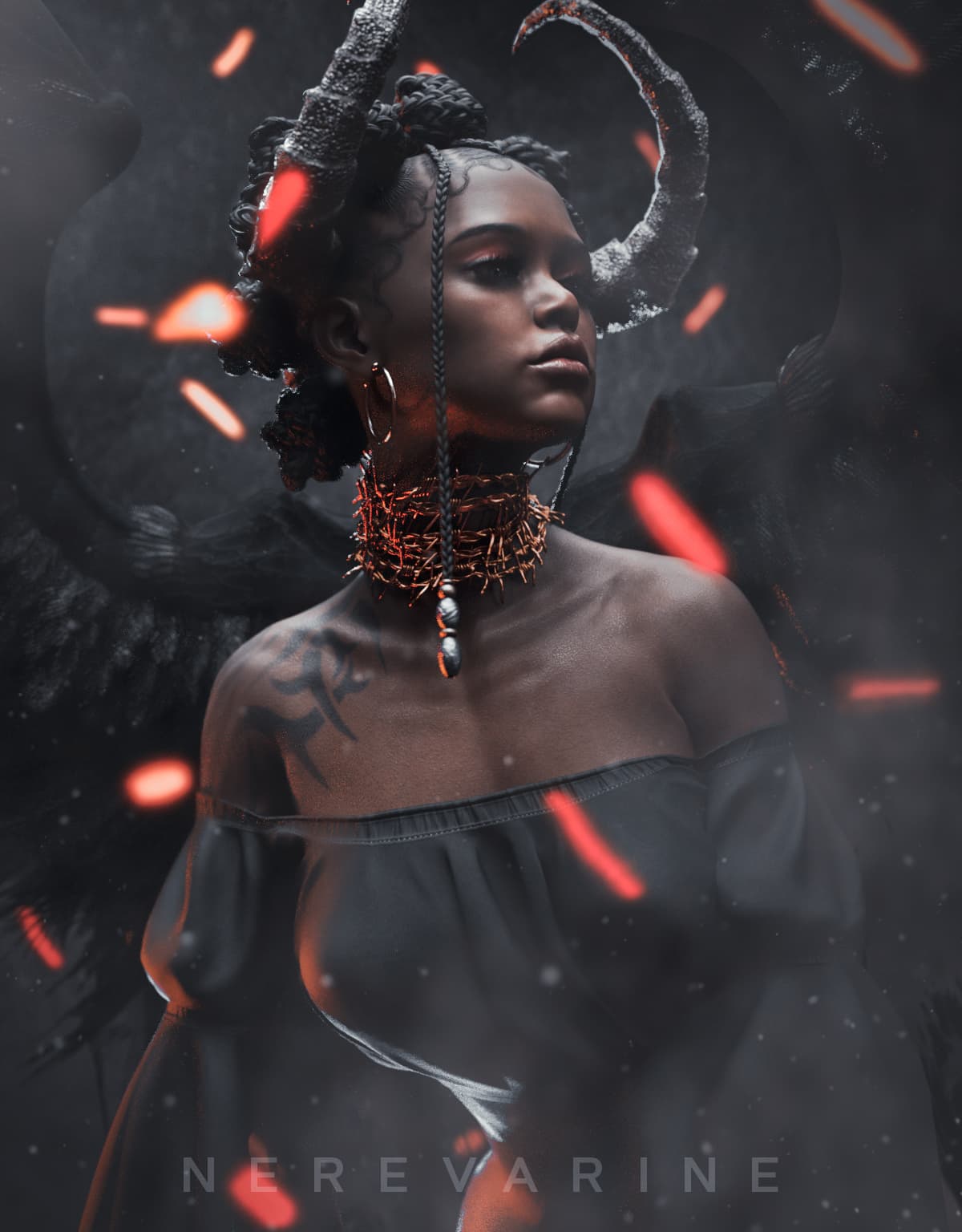
I need The Band Of Majesty and Fangs Of The Viper on my shelf. ![]() And your art is just chef’s kiss Especially the demon girl one
And your art is just chef’s kiss Especially the demon girl one
1 Like