You’re getting there! I think you could do it darker on the bottom though.
I also use the free version of Canva sometimes. I think in Canva, there’s a way to darken or make lines clearer? If you go to Edit Image and if you click on Adjust, there’s a way to increase “Shadows” which will, hopefully, only increase the shaded parts of the bottom photo. Then you might adjust “Clarity” or “Highlights”.
It’s good if you’re just starting out that you mess around with all the adjustments you can make to see what each of them do. Slide that dot to the highest and the lowest and see what they do. Experimentation is key to improving
If you’d like, I have a critiquing service where we can talk a little more about the cover instead of using a lot of space here. If I can get a more overall idea of where you want to go with it, I think I can give a few nudges and I’m pretty familiar with Canva (and the limitations of the free version )
Although, I do feel like the “As” has slightly blended too much into the background. It’s right over the leaves which is quite dark. The rose really stands out and I feel like it out shines the “As” a little bit bringing my eyes to the white of the rose and not the words. That white on the rose can maybe be a little dimmer?
First of all I am so sorry for the late reply, I meant to reply to this earlier but procrastination and Discord hit so whoops
Oooh, didn’t know script fonts (those cursive ones basically right?) shouldn’t be used for subtitles and author names I’ll note that for next time.
Oh and fun fact, the first cover for Broken was made almost entirely on Canva. I just used PhotoScape X to cut out a silhouette of the man and then paint black over the text so the silhouette outline would be more clear and all the second cover was made purely on Photoshop as a challenge since I still hate using it a lot XD
Oooh got it got it *notes things down* forgive me for my noob question but how do you do lighting? I just brighten one part and darken the other part and hope that it makes sense, and maybe add shadows
Oh yeah, you got a point. This was one of my first “manips”—they used to be PNG stacked on each other with text slapped onto them—and I guess I could’ve paid more attention to that looks like I need to work more on lighting
Yep, the curly ones XD and it’s not good practice because to people, especially in thumbnail view etc., those small subtexts aren’t going to be easily legible.
As someone who is a pure PS user, I can tell you that you will, with enough practice, be confident to work entirely in PS and enjoy it someday!
It’s not noob for sure XD Lighting is very difficult to get right, and especially easy to mess up. I’m only going to be able to give you tips in Photoshop, but I hope they’re helpful XD Not particularly geared towards the design though, just general tips. Stuff like curves and levels adjustments layers are my go-too for these kinds of thing, and this is for plain lighting (ie no colour or something). Let’s say it is coloured (not sure if you’ve seen my Crimson Masquerade cover but here just for reference) I’d use a solid colour fill layer and choose the colour of the lighting I need. Add a layer mask to the layer, fill it with black and then paint using white on the mask itself. The example I’ve shown is backlighting (still not perfect/accurate enough though ), which is why the light only touches a little on the inside of the model, but the edges are harsh. I believe eggyeuls has got a really insightful guide to lighting in her designer’s guide in the chapters lighting, and lighting theory. There’s references there as well to how light affects shadows and highlights dependent on its source.
Ah no worries! Manips can be a pain since you’re sourcing so many different resources to make one seamless composite so take your time! PIXimperfect has got really good videos about lighting, composition and PS in general on his channel on YouTube, so give those a watch if/when you can! <3
Oooo Didn’t consider that for sure XD I was more pained over the fact that the rose wasn’t turning out the way I wanted lol I’ve already sent this in, but I’ll keep this in mind for any similar work I do in the future! <3
Hey Everyone! I have a quick question for you all!
I have this logo that is big in my WIP, but I’m trying to make it fancy looking… Below I have the logo that was made for me about a year or so ago… But I want to see if anyone you know how to make it look fancy like the second photo.
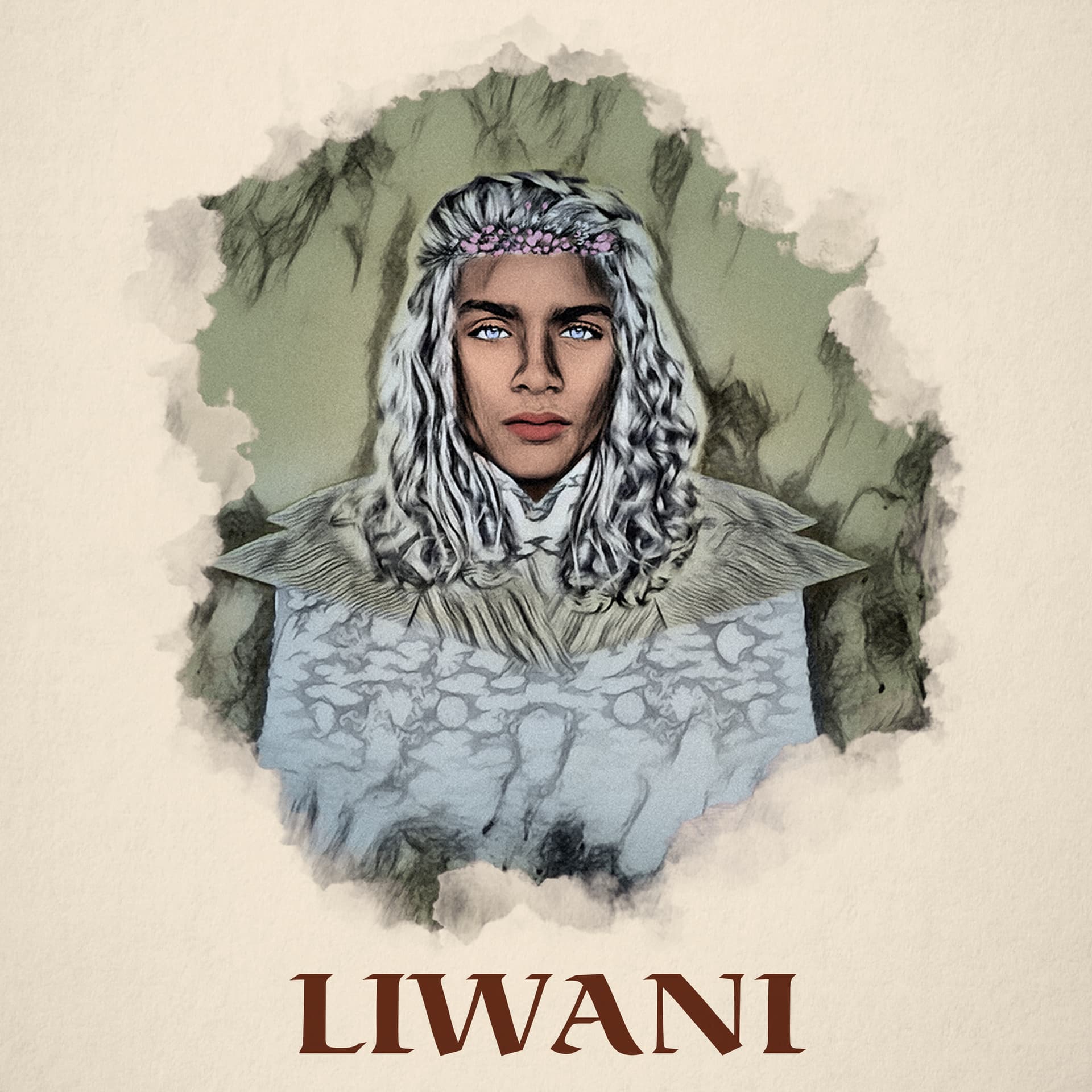
Got some new character design for my character Liwani (did the new one with some help with AI art initially for some broad/generic visuals, then changed the face and hair with faceapp and photoshop + added the snake necklace to look like my character).
Here’s a comparison of my old vs new art for Liwani:
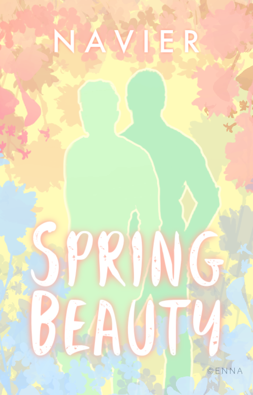
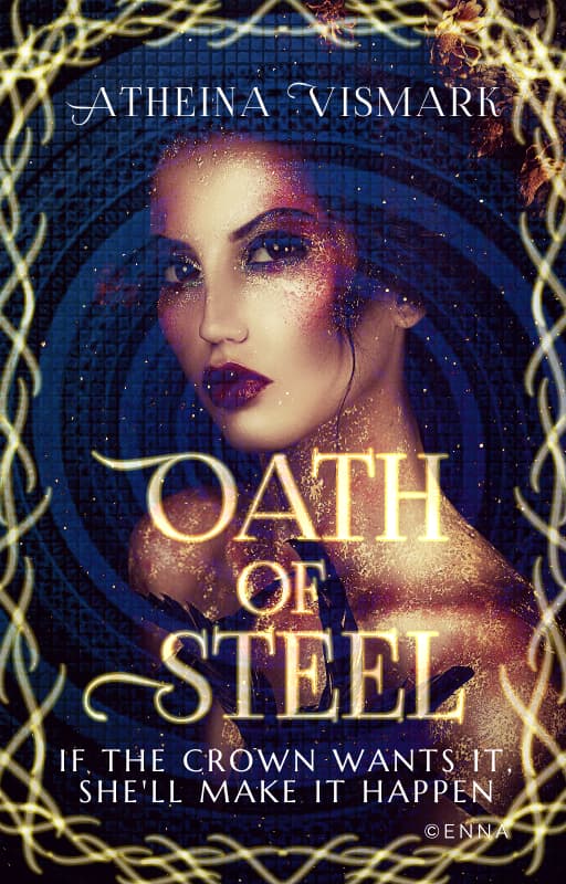
post | These are both very interesting concepts! I personally feel there’s too much going on in “Spring Beauty”, and the silhouettes don’t seem to be a part of the background. Also, those darker splotches? of leaves add a kind of jarring effect to the whole cover. As for “Oath of Steel”, I think the girl is over-blended. She looks lovely, I really like that gorgeous glow/starry effect on her skin but seeing how she cuts off by her shoulder and then her head throws me off. Also, I think the border makes the cover look too crowded and the subtitle is a little too big imo.
post | So cute! This one looks really good and kinda middle-grade fantasy tbh
@AGardenofBlood | post | You don’t have to now XD The new version is definitely stunning! I do think you could add a little more texture to his skin though, specifically the forehead and lower cheek areas, and maybe colour tone the forehead and the undereyes as well. His chest colour also seems to be a little too light as opposed to the rest of his skin. And for realism, a bit more of a shadow from the snake and crown on his skin and hair respectively!
Why are your covers so beautiful, Shreya? They are just so pretty.
The only one I have something to say about is Crimson Masquerade. The red text version is hard to read. For both, my eyes are confused at what I’m looking at. Is the figure holding a club or a bat or a chainsaw the wrong way?
I also can’t tell what the two white spots on the front skirt part are supposed to be. I was recently watching this artist on YouTube making sculptures and his style is to add a prominent bottom and that just reminds me of that
The person looks like they’re floating, too, because I don’t see their legs. Even with the text there, I would think you would see some of their legs.