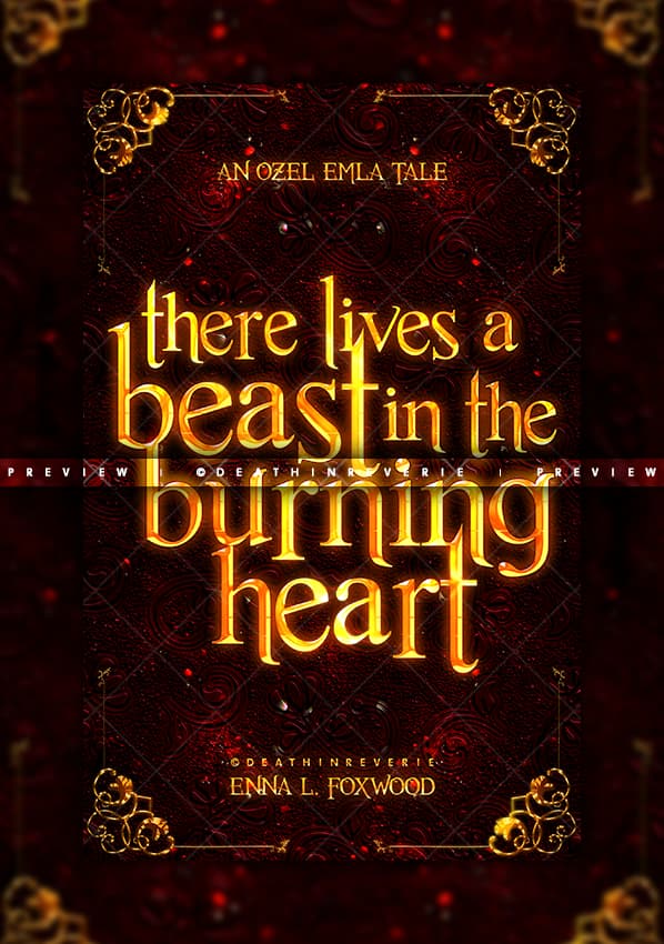
Ooof haha, so this clearly isn’t the one XD
In Moonlight Oaths, there is something slightly feeling off about the guy. It looks like his neck his attached to his collar. I think maybe the line of his collar should be harsher and maybe cast a shadow on his neck?
I love of “A Siren’s Plea”! I can’t do that kind of effect in PicMonkey, so I envy you ![]()
![]() It seems so obvious now that you mentioned it XD Thank you! I’ll work on fixing that up soon <3
It seems so obvious now that you mentioned it XD Thank you! I’ll work on fixing that up soon <3
I honestly love making this effect XD But if you’re ever interested in trying it, definitely try out Photopea, or if you don’t mind paying, PS. ![]()


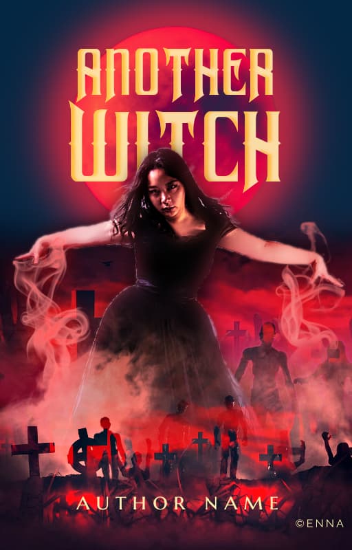
I still can’t seem to get this cover just right for this book series, but I was curious if this one was better, or what the feedback was on this one. I appreciate all of your help in this thread. I feel like you point out things that I wouldn’t usually see. But I like the way this one turned out a lot better than the last one I posted.
I think honestly if you just removed the model from the cover completely it’s a really awesome cover! The details in the smoke are so cool with all the crosses and people. The colors are good too. ![]()


Thanks ![]()
Is there a way I could do something to keep the model? If I were to keep the overall idea of the cover but still have the model there?
So, there are a couple of things that stand out to me as awkward in this.
details
(1) The model:
She’s definitely front and centre of the frame, but she stands out - a bit too much, I would say, because my eyes go right to the gun after I see her, and then expect her body to extend below it, which it doesn’t. Another issue is that the background in focus has a perspective, which doesn’t match with either the model or the gun. (but we will talk about that later)
And the girl doesn’t quite match the tone of the rest of the cover. IF she is supposed to be there as a part of the scene, is it possible to alter her coloring so that her hue is slightly cooler?
Also, did you do the cutting of the model yourself? That hair looks amazing!
(2) The gun and the hand:
This is pretty well placed, actually! Great idea on placing the title! Also, the gun doesn’t stand out from the background on the side without the hand. You might want to consider doing something to make it stand out more.
(3) The title and author name:
So I love how you have placed the title! My only issue with this is that it does not catch my eye when I’m looking at the cover. You don’t want that for a cover. Perhaps remove the blur and try going for a distortion effect. Or a glitch sort of effect. Using distressed urban fonts might work, too.
(4) Composition:
I just want to say great job on the composition of the cover! It draws my eyes almost everywhere it needs to go (except the title).
Maybe you could give her a rim light? And have red smoke merging into her dress at the bottom?
I am so sorry, I thought I’d replied to this for the feedback but apparently not :’)
I love the theme you have going on here, but there’s too much going on in the cover, and everything is screaming for attention. First off, the model’s lighting does not match the cover as a whole, and that drop shadow effect she has makes her seem even more out of place. I’d suggest adding some kind of smoke overlay to her edges if you can’t manually adjust her lighting, or just tone the edges down a bit, colour it more red and try to add in some light sources for the lighting. The double-exposure effect of the cemetery, the people and the model isn’t evenly done/faded out well, so this kinda throws the cover off balance again. I’d suggest enlarging the people and cemetery, then using a soft brush or something to fade that up and out into the girl. The moon’s glow is kinda artificial, but if you can use that as lighting then make the moon bigger, soften the glow and blur it out so you can use that for the model’s source. You’ve got a bit of dark blue in your cover, so I think for balance and a little variety, you can use this for the title and fade it in for something brighter maybe?
Thanks! I’ll try that ![]()
Heyo, I was just wondering whether you were referring to a specific person’s feedback in your post? ![]() The way you word it seems so to me, but I’m not sure since you haven’t tagged or direct replied to anyone.
The way you word it seems so to me, but I’m not sure since you haven’t tagged or direct replied to anyone. ![]()
I think they meant to respond to @Novel_Worm ![]()
Instead of working on my red witch girl, I made this. Does one or the other look more dystopian fantasy? Does one or the other look like the better cover? Thoughts on either?


No, everyone in general haha. It was just late when I wrote that and i wasnt sure what i was trying to say since it was right after designing and way past my bedtime. ![]() I was looking for feedback just from anyone who had some.
I was looking for feedback just from anyone who had some.
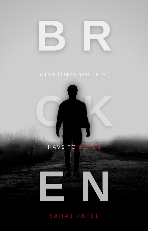
The first version of broken is so lovely! ![]() It’s simple, and yet the colour combination and layout of the text absolute has my heart XD.
It’s simple, and yet the colour combination and layout of the text absolute has my heart XD.
The second version doesn’t give me as much of an angsty vibe so yeah … also, this is a general rule of thumb but never use script fonts for subtitles/author names etc.
Fated Desires has a really lovely layout, but I do think you could have given more focus to the lighting. ![]() So, the wolf will be backlit, and the girl frontlit. You could up the contrast, increase the moon’s glow and darken everything else before using curves for the highlights on the girl’s hair, the upperparts of her arms falling inwards (if that makes sense) and on the wolf’s fur.
So, the wolf will be backlit, and the girl frontlit. You could up the contrast, increase the moon’s glow and darken everything else before using curves for the highlights on the girl’s hair, the upperparts of her arms falling inwards (if that makes sense) and on the wolf’s fur.
As for When Our Stars Collide, once again, nice layout. Some lighting and depth work here could really pull things together. That swirling thing in the sky (which could be centered imo) can be casting blue light onto the tops of the manor and on the grass. Since the light’s coming from the back towards the top, the manor should be casting a shadow onto the grass.
@TheTigerWriter post | Honestly, neither give me dystopian fantasy vibes. ![]() I find both to have more of an urban feel. But here’s stuff a little more in-depth:
I find both to have more of an urban feel. But here’s stuff a little more in-depth:
You’ve got a lovely colour scheme for the first version, and I think here you could have really made gradient text pop. ![]() As for the girl, she should have just a touch of light from that backglow on the inside of her, if that makes sense.
As for the girl, she should have just a touch of light from that backglow on the inside of her, if that makes sense. ![]() I think the gray suface at the bottom of the cover is a little out of place, so maybe darken that to be more towards black, and that also would make those purple swirls pop more?
I think the gray suface at the bottom of the cover is a little out of place, so maybe darken that to be more towards black, and that also would make those purple swirls pop more?
The second version also really cool colour scheme, but the top part is kinda unbalance imo. There’s too much of an overlay kinda darkness there, so maybe you could either remove it for a gradient or stretch it out so it spans both top and bottom evenly? Nice text effect, but I think Shadow should have that yellow glow and Glowing can have the blue at the top, so you’ve got an alternative effect. Shadow kinda looks empty rn in comparision with glowing. And I think you can move the subtitle to be at the top.