Thanks for the tips ![]()
1 Like
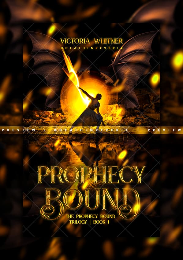
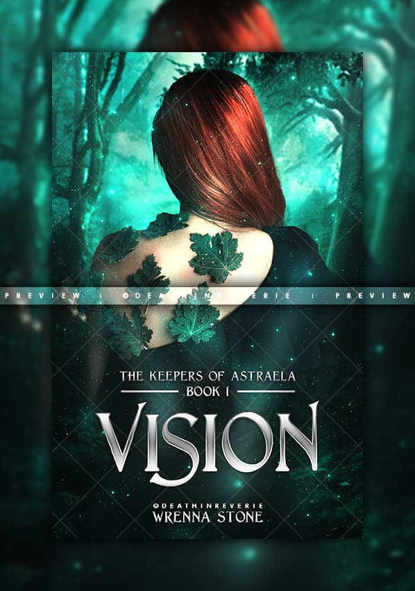
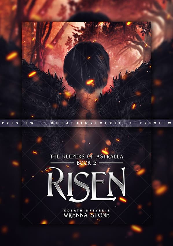
I absolutely adore the second versions of The House of Vortex. I could only dream of doing something so good.
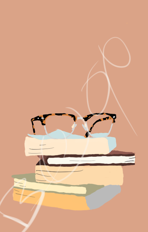
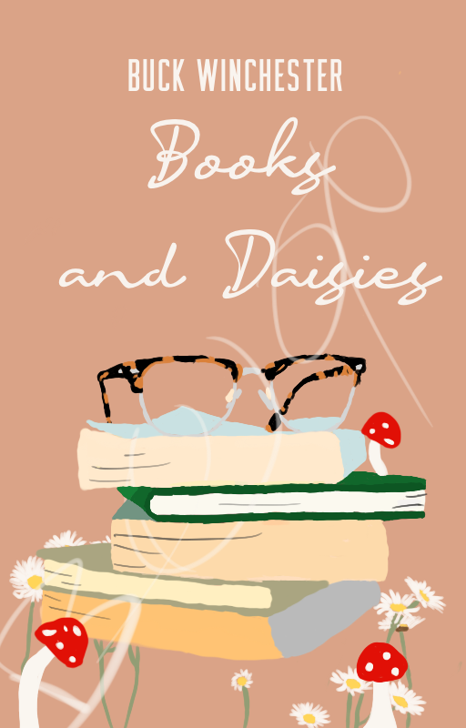
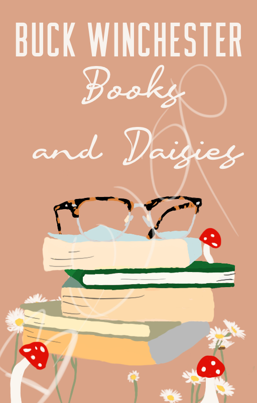
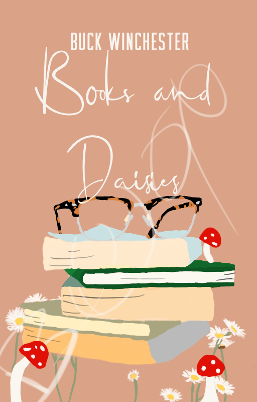
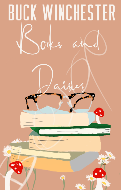
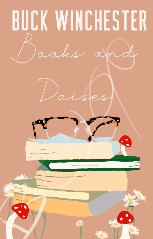
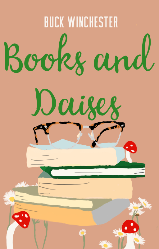
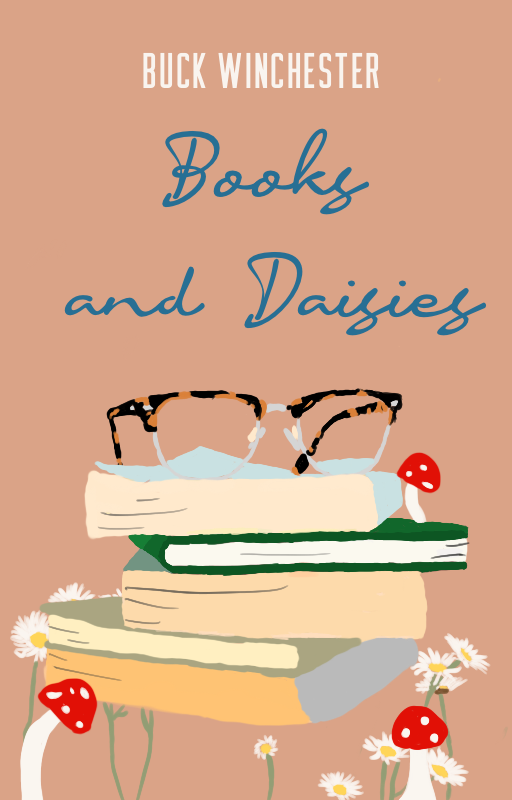
I really need some help with this wip cover. I feel like everything I add to it or change just doesn’t work out. The word boop is just to prevent people from taking it even though it sucks so I don’t know who would.
P.s. this is going to be for a na romance that has a lot to do with books and has cottagecore vibes. And I would love some font recommendations as well.
2 Likes
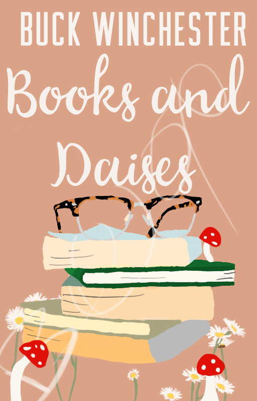
I’d say you got a good base to start with! Personally I’d decrease the size of and lower the books a tiny bit. I would put the author name at the top, centered, but not too close to the top edge (it’s generally much better to leave space between the text and edges) and place the book title big and bold in the center (with center alignment), but behind the books so it’s partially obscured.
As for the text color, I think the color could be the same as the color of the pages of the top book or other books (except the last one). The light color will contrast well with the background and match the elements too.
But then again, it all depends on how long the title is, different text and element placements could work ![]() but that’s the first idea I have
but that’s the first idea I have
2 Likes
Thank you! And honestly, practice really does make perfect lmao, so just keep trying! I’m personally satisfied with the level of my work rn for how little experience I have, but I’ve learned enough to know that there’s always room for improvement. I’ve got a loonggg way to go, that’s for sure.
1 Like
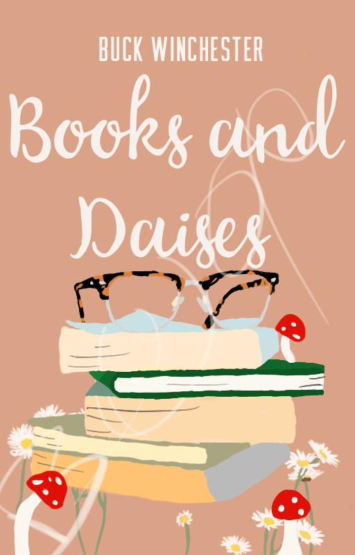
I had to research cottagecore for this since I forgot what that aesthetic looked like XD. Since I don’t really have a good grasp of that aesthetic, I’ll just give you my thoughts on technical aspects.
Dimension/perspective
Since the books and glasses are all stacked up together, it would make sense if they were casting shadows onto each other and the ground. As for the glasses, I’m not sure if it’s meant to be just the frame, but if you’d like, you can add some transparent glass overlays or a gradient overlay for the lens-reflection effect.Edges
Right now, the books and all have really rough edges, and happens when there are too many anchor points being used (for PS, that is). I think you can try adding some blur to the edges, or some for of smoothening/smudging to soften it out. If you are going for a worn-out look for the books though, I think textures would be a better option, or maybe just folded covers?Colours
This is more of a personal opinion, but I do think you could colour-code the books a little. Pale blues and greens would work really well with the colour of your background, and having them alternate in that stack would pop, in my opinion.Font
Definitely a script font, more calligraphy-style and preferably not something brush-like. Off the top of my head, I think Childish would work well. For the title, and like Stella said, styling it in such a way that it is partially obscured would work really well. I was also thinking that maybe you cou9ld have the letters closest to the stack looping through the glasses, and add a shadow for depth. For the author name, sans serif would work!
If you’re still stuck, looking at cover samples in your genre and aesthetic can really help. These are some I came across using the search “cottagecore romance”.


3 Likes
It’s so pretty! ![]() I like how there’s a color theme. Means that probably the other books in the series will compliment this one.
I like how there’s a color theme. Means that probably the other books in the series will compliment this one.
1 Like
Thank you! <3 The colour scheme was a pure stroke of luck XD
1 Like
Thank you. And yes there is supposed to be lenses I’m just trying to figure out how to add them as I’m using procreate.
This might just be me but I feel like the outline of the person should be a different colour. But at the same time it works so I don’t really know how I feel about it ![]() .
.
1 Like
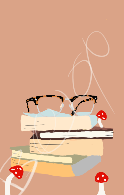
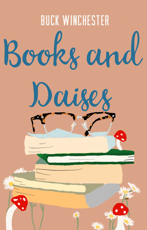
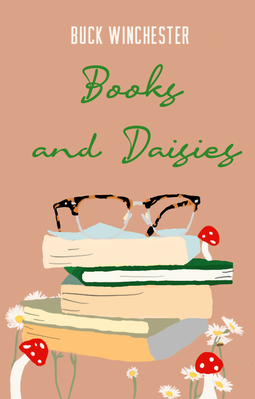
Well I added the title, author name, some daises and changed the colour of some of the books. Still need to make it look more clean, add lenses, possibly shadows and figure out which fonts and sizing work best.


lol, thanks, I guess? ![]()
My two cents lmao
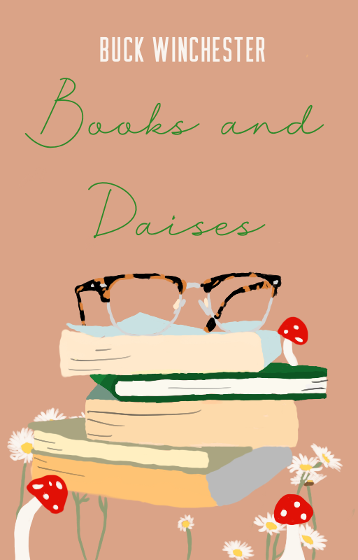
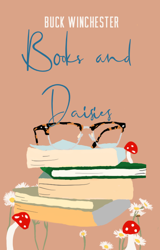
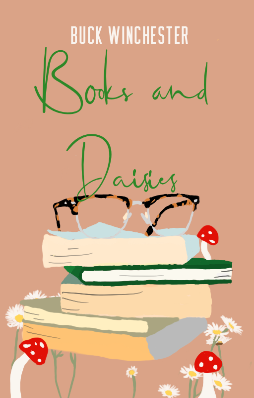
I think there’s a little too much going on in the cover right now, mainly because of the mushrooms and daisies. If you want to incorporate the daisies into the cover in some way, I’d recommend going for a patterned background set to low opacity, just enough to be visible but not so much that it seems like there’s a lot going on. I think white (for your text colour) looks best compared to the other options, and I think having all texts fully in lowercase would work best. You might want to try out different script fonts though, the ones you’ve used aren’t really flowing with the rest of the cover, if I make sense. ![]()
3 Likes
This looks great!
Thank you! <3
1 Like
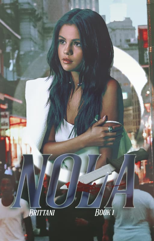
Another random bored cover for a book that I had the theme for, but never enough ideas to actually write. (3 book murder mystery series set in New Orleans) Not sure how I feel about this, but I’ve never been able to really make ‘the’ cover for this book/series.
2 Likes
This … is kinda confusing imo. ![]() It took me a while to figure out what the whole thing was, and a little longer for the title because of the knife? If that’s what it is. Anyways, you should try a more cohesive colour scheme, and keep perspective in mind. The knife should be casting a shadow on the text, and you’ll want to match the whole image’s lighting. The sub text is too small, but unless you don’t mind it that way, you should consider sizing it up + spacing it out and the aligning it with your title.
It took me a while to figure out what the whole thing was, and a little longer for the title because of the knife? If that’s what it is. Anyways, you should try a more cohesive colour scheme, and keep perspective in mind. The knife should be casting a shadow on the text, and you’ll want to match the whole image’s lighting. The sub text is too small, but unless you don’t mind it that way, you should consider sizing it up + spacing it out and the aligning it with your title.