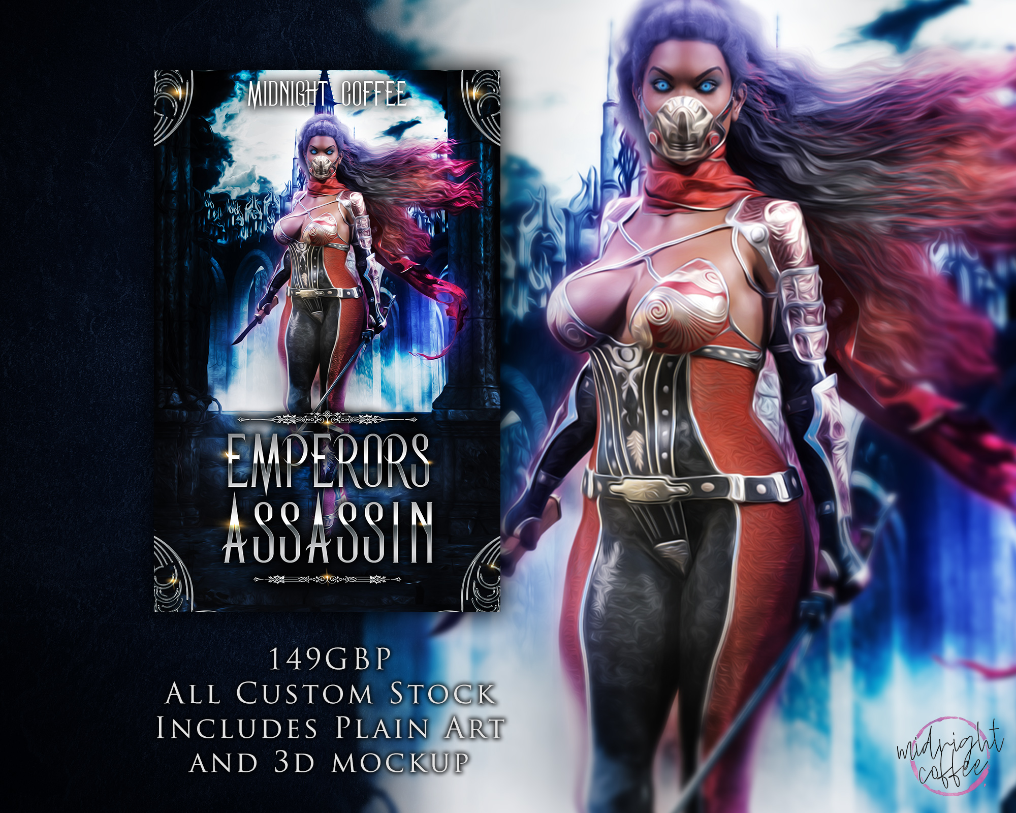
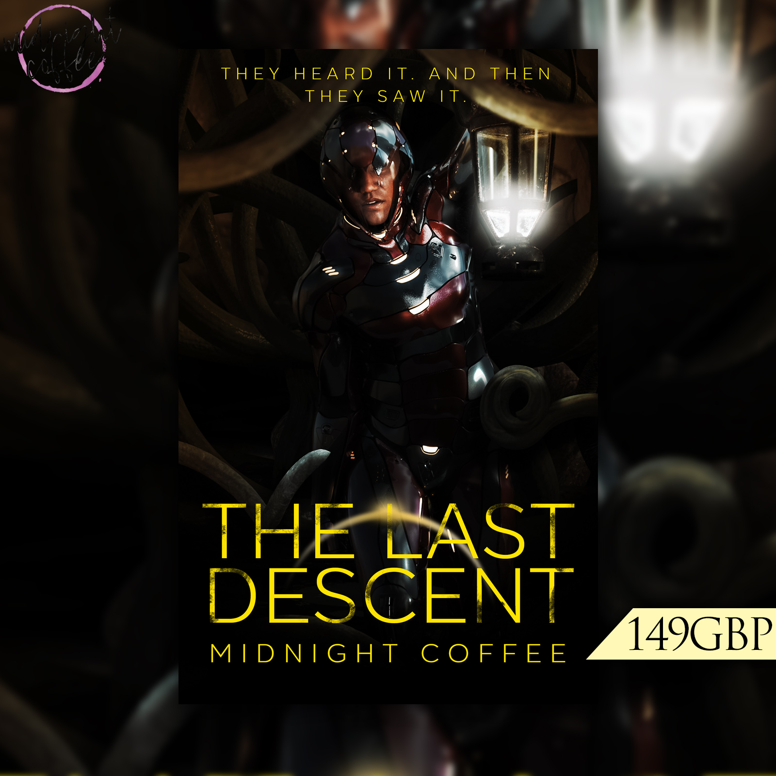
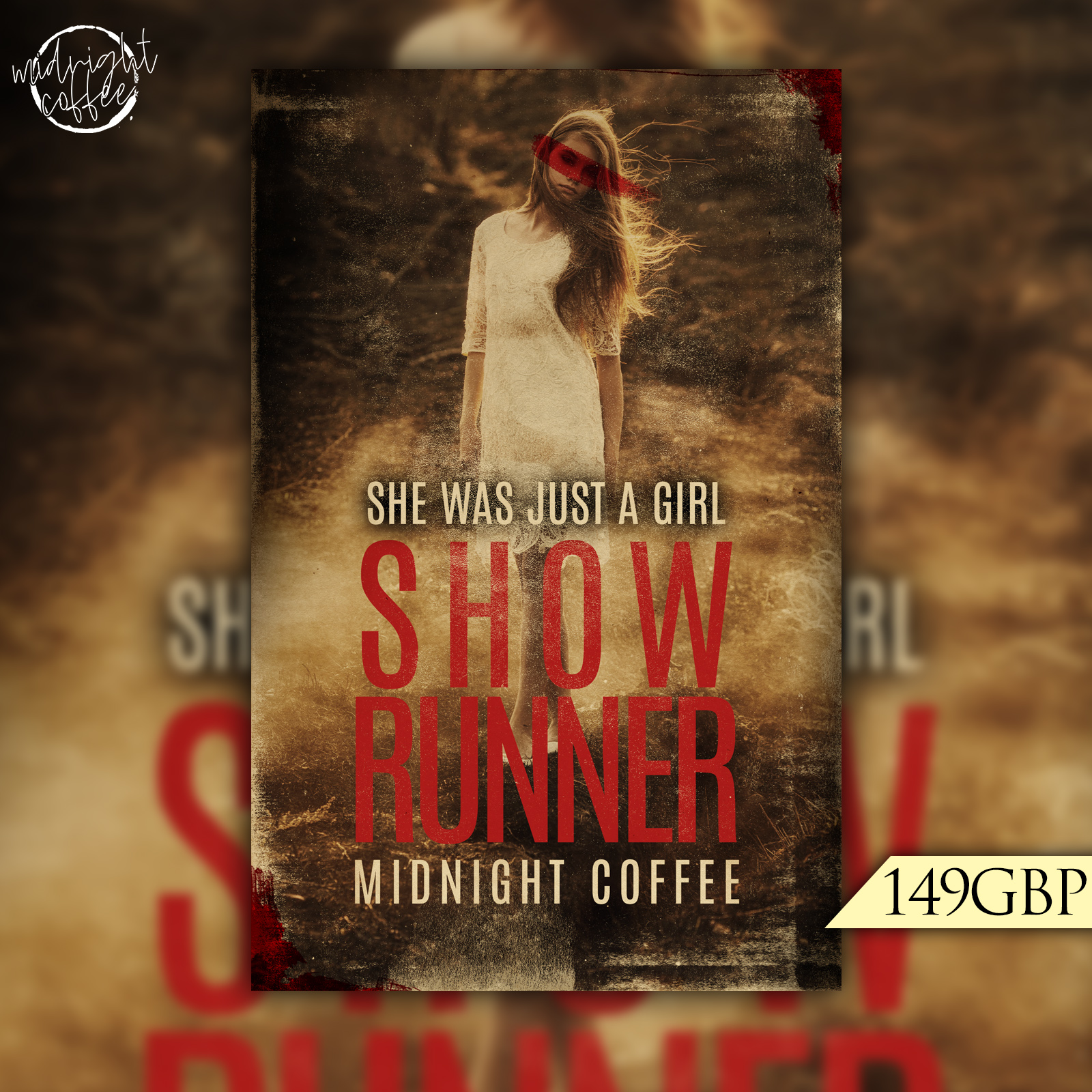
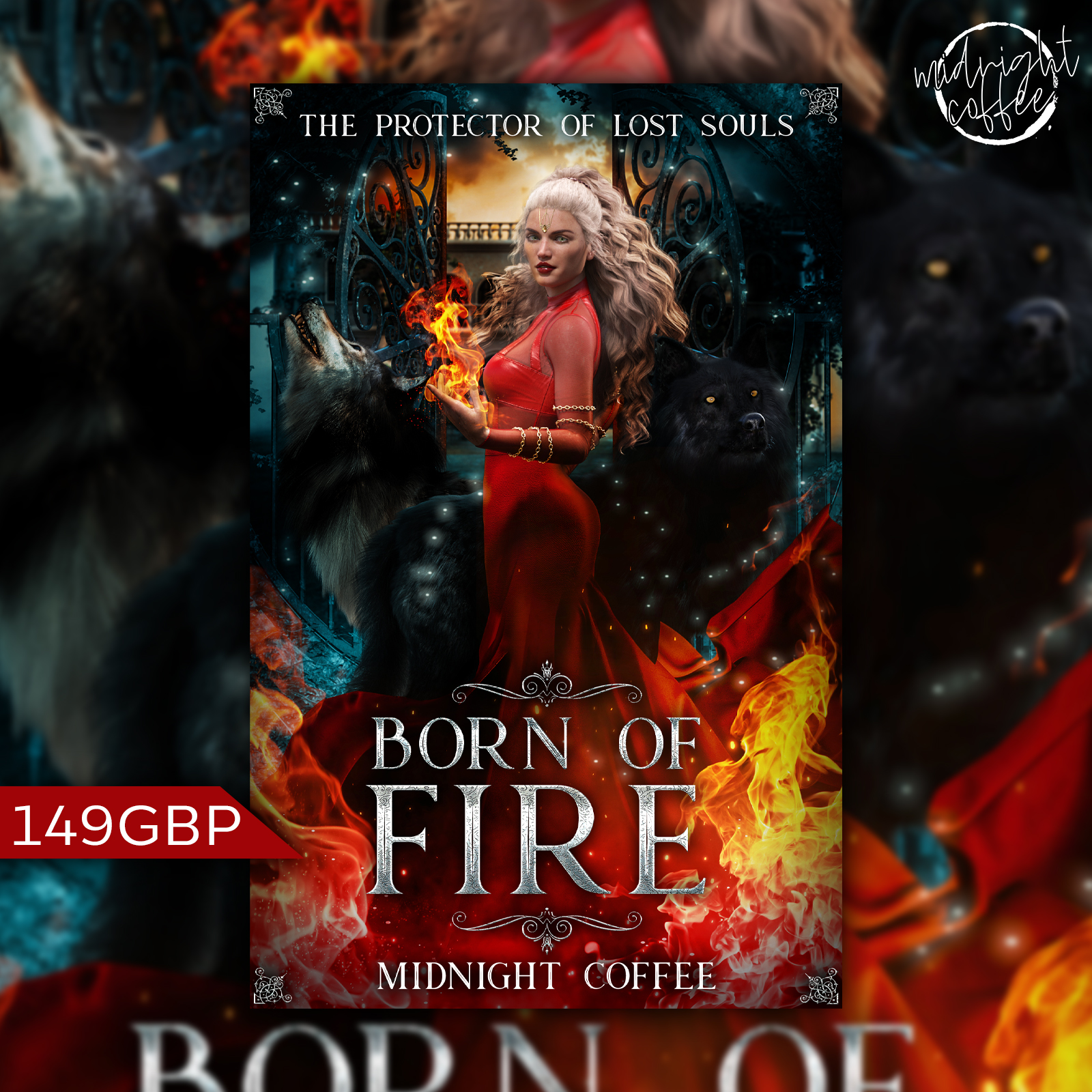
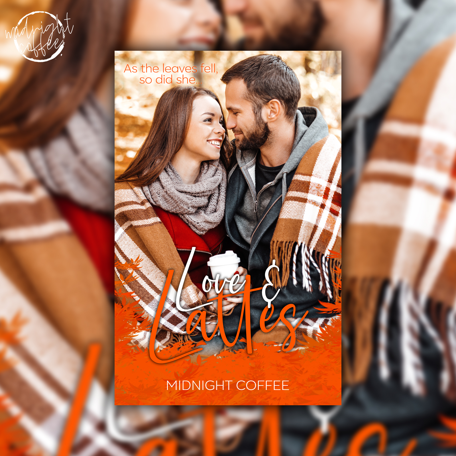
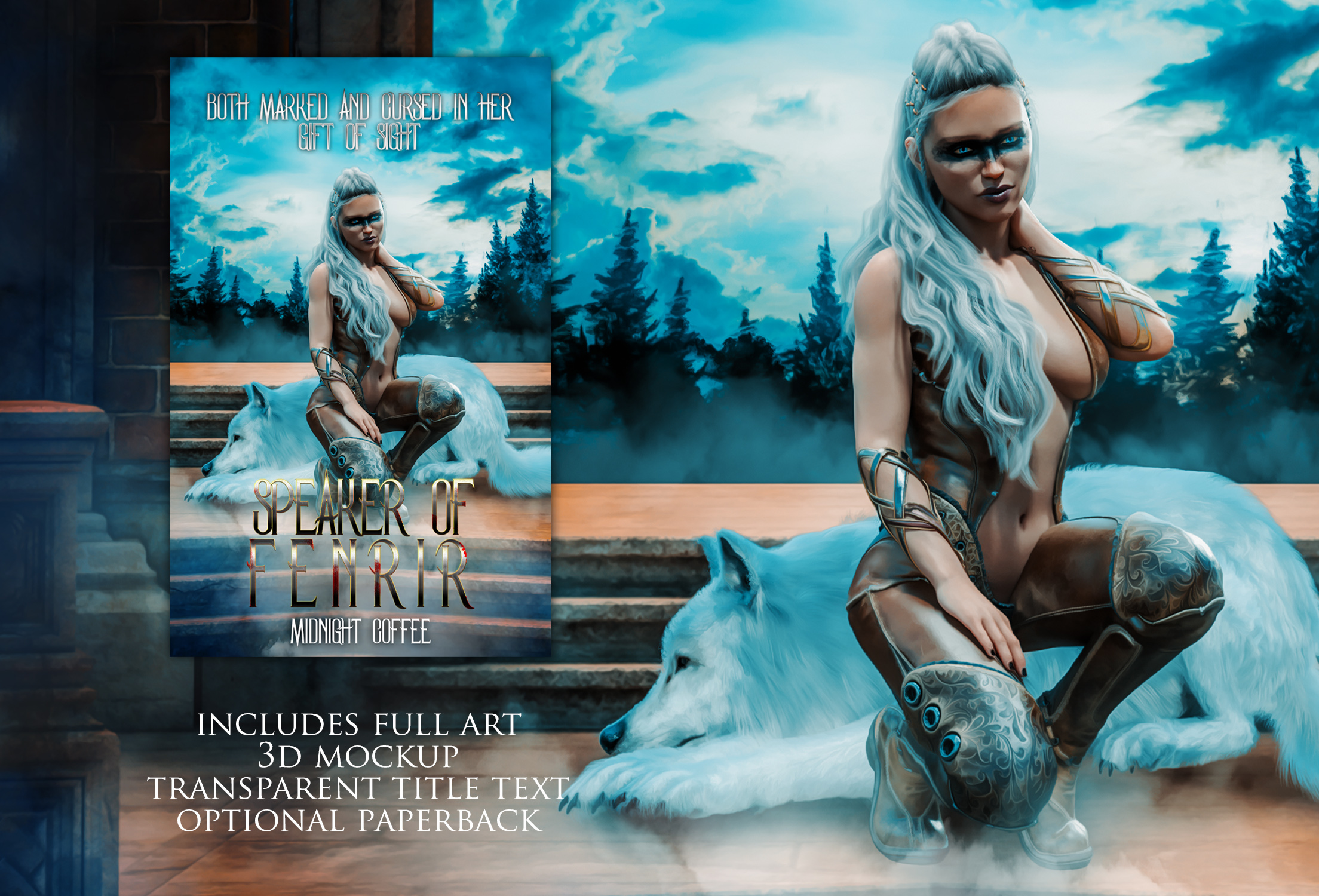
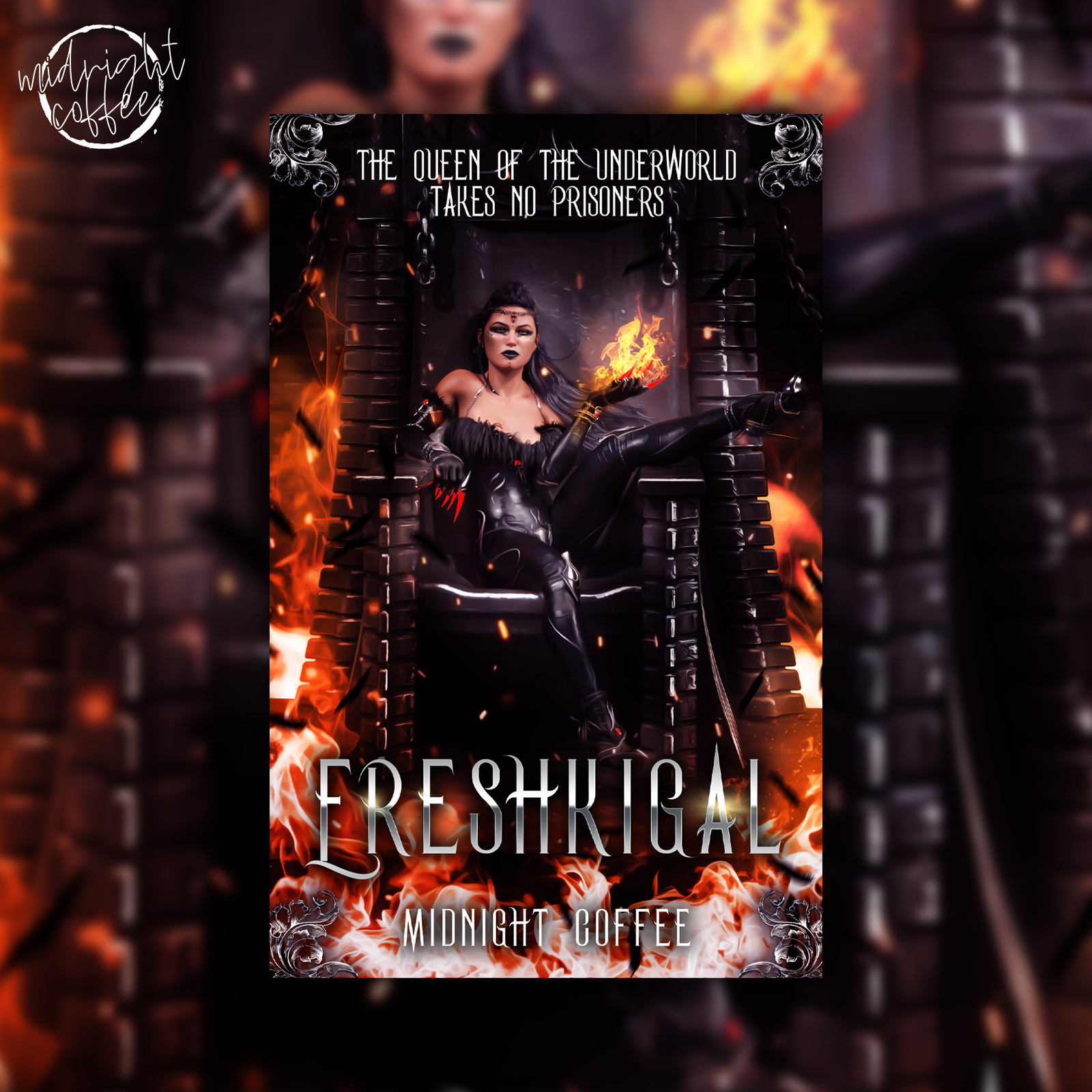
I love love love them! The Accia looks real unique. The shadow walker is cool too!
I think Daz serves as good inspiration too for illustration work.
I love love love them! The Accia looks real unique. The shadow walker is cool too!
I think Daz serves as good inspiration too for illustration work.
Acicia is nice. I bought the Nyao set for cat ears recently, but Acicia comes with a huge scythe and a fluffy fox tail, so I reaaally wanted that bundle too. The ears are nice, but I think I prefer nyao’s! 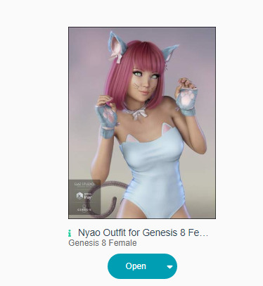

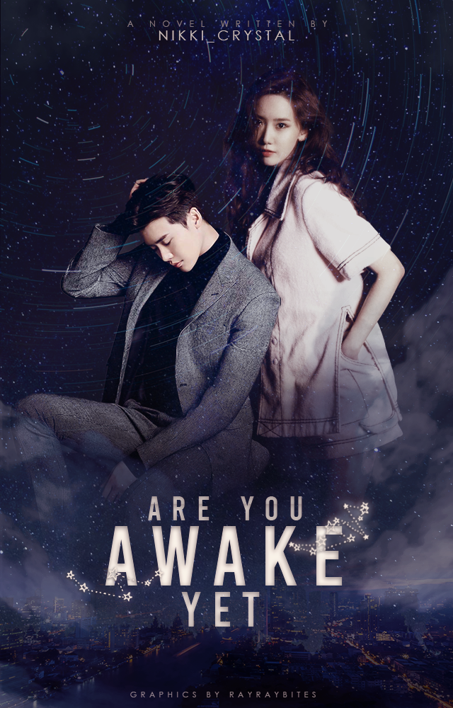
Tried to revamp an old unused cover but it became really blurry somehow yeet and idk how to fix ;-;
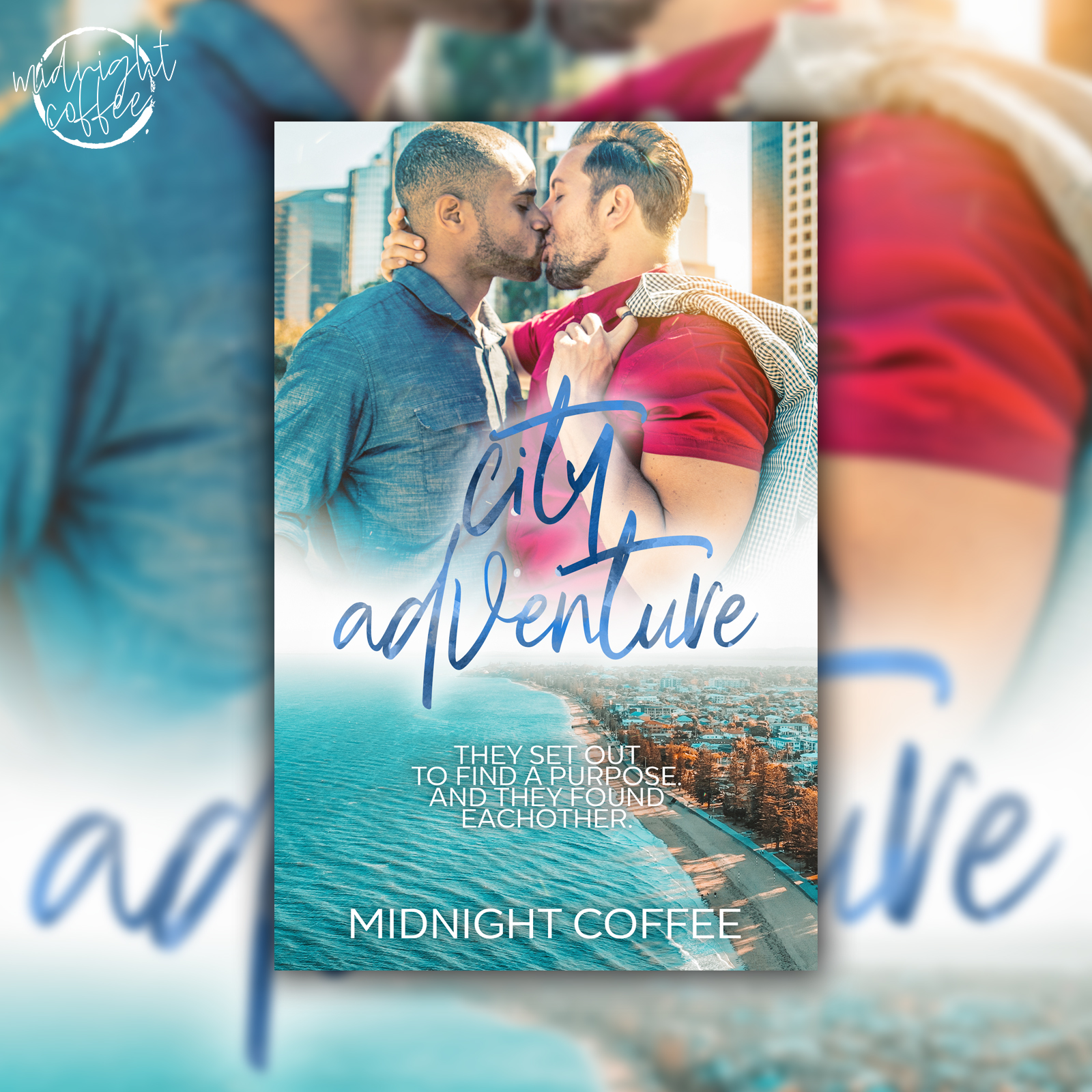
Oh goodness me, there are some amazing graphic artists here. Well, I finished my first semester of college and decided to tackle a small vector cover. It took me a long while because finding the colors werean absolutely horrible experince. Plus, findnig fonts were a whole new nightmare. Heh, enjoy my struggle. 

That’s seamless and looks amazing!
maybe try high res converter? Usually helps a lot for me ( v pretty btw  )
)
I’m using photoshop though o.o (thank you~)
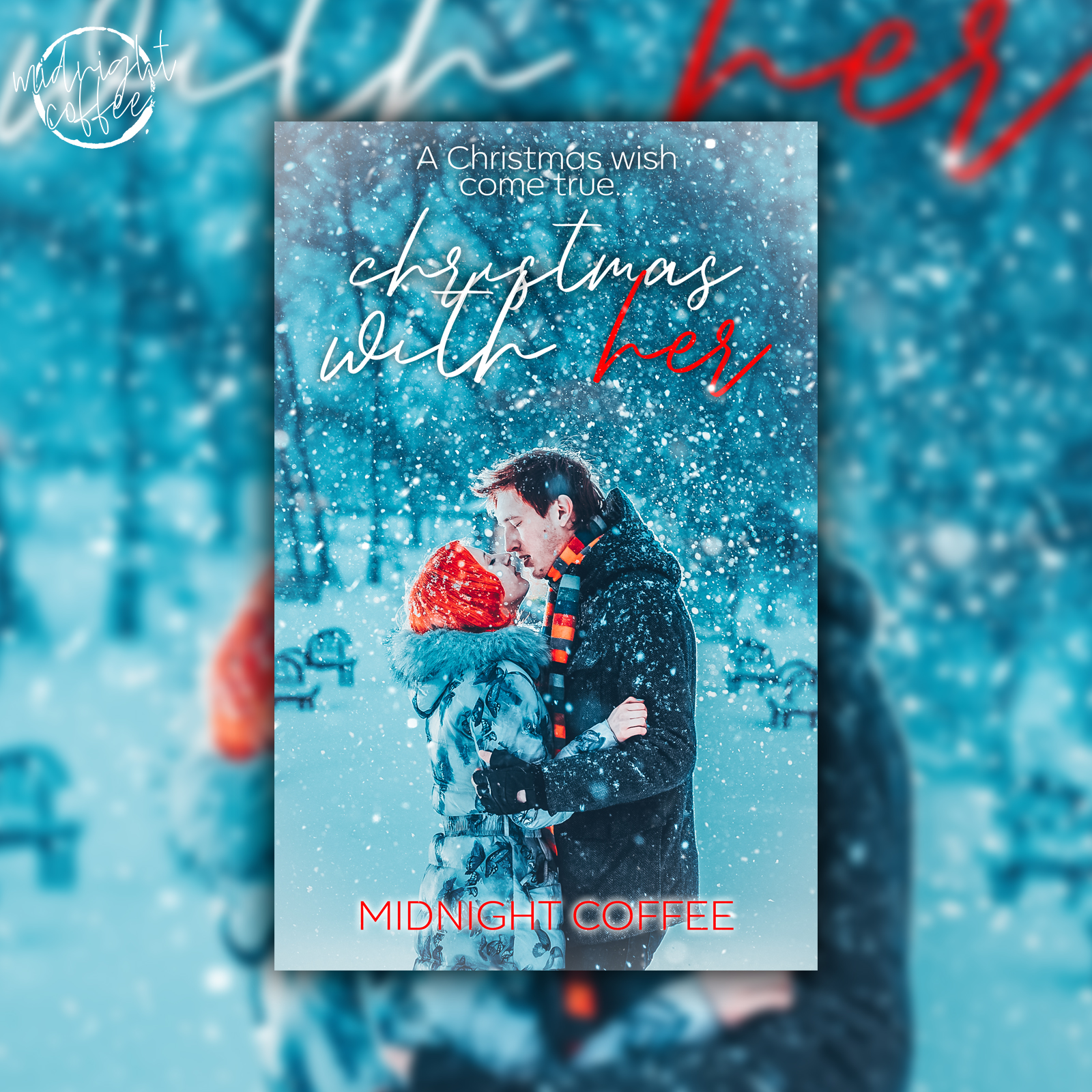
I like the colours! It looks cute.  Not too sure on the genre, but looks really nice.
@EncryptedWriting Oooo I like! The text is nice, too - I love that gradient sm!
This was really fun. I bought the dogs to render today, but everything else I had and don’t use much apart from the main model. A lottttt of fun!
Aaaand the other…
thank youuuu ;-;
You are v welcome

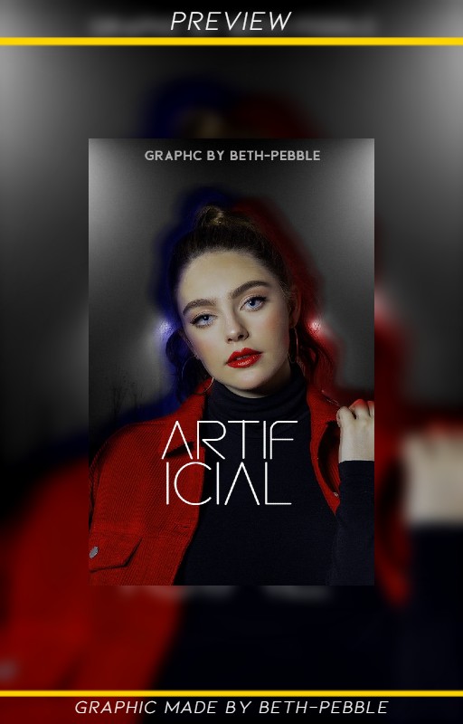
maybe the red & blue outline could be extended outwards a bit like a glow effect
& for the text, a little bit more space between the ‘A’ and the ‘L’ so the top line of the ‘F’ and the bottom of the ‘L’ line up( this is just me being nitpicky, don’t have to pay mind to this  )
)
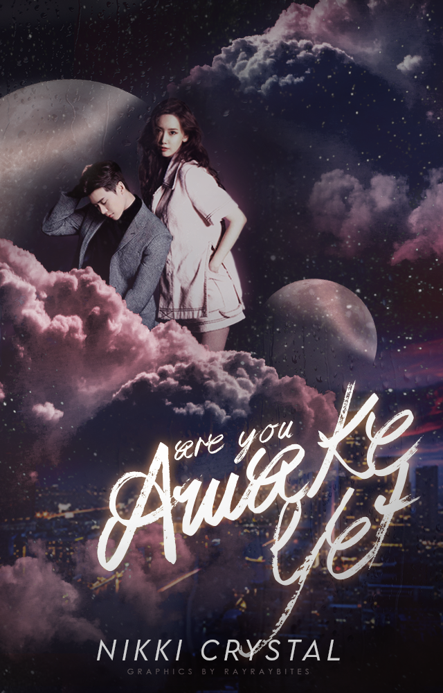
title could be adjusted slightly to the right since the model is tilting her head towards that direction( to make it seem more balanced) and moved down towards approx to middle of her chest to give more room between chin & bottom of graphic( since turtleneck & close title makes it seem a bit “squished” in her neck area)
Of course, you don’t have to listen to me since these are only my opinion  (and your graphics are already stunning
  )
)
Thank you so much for the advice, i will try that out later <3
And thank you! <3
@trappedinabooknook it looks really nice! The only tip I can give is to enlarge the title a bit and vertically line up the A and I.
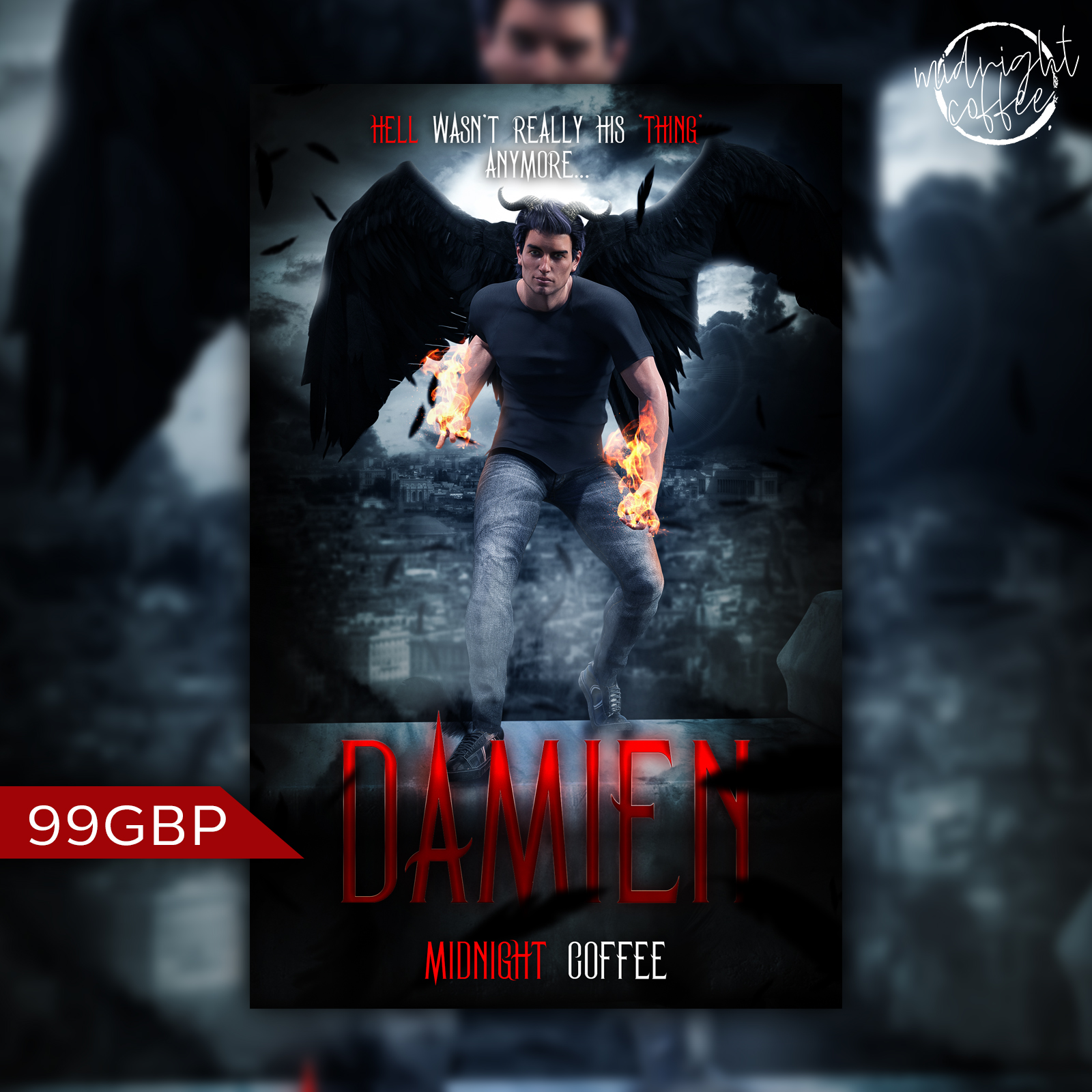
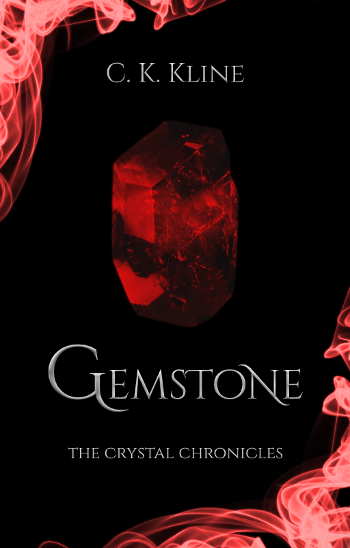
Here’s a cover I initially made for someone else, but turned into a premade. I feel like serializing it but I’m not sure if it’s good enough. What do you think?
EDIT: Took @/CoffeebyNight’s suggestion. Here’s the revised version:
I like it. I think it does look a little flat, but it’s an excellent start. The smoke could do with a little… something going on with it. Perhaps some slight motion blur in parts so it doesn’t feel as static, and the flat black background is a little offputting. Perhaps something textured and definitely not pure black - perhaps a very dark grey, or a stone texture?