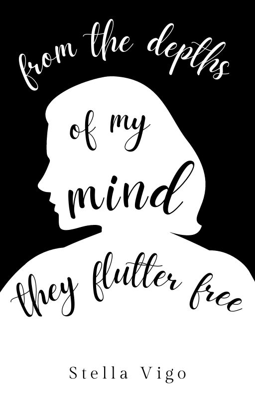
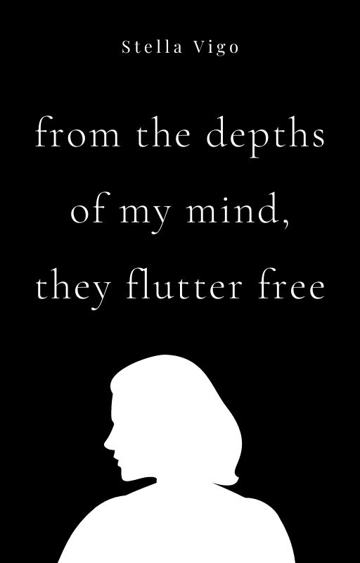
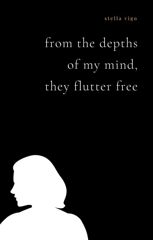
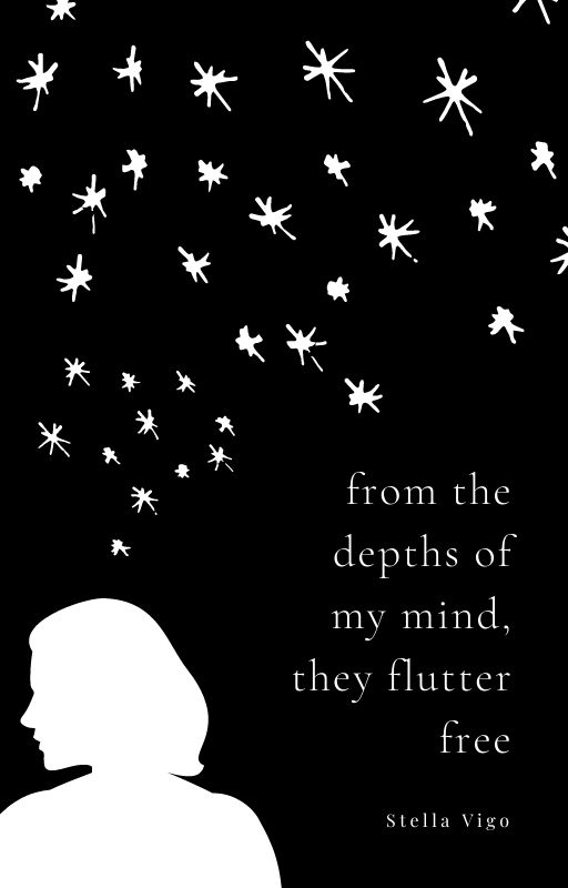
I’m back! So I tried to follow the feedback and ended up making six different covers so which of these do you like the most, or are none of them good enough? more feedback is welcome because I’m lost
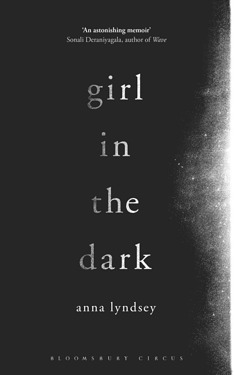
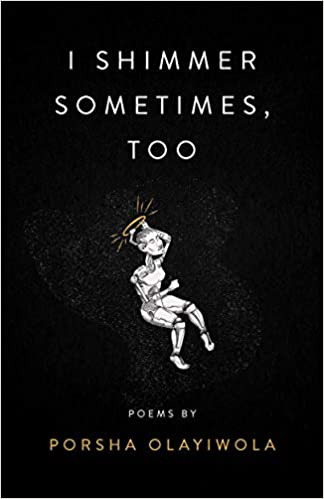
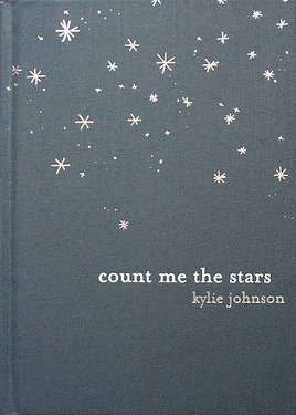
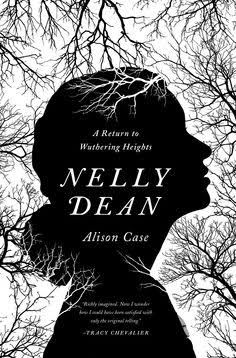
and the inspo for my covers (I’m trying to make a minimalist cover for a poetry collection)
boop
Which one is the best?
1
2
3
4
5
6
none of them are good enough (please comment how to fix it pls)
0voters
I tried to put the stars inside the silhouette like the suggestions, but I couldn’t figure out how to do it nicely
tagging @Zena and @anon25068527 since both of you helped me out last time
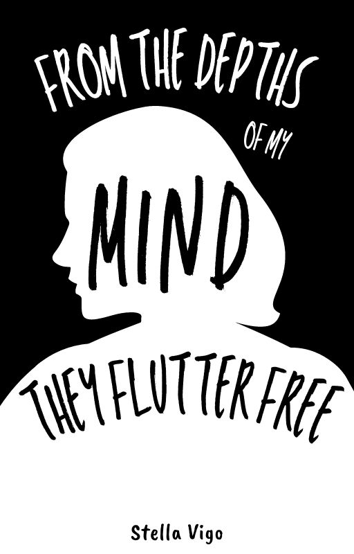
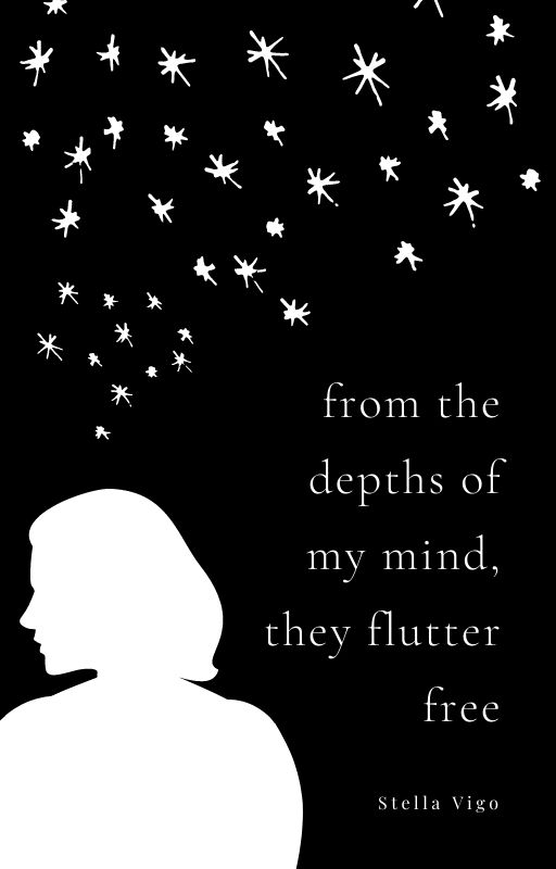
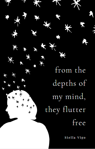
EDIT: Thank you everyone, I’ve decided to go with cover 6 and add black stars to the silhouette like what @/Manya707 suggested. Here’s (a screenshot of) the final cover:
I liked the sixth one, but I feel like the contrast between the white and black is very stark, and the other examples you showed it’s more greyer or the image is smaller. I’m not saying you should change the color of the silhouette, but maybe add some elements inside it
maybe do something like this:
Maybe add black stars inside the girl and add more white stars closer to the title but make them a lot smaller, I hope this helped in some way~
My favorites would be 4 and 5 ^^ I love the aesthetic of the 5th but I’m also really fond of the minimalistic look & the placement of the 2nd~ (I like the fact that the girl is in the corner for the both of them )
On the 4th one, you could maybe add in stars (small dots mixed w medium stars/like in your 3rd inspo) at the top that gradually comes down to her head (similar to how you did it in 5 & 6 / could have fewer around the text for better visibility)?
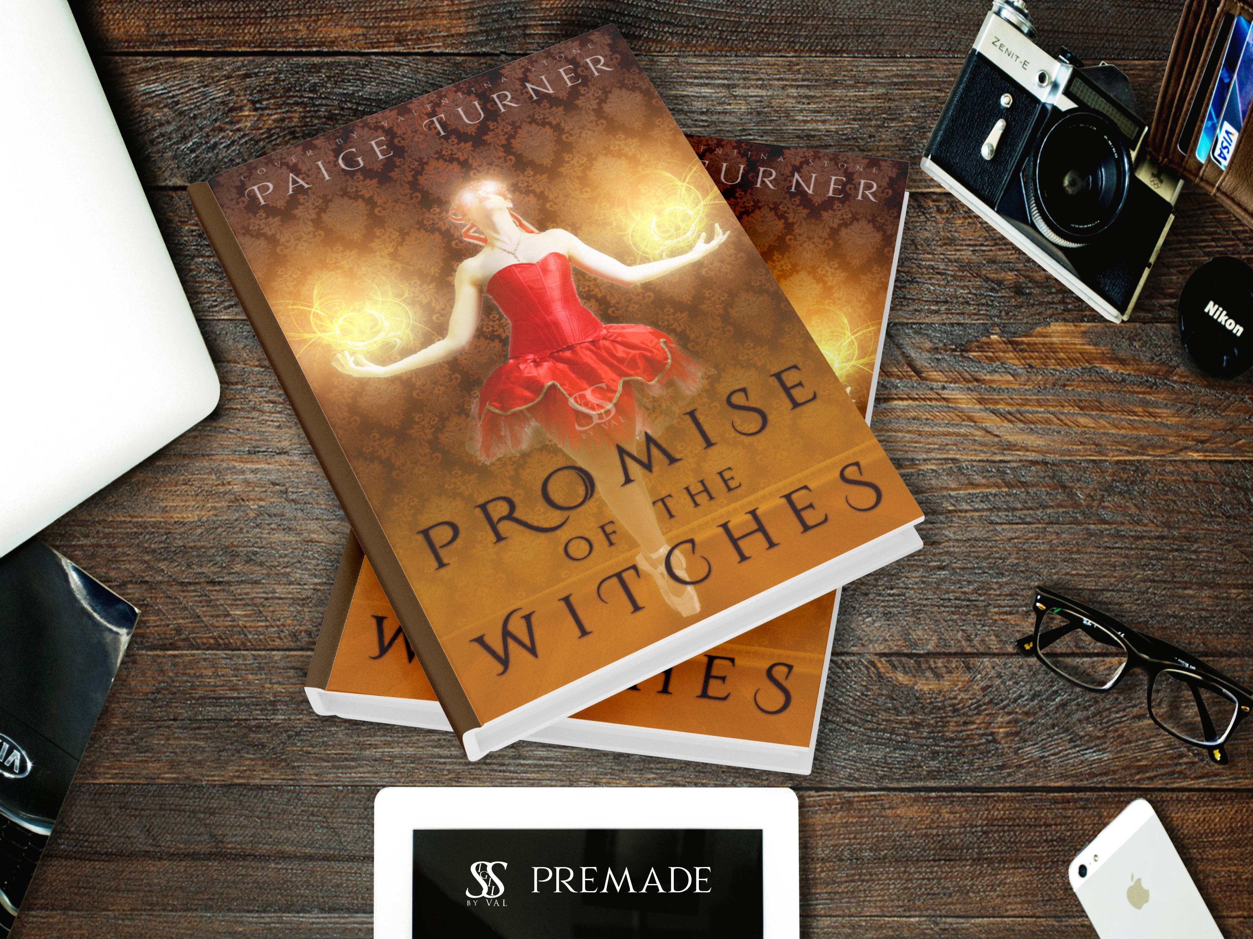
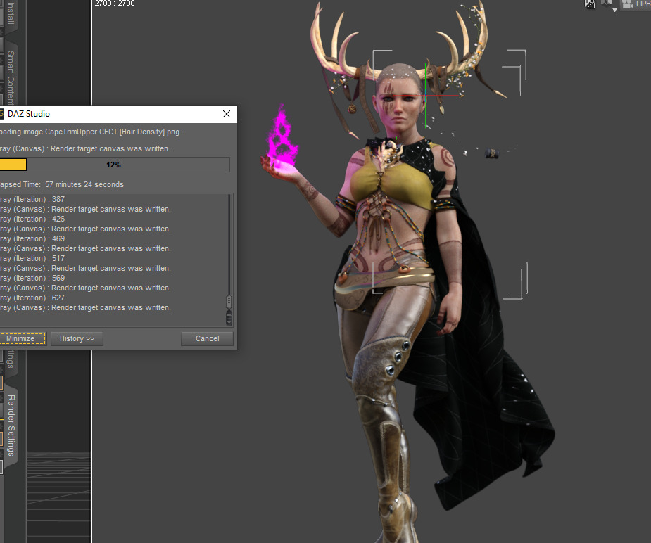
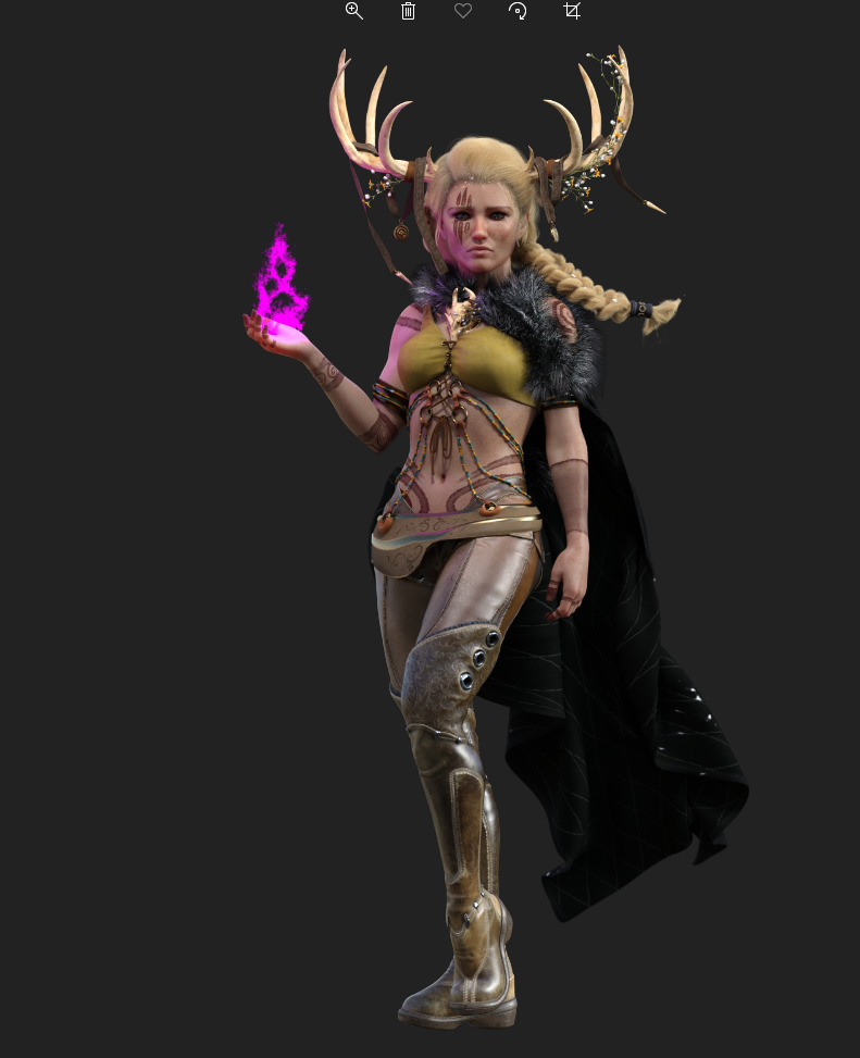
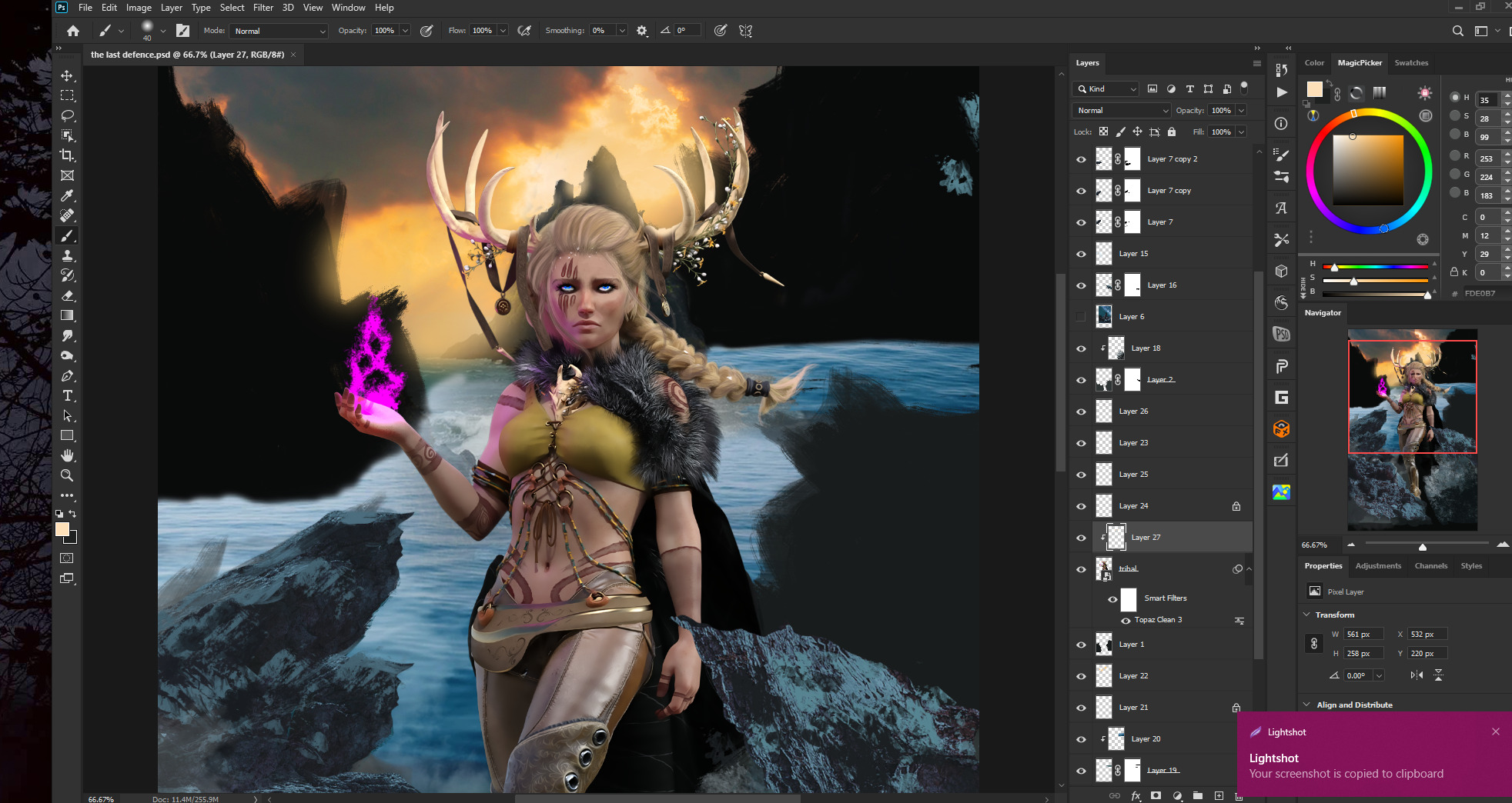
Here’s a little something I cooked up because the model had been sitting in my resources for too long and I wanted to use her already. I’m digging this new mockup, too.

 so which of these do you like the most, or are none of them good enough? more feedback is welcome



 )
)