i- the quality of the graphic just got worse hang on XD
1 Like
It might feel off because of the balancing. The upper half is more filled than the lower, with nothing to balance it. Looks really clean and nice though!
3 Likes
Rules of Fung Shui?
1 is lonely.
Not necessarily bad for a book.
1 Like
Of course, my brain is going:
One shots…where’s the bullet holes?!
2 Likes
Take a look at the cover for Gothika:
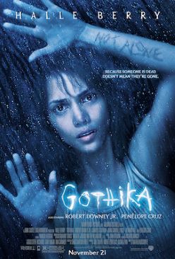
Blue instead of white.
Disney evil: green instead of white.
Me with the sepia tone: beige instead of white.
You’re right there with it, but unless its linen, we ain’t skered of white.
Now, you COULD just go against the programming and channel IT.
3 Likes
thank you, but I like the angst look better for this cover  I might create a more thriller-ish concept tomorrow though, if I have the willpower

2 Likes
You have a penchant for adding white or brights in dark scenes: it works for ghosts, and that’s about it.
You like the crispness of the brighter tones, don’t you?
I don’t think it’s wrong, it’s just predisposition of media.
2 Likes
I have no idea ![]() I just go with what seems to work. Lighting is usually an effect of the textures I use, sometimes from the base image itself, and I either use it or I hide it based on the look I’m going for.
I just go with what seems to work. Lighting is usually an effect of the textures I use, sometimes from the base image itself, and I either use it or I hide it based on the look I’m going for.
Ah well, I am said to be wired different ![]() I never liked following trends that “cramp my style” or that was popular unless it worked for me
I never liked following trends that “cramp my style” or that was popular unless it worked for me ![]()
2 Likes
So I really don’t know how to do romance books, So I decided that I was going to focus on getting better in that genre.
Here’s my very first try…
I love how the back ground turned out, But the title… What font should I use and how to style it?
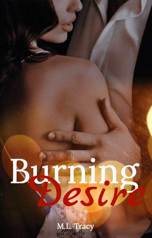
2 Likes
I like the font colors. Try using a thinner decorative italic or a thin serif + script combination
2 Likes
A modern sans-serif or something geometric paired with a brush font, like Jeko + White Oleander works well. 
3 Likes
Something that’s been irking my nerves all day.
When you have 2 contrasting colors in words that overlap, you can manually weave them together:
Not that it’s an automatic improvement, but that my brain wouldn’t leave it alone.
3 Likes
How do you do that?! I have never even tried that… Whoops!!
2 Likes
Just use a layer mark or erase
2 Likes
I hand drew it in on my phone. I used the graphite pencil because it “blurs” better at that size.
2 Likes
The conundrum:
The fairy is as big as my thumbnail on my phone. I thought it was an angel, that small…so it may be a miss at the size people are seeing it.
But leaves and a moon doesn’t scream the fae part of it as much.
Can the wings be outlines that are empty, to imply gossameresque qualities or does that show up even worse?
And I bet a 25% increase on the central figure to the rest of it would show up well.
That being said, both are nice.
1 Like
I prefer the one on the left personally since I like how it incorporates both the ‘fae’ and ‘moones’ part of the name xD
1 Like
oh - oopss ![]()
i thought so too
I did try this this but it looked really weird ![]()
I’ll try making it bigger then
Thank you! ![]() Also, thanks for the feedback!
Also, thanks for the feedback!
1 Like
it was so difficult finding the stock lmaoo Thank you! 
2 Likes
No problem.
Just remember that half of everyone you’re reaching out to is on a tiny ass phone and the others are on honking laptops.
1 Like