Thank you!  I might change the title name but I’m glad it still looks like they go together
3 Likes
OMG THERES GONNA BE A SECOND BOOK-
and they’re both gorgeous ![]()
1 Like
Yesss! I won’t be announcing it until I’m close to finishing the first book.  The idea started forming not too long ago. And thank you!
1 Like
So good!! It definitely looks like a series! I think that it would look even lovelier if you put the subtitle in one line and move it further in, so it’s not so close to the edge. Also, maybe make “game” bigger? But it’s all up to you. The story is really good and I’m looking forward to the next!!!
1 Like
Ooooh  so pretty-
Kinda curious to see what it would look like if the title were a dark blue (matching the color scheme) 
2 Likes
Hmmm, I might try it. If I find a good font. sigh And thank you so much! 

2 Likes
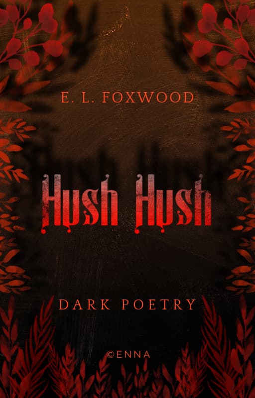
Ooh, I like this. I do think it would look better if the title was larger + broken into two lines
3 Likes
What aboutthe 2nd hush being a horizontal mirror of the 1st?
2 Likes
i think you replied to the wrong person but if not don’t mind me xD
that’d be pretty cool too @TheTigerWriter
2 Likes
I’d be thinking reflection/pool of blood.
2 Likes
@TheTigerWriter - this would be really nice too
sorry for tagging you twice ![]()
3 Likes
I will live.
For now.
1 Like
and @J.L.O yeah, that would be cool. But I don’t want it to be too bloody XD
I’ll have to figure out how to do a reflection in PicMonkey though. It would be cool.
3 Likes
2 Likes
Hrm…let me try something on my S7.
1 Like
sure  and thankss
1 Like
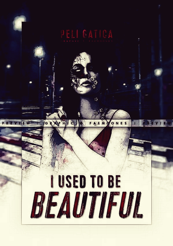
As you can see, it’s not good for the whole look–needs to be done with more care of detail–but what I did was 2 filters: Cartoon, then Nostalgia. Cartoon would be like “Find edges” and “Seipa Tone” I think in PSP7?
The point being that harsher edges is grittier, and aged white is good for decay.
2 Likes
interesting … I’ll try this out soon - thank you! 
2 Likes