Thanks 
I can kind of see the Egyptian vibe too, now that you mention it 
You don’t think the sides seem empty?
Thanks
I can kind of see the Egyptian vibe too, now that you mention it
You don’t think the sides seem empty?
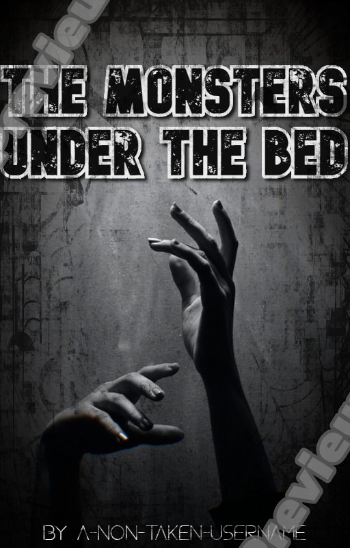
@TheTigerWriter Oooh! Love this! The TPL looks good, ives facing the other way? Or don’t listen to me XD I suck at typography. I love the hands they look cool! I love the simplicity of it
Thank you! 
I’m now wondering if there’s anyway to make TPL stand for something else in the story
ooh! interesting! I love that idea 
Nope, the balance is already really good in there–if you put anything more, I think it would look cluttered.
Good to know 
And as I give it time to sit, I’m beginning to think that as well.
Here’s my first photoshop cover… suggestions?
I’m just gonna run away and hide now cause you’re all so talented and then there’s me
Ooh, I live the color contrast! The blue and the orange complement each other well. The font you chose is very nice, but the purple blends in with the background and is hard to see. Perhaps change it to white lettering with purple as the text shadow.
Thanks and yeah I agree. I’m going to change that right now.
It’s very blue and the text is a bit hard to read because it’s dark and the background is dark too.
Did you add the black part on top of everything else?
You’re completely right, thanks for pointing that out.
And the black part is on top of the images but beneath the text.
I think it’s a bit uneven so you might want to try fixing it if you can. I like to use layer masks without rasterizing for everything so that I can get the original thing back anytime I want to–you can try doing this next time if you didn’t do it on this one c:
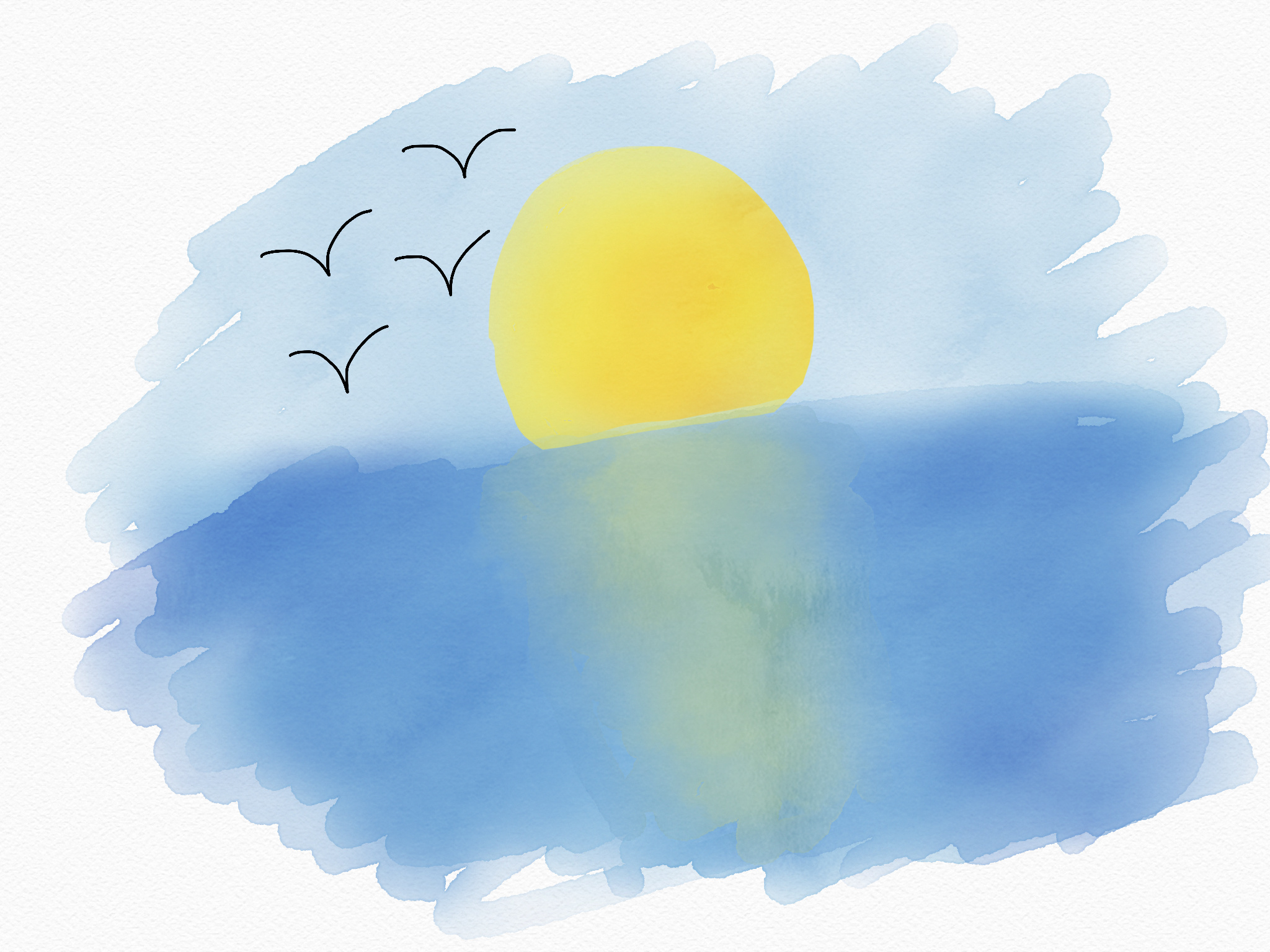
@anon25068527 this is nice! I feel sort of serene just looking at it.
@Daisy I agree with what others have said about the text,
though this is great for your first try in photoshop!
I have CS6, but I’ve literally never been able to fully switch over and get used to it
here is my latest thing. I’m actually mostly satisfied with it, which is rare.
me too lol, I really love the cover!
any feedback? @xinmure
IT TOOK ME SO LONG TO GET TO THIS XD EVERYTHING I SAY BELOW ARE MERELY SUGGESTIONS, PLEASE DON’T TAKE OFFENSE. THANK YOU
@Daisy For a first photoshop cover that looks amazing, the title is a little hard to read tho, maybe reduce the bevel and emboss? Switch the author name and subtitle, the subtitle below is a little hard to read maybe because the gradient color at the bottom blends with the bg and the outer glow blurred it further?
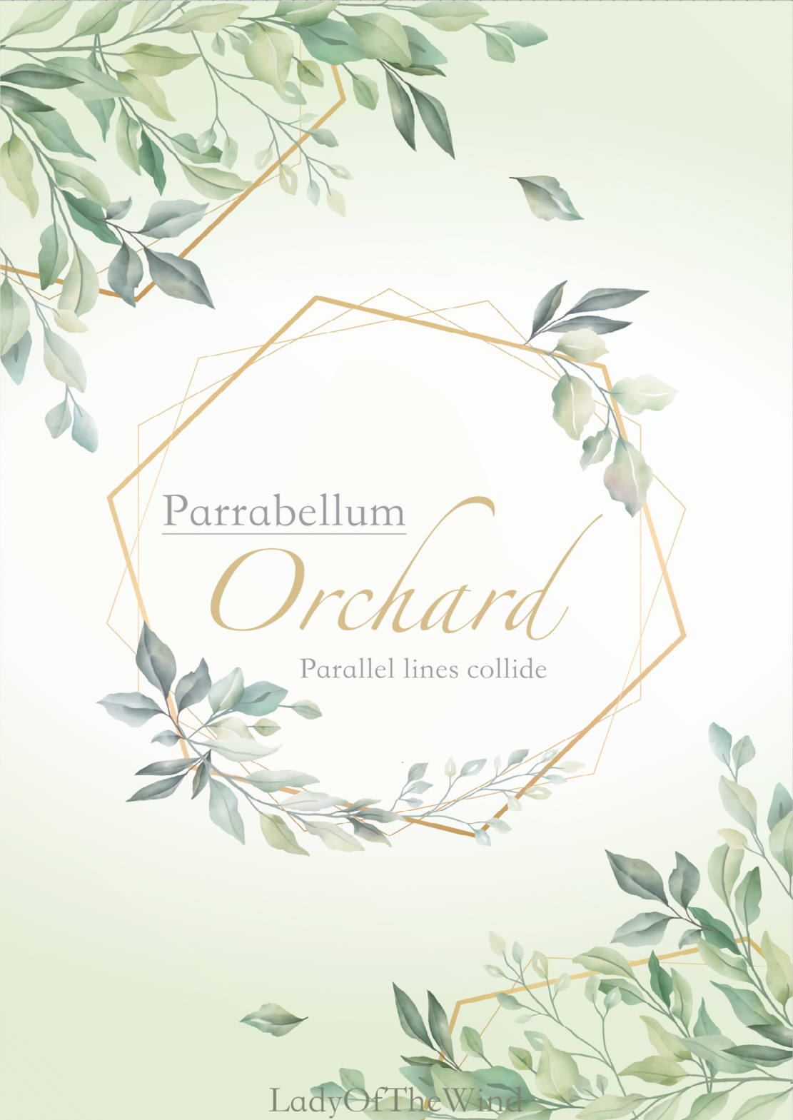
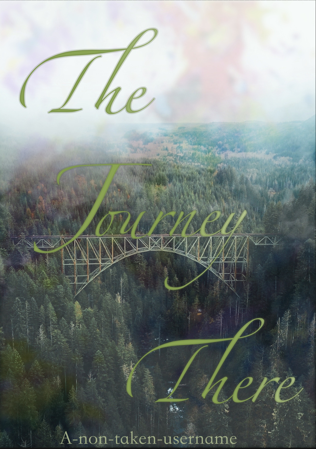
@anon25068527 that painting looks so serene!  The parabellum cover looks pretty and balanced, I can hardly read the author name tho The journey cover: I have a slight issue with the spacing between the titles and the font size? Try reducing the font size of ‘THE’ and ‘THERE’ and place them closer to Journey, add an outer glow or duplicate and gaussian blur. Move the author name up a bit
@terraxxa dude what else can I say except that cover looks amazing!
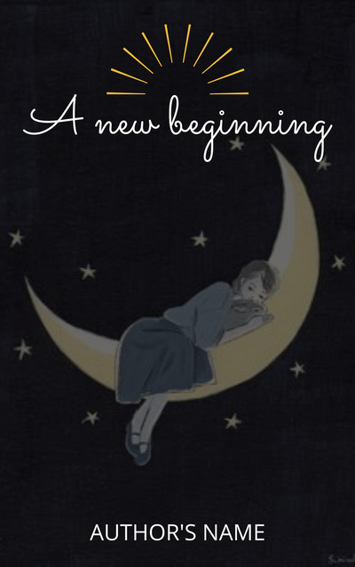
@raven_09 I like the simplicity of this cover, try using the same color of the moon for the color of the rays above the title. I like the font used for the title, maybe blend it a bit to the background or add teeny tiny stars near the title. Other than that, it looks good
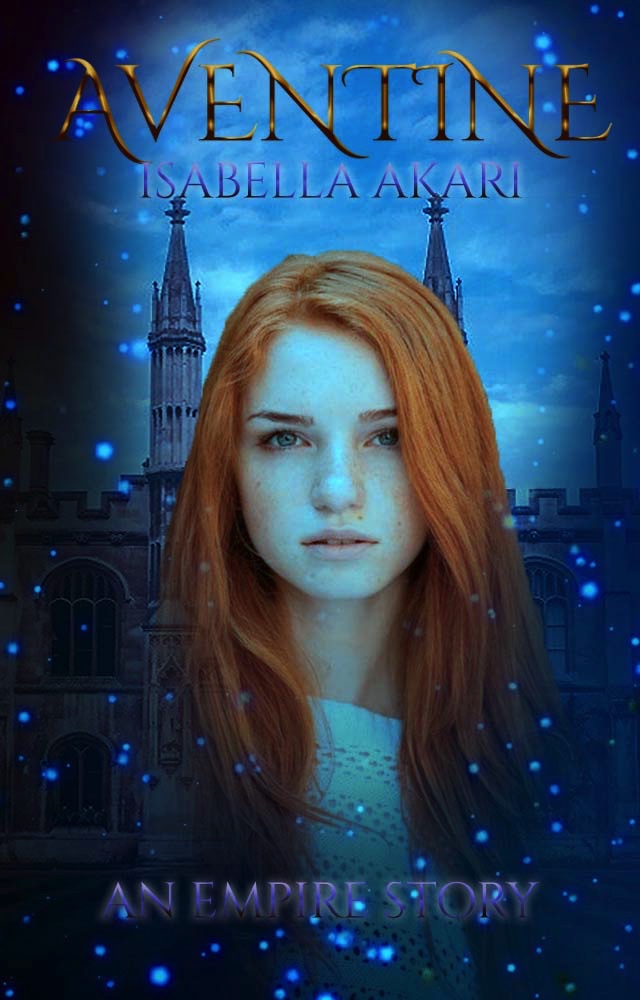
@CandySweetApple I like the hands and the texture background, I am not a fan of the font tho and I feel like the stroke is too thick and reduce the title size so it isn’t touching the edge of the graphic.