Can I have the link? (͡° ͜ʖ ͡°)
2 Likes
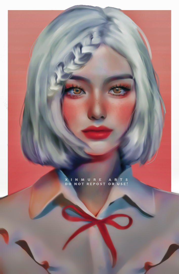
I had to use resources because I cannot for the life of me change the color of her original hair XD lemme go reduce their size
1 Like
11 Likes
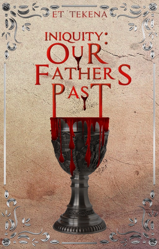
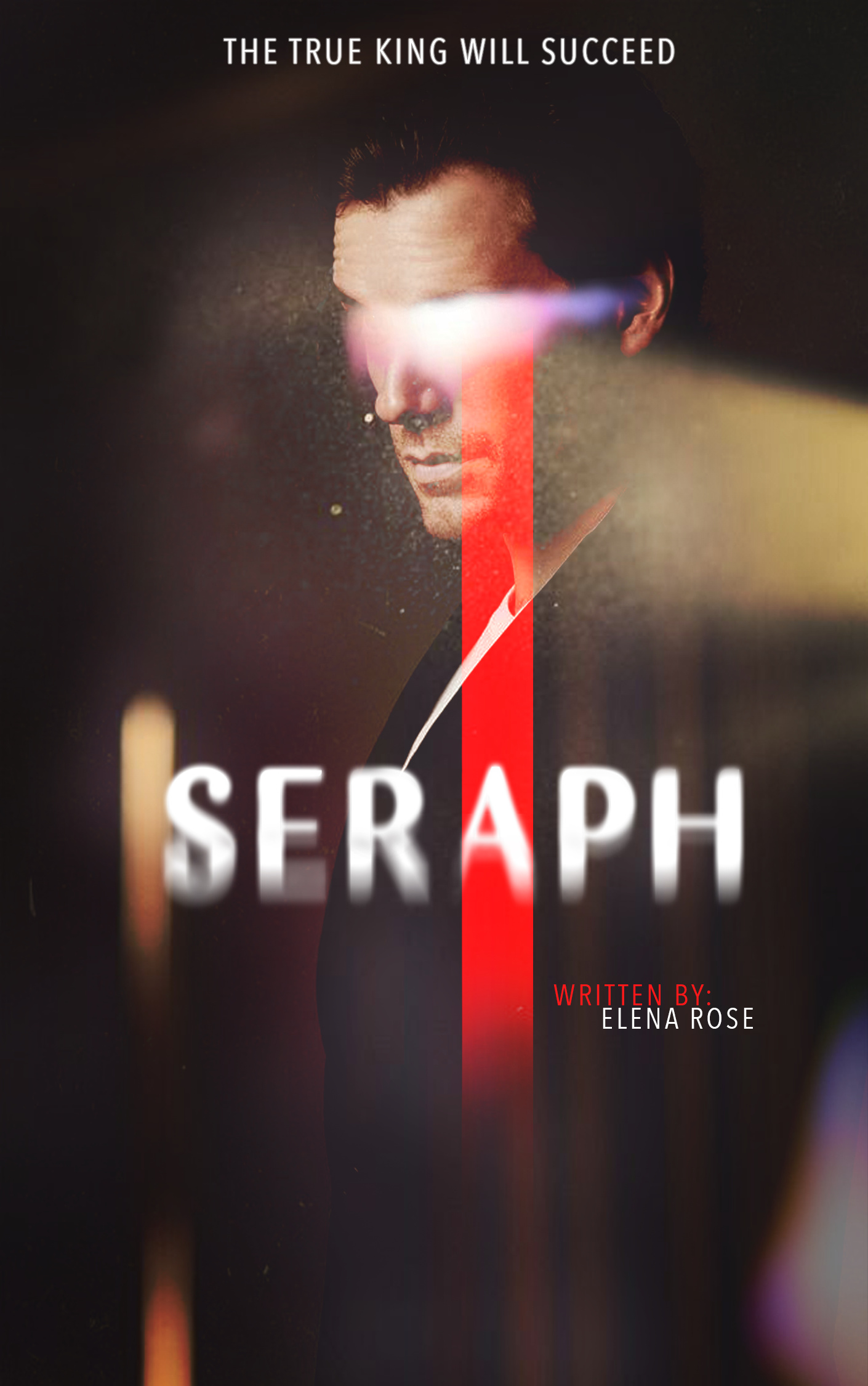
@NuminousAuthor I love the vibes of both those covers, they look so good! For the first cover, maybe try not to put your text too close the edge and maybe remove the bevel for the author name and add a glow or smoke behind the title. For the second one, maybe use the same color used for the blood and the title, I love the concept of the dripping title onto the cup!
@xinmure dude! like whut? that’s so amazing  teach me please
3 Likes
HOW ARE YOU SO TALENTED
2 Likes
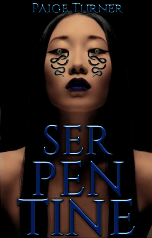
they’re all so beautiful guys! here is 2 that I’ve been working on, it will be a book series. let me know what you guys think!
11 Likes
@amansrose those are amazing! 
2 Likes
thank you! i was so nervous on keeping the layout for the second book the same, just with the male MC (and a few words) being the difference 
3 Likes
no no it’s good! you would know its a series just by looking at em
2 Likes
@panaceia @anticlimactic thank you omggg >< y’all are too cute <333
@amansrose they’re gorgeous !! i love the light on the eyes and the red line omg so happy to see u again aa
4 Likes
The smoke idea is really good, thank you!
3 Likes
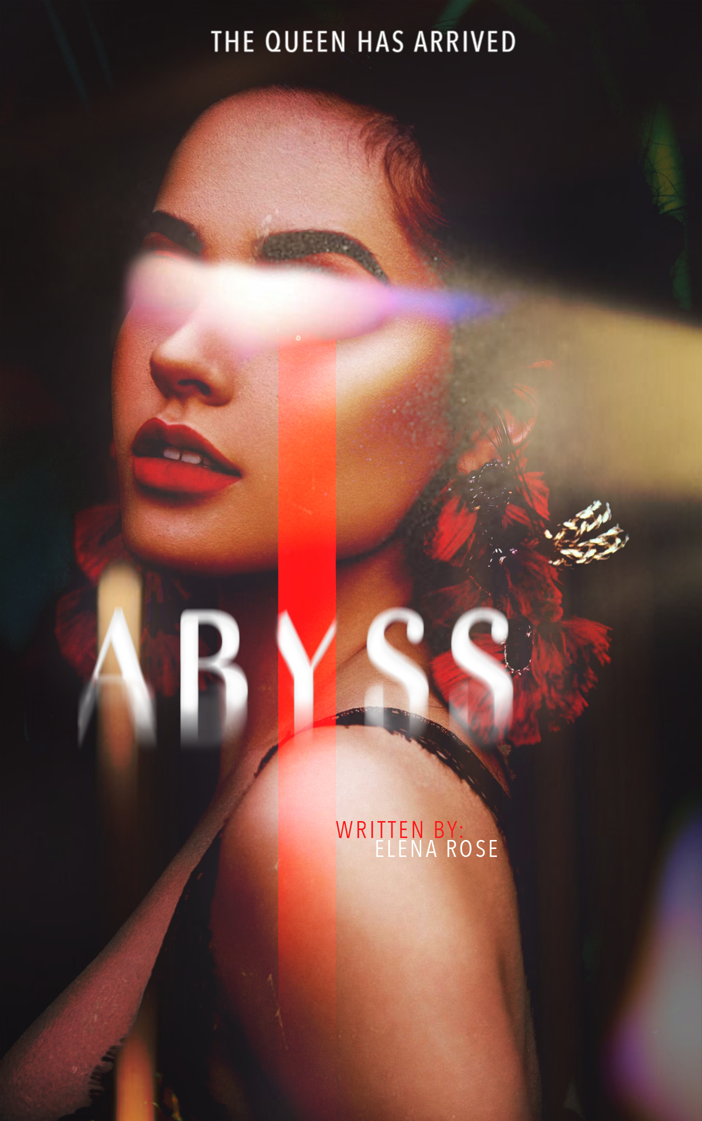
Oh, I like the design! It’s really cool and eye-catching. I do like how they have the same layout cause it brings them together more.
My only note is that the author name and hook line are quite small, so it would be almost impossible for people to read them while browsing without zooming in once they are set on a book.
3 Likes
How did you do that sorcery  Her shirt folds are so realistic.
2 Likes
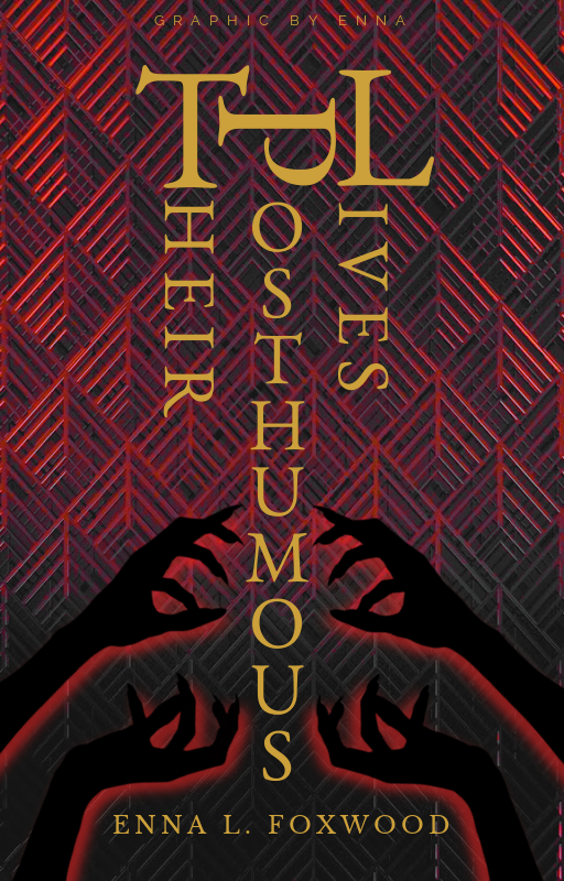
Uh, so, I made this thing. Idk what it is. Idk what I’m doing 
I wanted it to be: gentleman classy, 1850s USA, mysterious with demons, sinister but not bloody, sophisticated but not too high class (if you know what I mean), simple with silhouettes or abstract, and quirky (joking or playful, poking fun at)
The problem I kept having making a cover titled
Their Posthumous Lives
is that the second word is longer than the others and horizontal just made it all look bleh
So I thought hey, why don’t I do vertical? And then this came out. I feel like I need something on the sides or that the title is hard to read. Maybe I should make it all facing the same direction… but then it looks like “T Heir Posthumous Lives” because “heir” is a word, so I turned it that way.
Maybe I should just make all the letters the same size?
Uhm thoughts? Help?
5 Likes
aww thank you so much! such high praise coming from you  and it’s so good to see you too!!
3 Likes
thank you! I will change that
3 Likes
if you really wanna trip the readers up, put the horizontal letters facing the opposite way.
2 Likes
Is it…readable though?
3 Likes
It looks really good and I’m getting Egyptian vibes for some reason xD
3 Likes