oooh I love the Amethyst Inception onbe but it might just be because I’m really into purple and yellow these days xD
2 Likes
@xinmure those are so pretty! Those colors work so well together
@terraxxa I’ve seen your work and every single one looks so good. I love how every graphic has a clean finish O.O
@anticlimactic squeals you’re here! I have no words, your graphics are amazing. I shall stalk you til the end of time >.<
3 Likes
I’m too shy to post any of my recent covers (new designer here) but bookmarking this thread definitely not planning on stalking your graphics
5 Likes
you’re everywhere :0
1 Like
I’ve kind of been getting into designing fantasy covers these days due to the requests. I still don’t know how to do complex manipulations but I’m trying my best >~>


14 Likes
Wow it’s great
2 Likes
@terraxxa thank you !! i’ll try to input your thoughts in my work  i absolutely love half flight * w * i love the blur and the text and everything, i love how you play with colors in your cover ><
@anticlimactic you never fail to amaze me with how creative and amazing your covers are ; - ; im so jelly ;; amethyst inception is amazing !!
@panaceia thank youu~
@Daisy dont be shy, we can improve together here but of course no pressure, i’ll be waiting to see your stuff later on ~
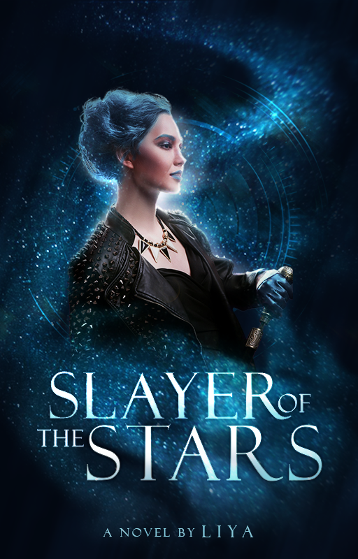
@rayraybites love slayer of the stars and abyss king! i like the lighting on the slayer of the stars and the creepy vibes in abyss king ><
5 Likes
@panaceia I saw your post in the premade thread and I gotta ask: is that Tomorrow x Together on the Run Away cover?
2 Likes
Your English is more than good enough. I can understand you just fine!
Wow, so many resources! I don’t think I’ve ever seen so many font designs in one place before. I do love the look of corners, but I haven’t been able to find ones to fit the look. Most of them are swirly or metallic, which isn’t really what I’m going for. Maybe though.
I was trying to make it less monotone by adding the red, but I guess some things just don’t work out that way. And white was too glaring, so I think I’ll go with light green. Ooh dividers 
Recommneding resources is just a great as giving critique–maybe even more so. Thank you so much for your help! 
2 Likes
Those are beautiful!  How is that rusty? Not rusty at all!
3 Likes

all of these graphics look GOOD!
1 Like
yes it is! x
2 Likes
The tagline and the author name are a bit too close to the edges of the cover and are probably unreadable when you upload it to wattpad…
You can probably make the author name 2-3 times bigger than that and move the tagline to somewhere between the title and the two people where there’s lots of empty space. You can also try moving the people a bit more towards the bottom and align their heads to 1/3 of the cover from the top, making use of the rule of thirds.
2 Likes
oh my gosh. I love it so much 
1 Like
@TheTigerWriter oooh this is an eye catching cover! It looks like mystery/adventure. Maybe decrease the spaces between the words in the title.
@CandySweetApple This looks so good! One thing though, the subtitle is so near the edge of the graphic, I hardly noticed it, maybe try moving it down a bit, I am not a fan of the stroke around it too,maybe try outer glow? or a thinner stroke. As for the title, I like the font but I feel like it could use a bit of motion blur to accentuate the horizontal lines. Use the same font for the subtitle and author? These are all suggestions, you don’t have to do em
@Spider-Hawk aww tysm! 
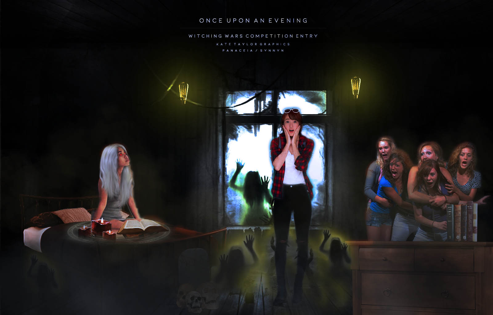
My latest things, entries for graphic comps I’m in, the second one was painful to make because I had to follow a specific scene.

8 Likes
@TheTigerWriter hiya~ here are my thoughts on your cover <3 personally i love your text placement, but i felt like the line spacing was a bit too much for the title. and the author’s name could be way too zoomed/big for the cover. it’s a bit close to the cover. i hope i’m making sense. i feel like the outer glow of the sillhoutte is a bit too brash compared to the black, so i reccomend making the outer glow’s size bigger^^ sorry for my poopy english but i love the input of silhouttes with the background!
@CandySweetApple hiya ~ i reccomend adding a lil bit of lighting to the people so they could be distinguished from the background! i reccomend using outer glow, with the color white to make them pop, if you use photoshop! like rayraybites say, the title are too close >< and the subtitle is near the edge and i suggest to make the subtitle without stroke, or use other font styles so it could distinguished from the cover! sorry for my poopy english again
@Spider-Hawk i’m glad <33 you are welcome !!
@panaceia omg the second is amazing! did you paint the hair on your own or did you use resources? though i feel like the girls beside the white-haired lady is a bit out of place >< maybe their size is way too bigger for the perspective they are in ~
5 Likes
well i use pixlr, I still nedd to learn all the stuff you reccomeded
1 Like
here are a pixlr tutorial ! i haven’t found other ones tho ><
1 Like
thx!
1 Like