No, a normal gradient xD
Can I save the first cover and edit it to show you want I mean?
No, a normal gradient xD
Can I save the first cover and edit it to show you want I mean?
I think it’s the second. I didn’t like it as much though
Well this is what happens when you tag artists and encourage them 
Yes the first one is more cohesive because there were less fonts used
just remembered you have the ‘fix your cover’ its so helpful and resourceful >< i’ll be adding it to the resources/affliates link when i’m making a new thread hope you dont mind x
just realized these aren’t the right size. Ahhh no wonder I had trouble with them

It’s actually thread idea I stole from someone else but they were more inactive than me and last time I checked, they’d poofed after they made the thread so I made my own >~<
Sure! What kind of thread are you planning to make? :0
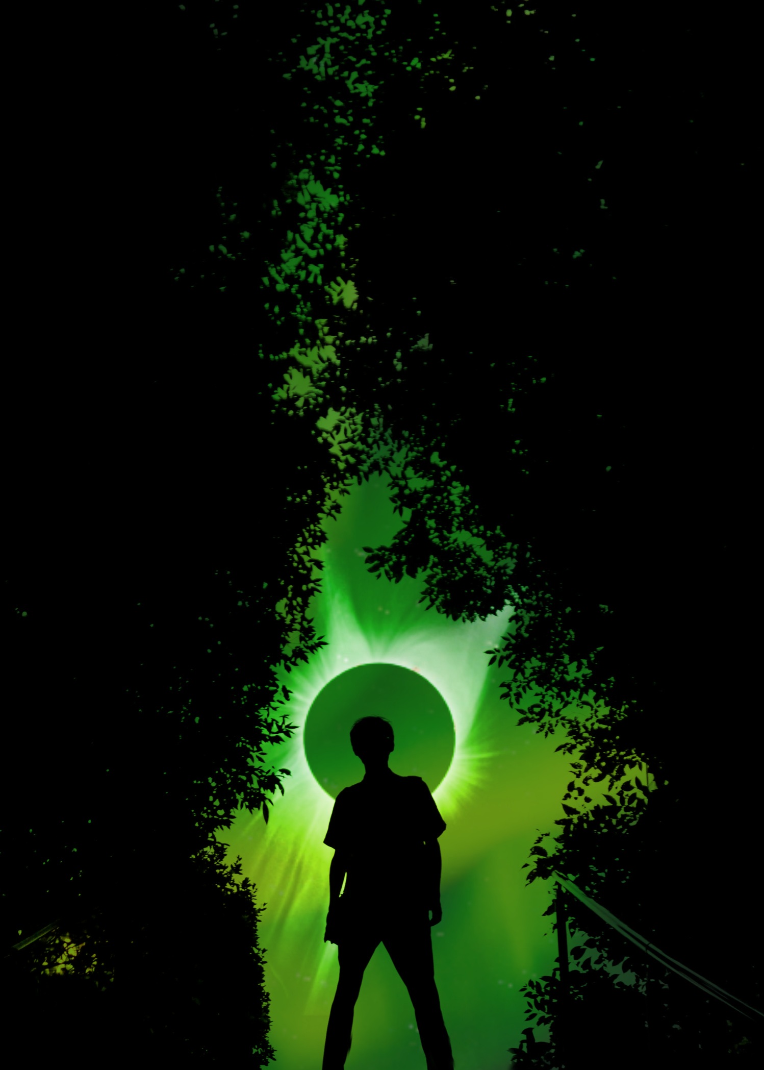
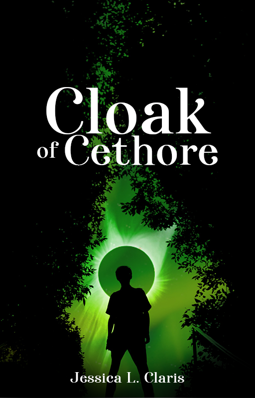
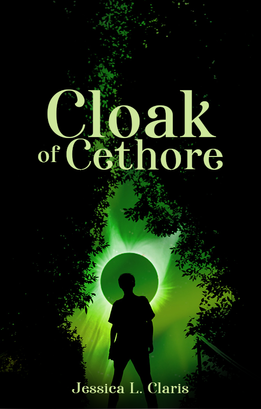
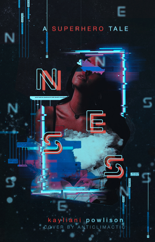
Eyy, that looks nice! The light green text was a good call! I have felt the red was a but out-of place, and the white kinda feels a but too bright and glaring, ya know. What font did you use? And that’s what I was trying to say about the gradient, but I guess I was bad at explaining it.
It’s called Afterglow. Feel free to take them if you want–I don’t mind c:
Oh, thank you so much! 
i can’t make a proper thread because i’m not sure how to make a thread with just words so i did banners instead lol i think banners are better since people can manually zoom if the words are small, but img threads are hard to do so !! my english never make sense
its nothing special cx i’ll definitely wait for a better designer who can help make a better thread hehe
i’m finally at my laptop so i can take a better serious take in my critique >< mind you my english isn’t the best hehe !!
i personally like your font choice, i think it’s better than the first one! i guess it’s just the placement. the fonts are okay, but there’s much better fonts here // and this one is great too. it’s not really gothic, it’s medieval fonts that fits a fantasy cover! if you use photoshop one day, (if you need help on getting photoshop, i can link it up!) i reccomend using font styles. these are my reccomendations! // here’s somebody’s collection of em ;; they are great to add spice to your cover. i also reccomend using corners (these are png) to fit the fantasy theme!
for the cover itself, as it’s rather monotone in the colors, as it’s only green and black, i feel the color of the red is sudden xc i reccomend the color white instead, which fits the white orb behind the silhoutte guy! or light green! and for the author’s name, i reccomend not using the ribbon thingy, although it’s cute, i feel like it doesn’t fit with the theme. if you like to add spice to the title/author’s name, put the text in the middle of dividers.
not sure if this is much of a critique, it’s more of resources which i hope can help you! <3 you are doing great and i hope to see your improvement! realize you did this on a phone i reccomend ibis paint x tutorials, and picsart tutorials if you prefer to continue on your phone!
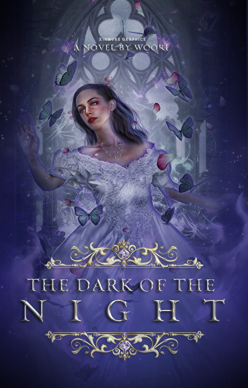
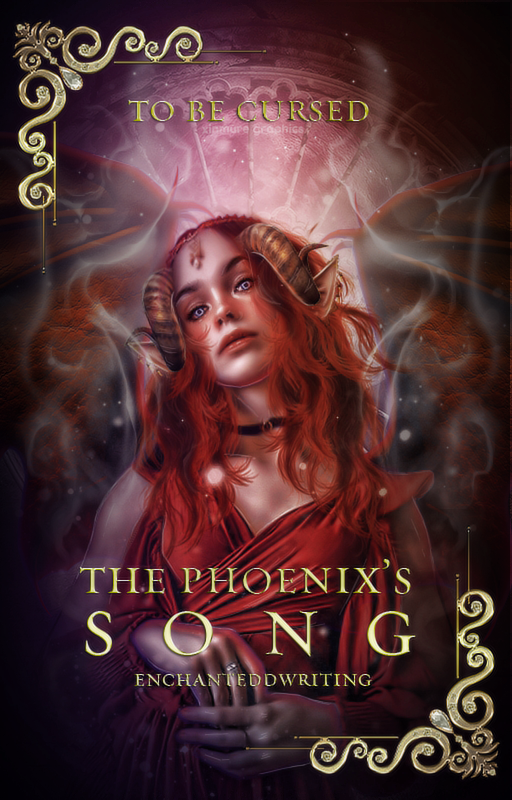
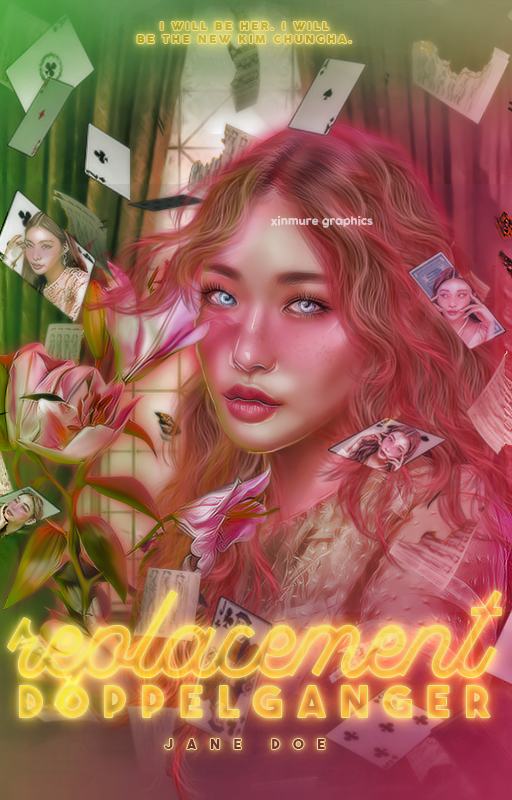
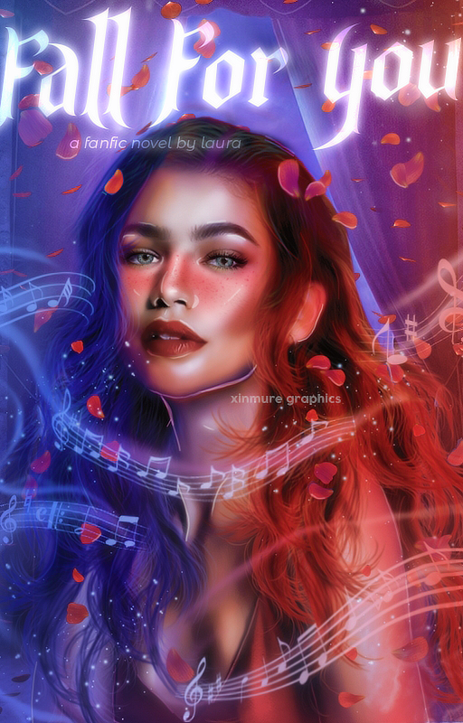
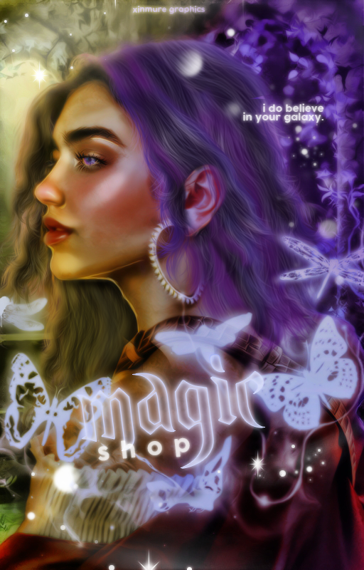
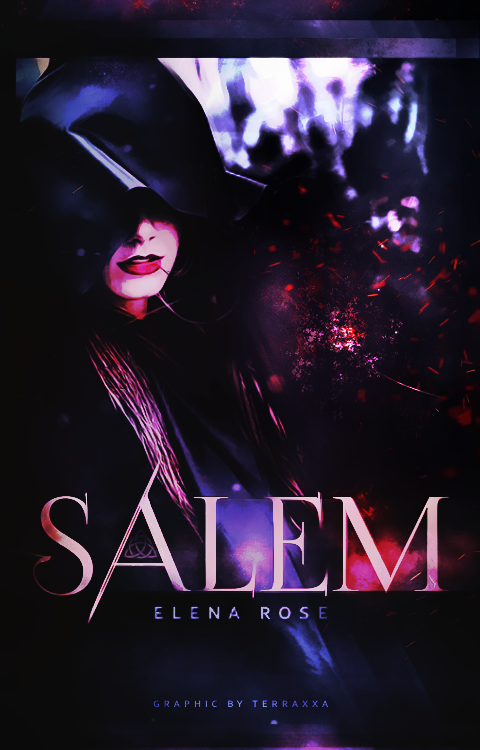
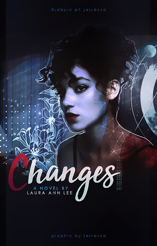
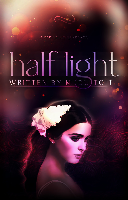
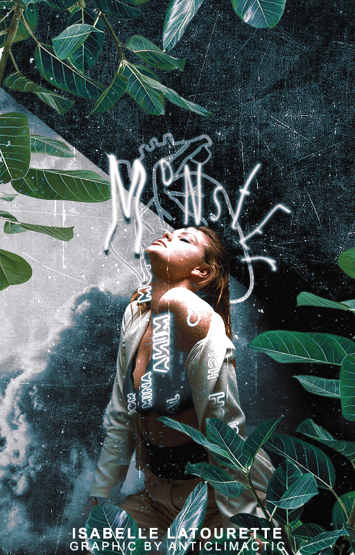
here are my recent cover designs~ i’m still not use to the whole fantasy shebang, but i’m trying my best >< though i’m focusing more on art! despite being a graphic design major…
these three are still my favorite ; - ; i love photoshopping the faces but i hate the font placement //sigh i suck at text hehe
Cute, thanks for the tag!  It’s lovely to see everyone’s graphics!
the way you edit all of their faces is v cool and stylistic! I’ve never tried to do anything like that. I love the composition of the first two, though I feel like the text on those could maybe be more integrated with the rest of the cover somehow, like the strong shadow & bevel makes it stick out a lot - though that might be personal preference. they are all gorgeous! 
I felt rusty making these after coming back from a break, and they honestly took forever…