helloooo  I’m back with another one, simply because i’m in a researching phase and stumbled across this beauty (my cover request remains non-urgent - and i can totally redo the payment if you ultimately need me to)
original source from the royal danish library: Udsigt til ”The Castle” - Digitale samlinger
link to download: https://kb-images.kb.dk/DAMJP2/DAM/Samlingsbilleder/0002/175/429/Elfelt-Stereo_02605a/full/full/0/native.jpg
this is a picture from around lates 1890s - early 1900s. it’s a view of Edinburgh Castle from the Princess Street Gardens. goes to show how foggy the city was lol. and i thought there would be enough space to kinda put the figure on the path somewhere?
i also found these alternative views of the Scott Monument (except for the last one  ) if any might prove useful.
https://soeg.kb.dk/discovery/search?query=any,contains,lars%20peter%20elfelt%20scott&pfilter=rtype,exact,images&tab=Everything&search_scope=MyInst_and_CI&vid=45KBDK_KGL:KGL&lang=en&offset=0
and maybe this lady works better after all, you don’t even have to change the colour of her outfit.
ok that’s it peace out 
1 Like
Ah yes, thank you for these resources!
Sorry for the long wait  I promise I haven’t forgotten, but I’ve been working on it slowly in between job applications and interviews
 (and food reviews)
I can’t guarantee an exact date but it should be sometime early this year  again, thank you for being so patient!
1 Like
That’s no problem at all! Thanks a lot for doing this! 
1 Like
NOOOO
I DIDN’T KNOW EDITING MY THREAD TITLE WOULD ALSO EDIT MY ORIGINAL POST
NOW MY BEAUTIFUL CODE DOESN’T WORK ANYMORE 
but anyway I am slowly working on that one request and will be revamping the thread to reflect changes in the shop!
And I have revamped the thread! It’s a shame the old code doesn’t work anymore, but this will do for now  due to recent forum changes, I will no longer be offering custom code in this thread. I will still be offering covers, though!
I’ve also changed the form for requesting  it’s less complicated than the previous one
  feel free to scroll through the new look! :3
► PROTOTYPE
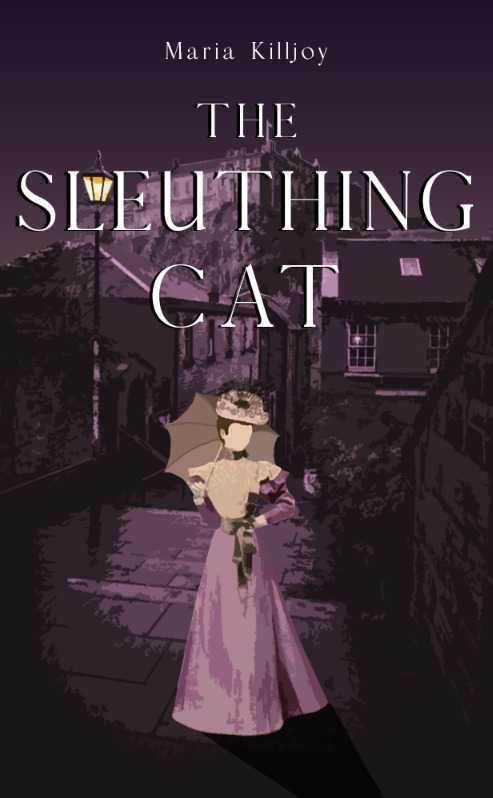
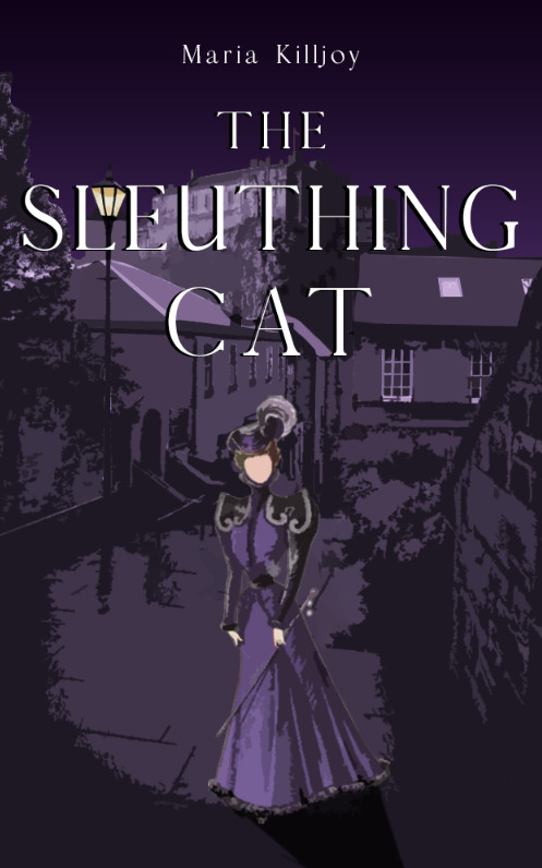
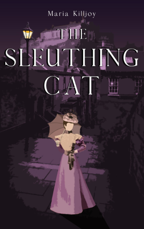
@alcoholandcaffeine I know it’s been ages, but here are prototypes of two versions! (unfortunately not done yet  )
)
If you can’t tell, I’m a little stuck I did experiment with the other backgrounds you sent, but they either didn’t have a trail that was long enough, would have the monument significantly cut out of view, or require me to scale the silhouette down by a lot  so I ended up just using a photo of the same landmark that was taken from a different angle
So between the covers, lemme know which you prefer in terms of:
- level of detail (more detailed background or less detailed?)
- silhouette (umbrella or cane/stick/unfortunately I forgot what exactly she’s holding
 )
)
- color scheme (a more pinkish purple like the first, or a deeper purple like the second?)
I can mix and match between the two versions, so if you want a more-detailed background with the more saturated purple and the lady with the umbrella, I can definitely do that! Or something in between. Or I can make both if you also can’t decide
Thank you so much for being patient! 
1 Like
Those are pretyyyy 
I’m gonna need to sit with this for a while before I decide, but my concern remains that the background behind the title is a bit busy  which might make the title difficult to read in small thumbnail format, I’ll have to experiment with a draft on Inkitt.
Can the picture go up a bit so the title is perched more on the hill, just below the castle? Or up, so more of the title goes against the sky? Or would that shift perspective too much?
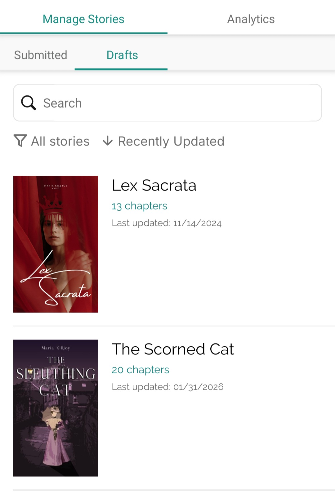
Edit: here is the thumbnail look. Granted, sleuthing is a long word lol. But the background doesn't make it easy 🙈
LE 2: based on the draft experiments, I think the pinkish colour might work better… although thematically I prefer the deeper purple… would a lighter shade of that purple work with the first version? I like that the pinkish one isn’t so deep, but I think it would also be nice a little less…pink  as for the level of detail, not sure I think I like the first one better overall, but I hope we can figure out a way to make the title easier to read
1 Like
also the colours look different on my laptop…I wonder if I have a night light on or something lol. they look a bit…faded? are the colours kinda matte, or is it just my brightness settings?  they looked a bit more vibrant on my phone
1 Like
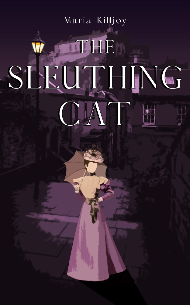
Ok I’ve let it sit and definitely the first version! The silhouette stands out better and honestly the colours are great. If we can just get the title a bit clearer it’d be perfect! 
1 Like
For sure!
Sorry, I’ve been rather busy lately  but I’ll make sure to get that done sometime soon!
1 Like
► PROTOTYPE
Thank you for being so patient! I’m purposefully making the preview tiny so that it’s easier to judge if the title is easier to read now I also made the color scheme for the cover a little less pinkish and smoothed out the background around the text so that it feels less busy.
This is just a screenshot, lemme know of any changes you want before I send the full version over! ^-^
1 Like
This is definitely better, I like it! Not sure if I want any changes…I wonder maybe if the background behind the title can be darkened/blurred? So there is less detail? But even if not, I think it works like this  Thanks so much for all the effort!!! I appreciate it
2 Likes
► DELIVERY
Here’s your cover, and thank you once again for being so patient  don’t forget to open the image in a new tab before downloading!
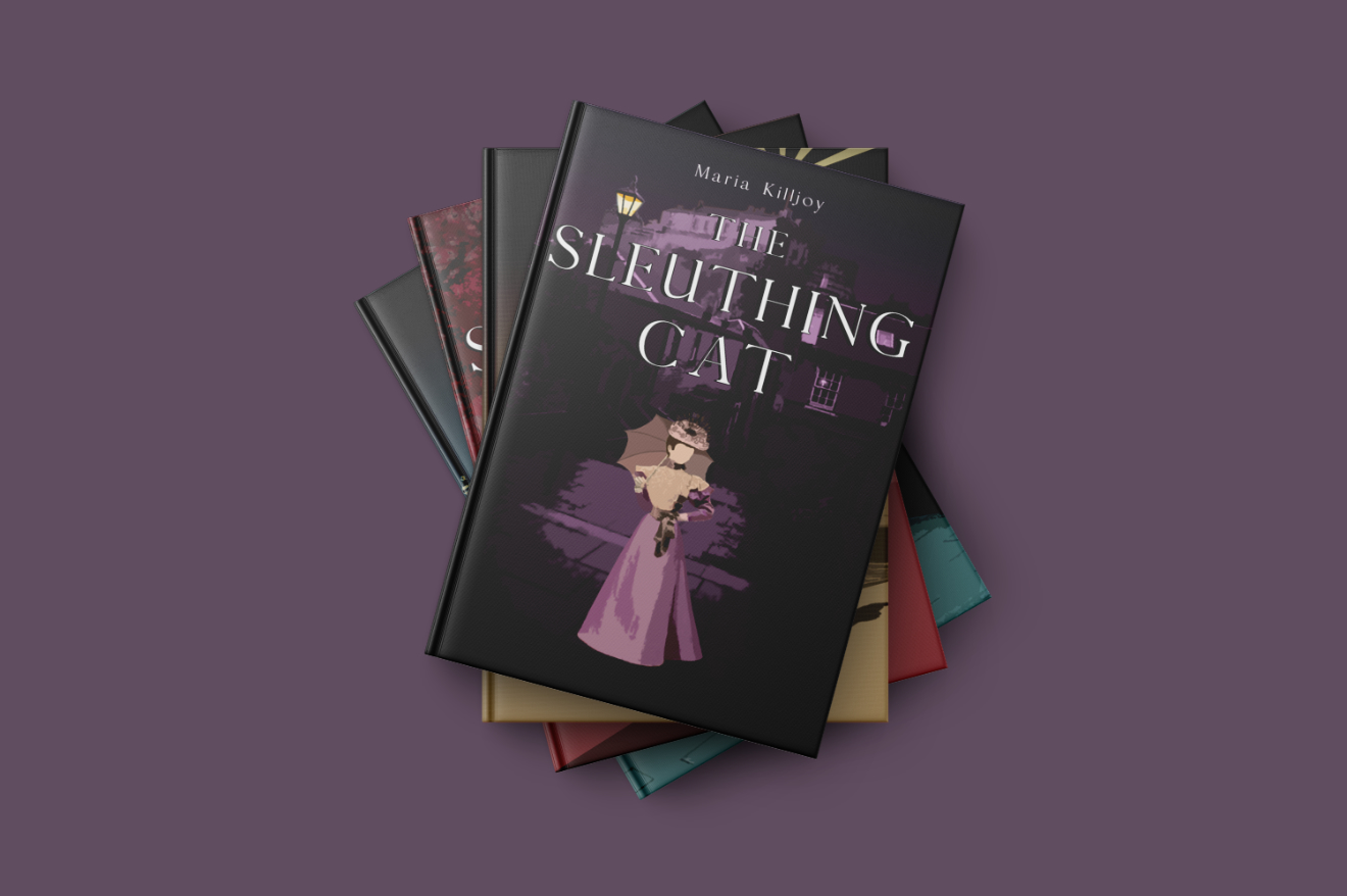
And have a 3D mockup too
2 Likes
► BUMP!
This shop is open for requests!
1 Like
Heeeeey, sorry it took me forever to get back to you! I’ve been travelling and on/off my phone. Thank you for this, I love it!
If nobody signs up by the time I recover from my travels… I might just submit the last request for book 5
1 Like
I did! I ended up back in Paris, actually, where book 2 takes place, so it was also sort of a research trip great weather, too!
1 Like