lmaoo ah oki thank you! 
1 Like

WOW!
1 Like
It’s beautiful! The title feels off simply because nothing lines up on the cover, but otherwise, I like the simplicity and feel of it.
Also, I don’t know the fonts, but could be just me, because most fonts I know are fantasy
2 Likes
Be careful with fontbondles, their licensing is brutal.
I buy all my fonts from indie foundries, MyFonts, and CreativeFabrica. 
Sorry I’m still waking up. Free fonts, try your Adobe subscription, Google Fonts, CreativeFabrica, CreativeMarket, Envato!
2 Likes
 Thank you!
1 Like
Thanks 
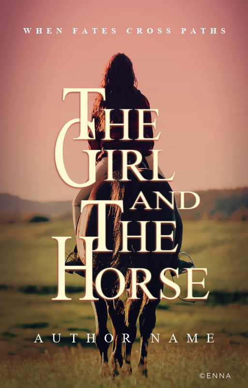
It’s actually Times New Roman. I never make covers with this font, so I decided to try and see if it’s all about font, or all about design.
2 Likes
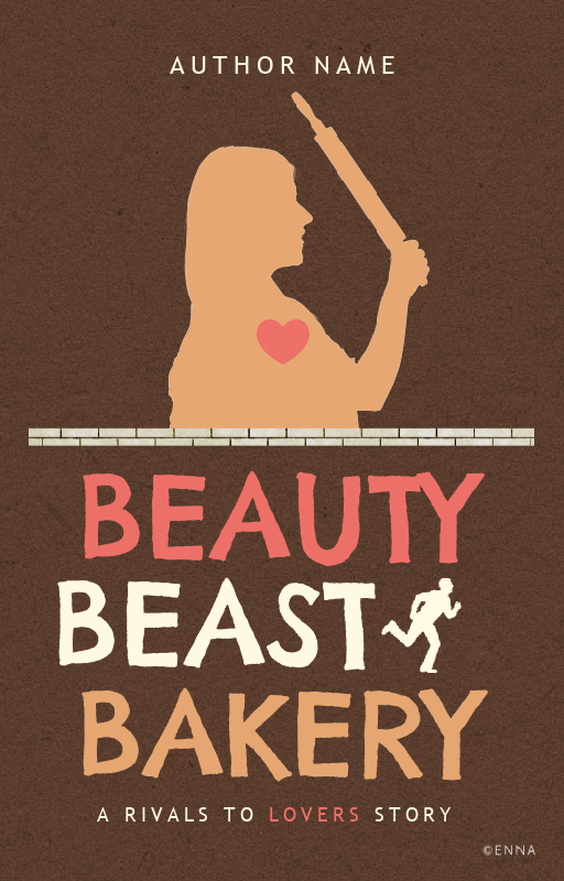
Help, Idk what I’m doing with this XD
The sides of the girl just seem so empty, but idk what to do with it.
5 Likes
HAHA wow. It’s clearly about design, though. It depends upon the cover.
2 Likes
Nice! Add in decors, draw some flourishes
2 Likes
I like the texture! Really makes it unique!
2 Likes
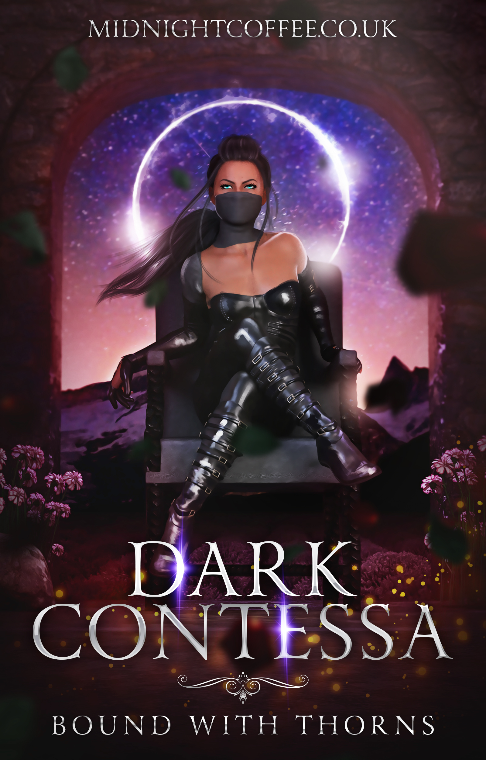
This was a fun experiment in “how many tabs can I open whilst buying stock”. Background and model both custom renders made by me.
7 Likes
Can I know what font you used in Laws of Chaos? 
1 Like
2 Likes
Thank you!
1 Like
uh I use befonts, dafontfree.io and dafont but I’d be careful ith those… ![]()
Np, you should get it! It’s a really lovely font!
1 Like
It definitely is, and I did! 
1 Like
Thanks
1 Like
Ahhh, flourish. Like some of those flourishy flourishes…
I’ll have to see what I have, but I think I have an idea.
2 Likes